Quietly Illuminating
Ash on the Beech Kitchen
The brief: create a space to brighten up the room, provide ample storage and showcase natural materials.
The result: warm Ash and Beech cabinetry, integrated LED lighting, unique storage ideas, a fine space for cooking.
The design of this kitchen took several different iterations before we landed on a layout that would work. It is easy to imagine dropping an island into the middle of a room, or wrapping a room completely in cabinetry. But the reality soon hits home that walk-ways can be as important as work ways. Do you want to always be walking around a lump of furniture which becomes increasingly cumbersome over the years? Do you want to constantly be walking to the other side of the room for that tool which was in… that cupboard? As with many things in life, when working out the layout of a kitchen, it can pay to be concise, after all, you will be the one using the space.
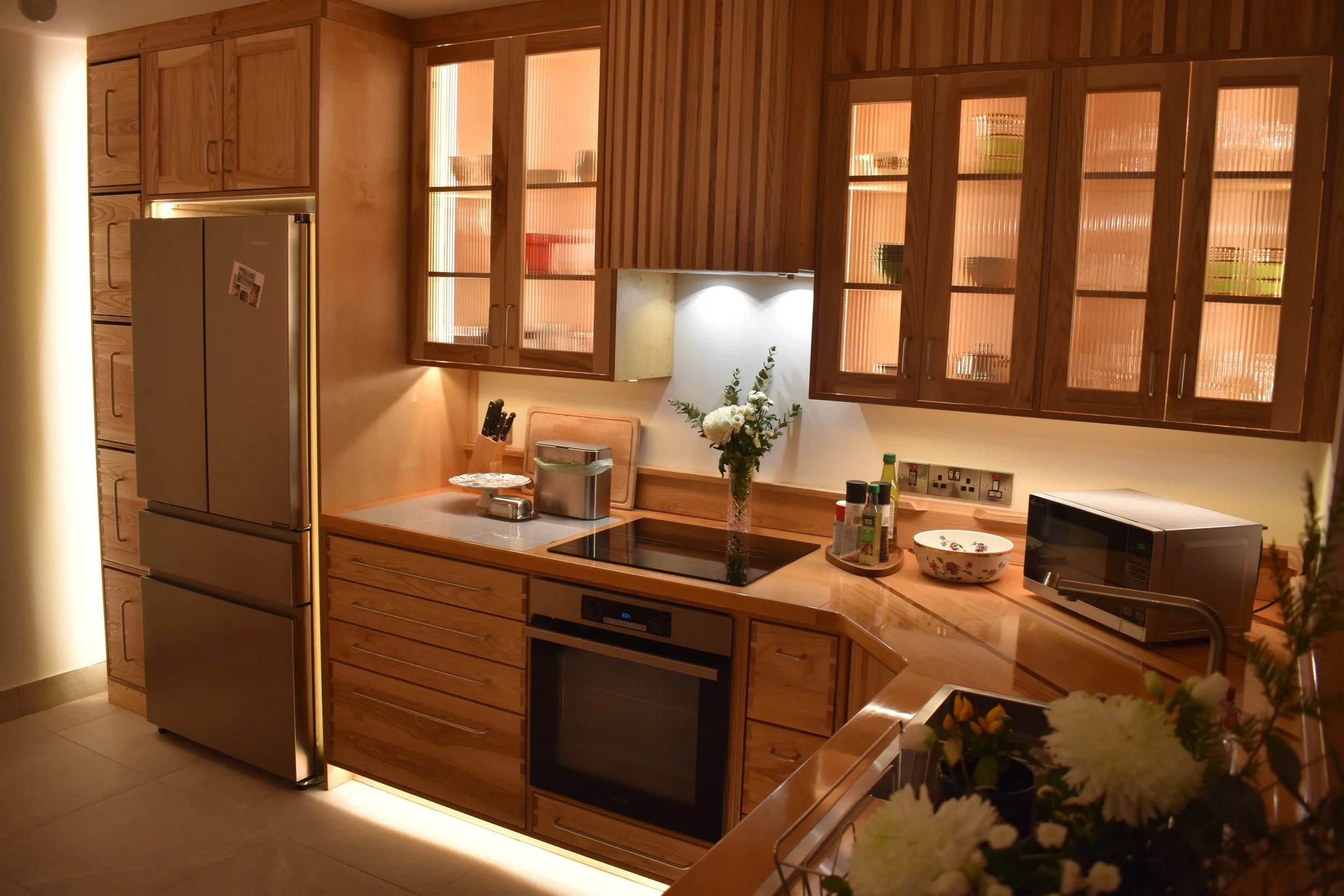
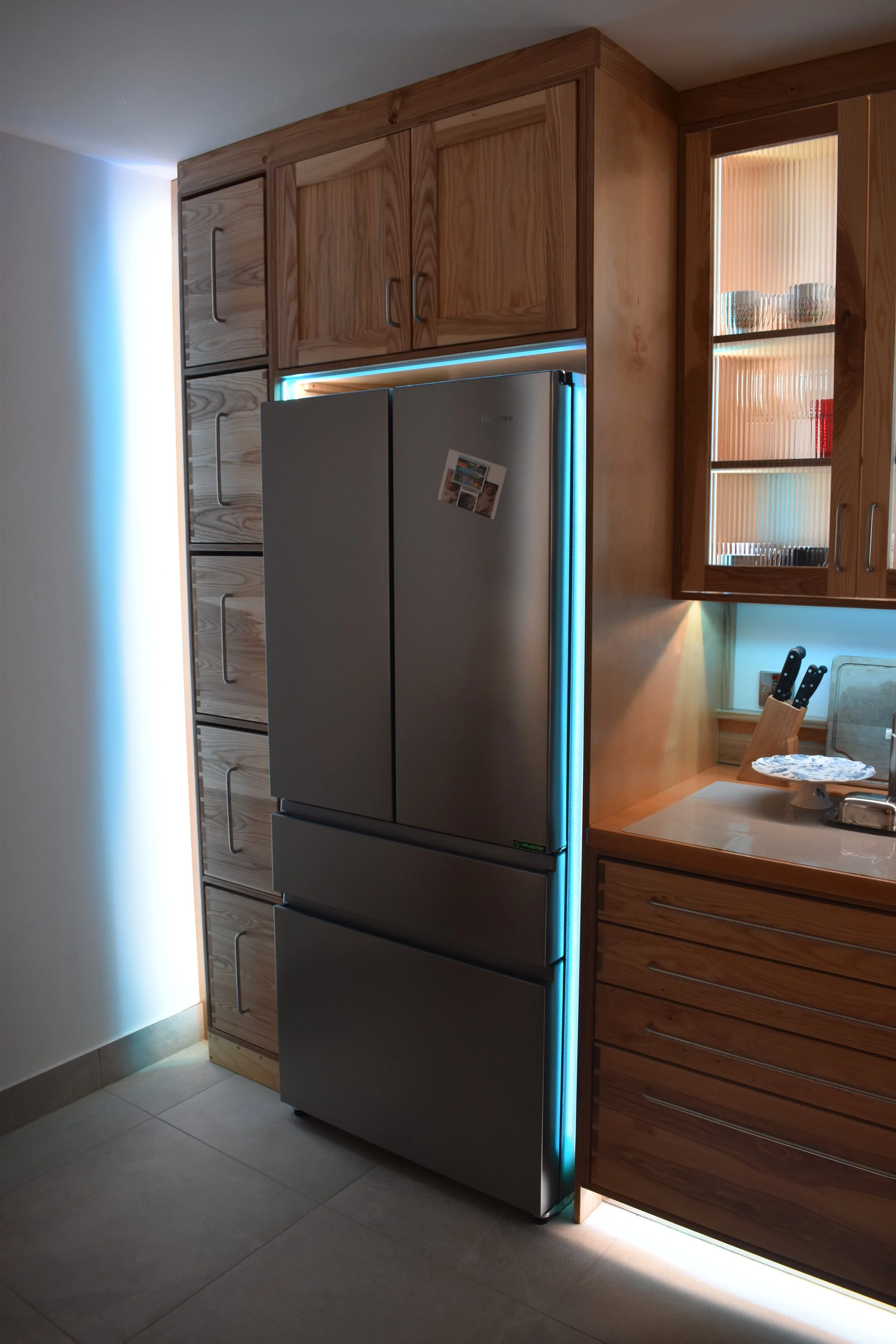
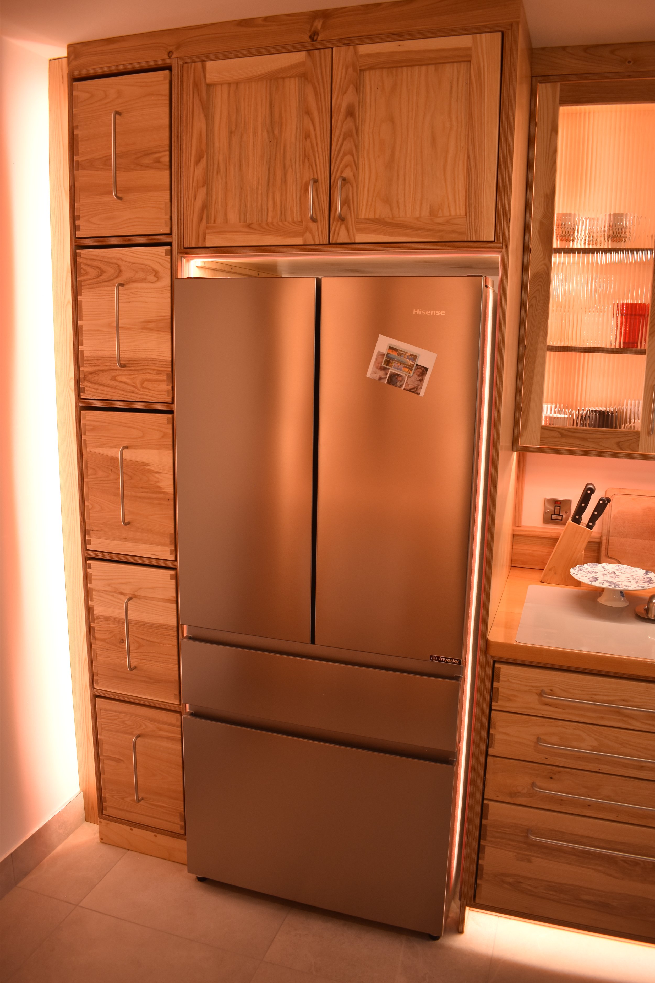
As with most UK houses, this one didn’t really have enough space for double sided cabinetry or a traditional island and still allow for walkways with an acceptable width. As we were going down the path of having a deep American style fridge, the inspiration came to engineer the space with deeper cabinetry and therefore boost storage capacity and worktop space in what would be for the most part, an ‘L’ shaped kitchen.
As you can see in the picture below, this was the starting point. In the beginning we had tired, vinyl faced, budget cabinetry with a generic style and maybe not the most useful layout in the world.
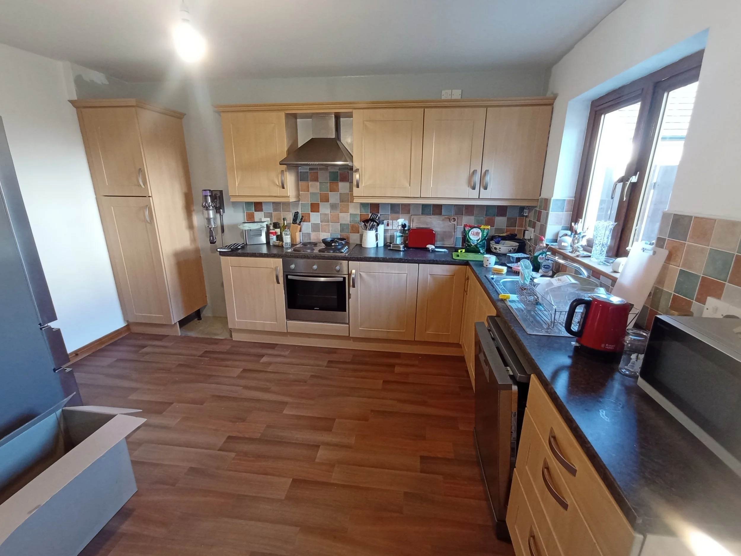
This kitchen came before a time when soft close hardware was affordable and widespread, so the cutlery drawer would slide home with a crash. Not only that, the single column of drawers was not centrally placed but positioned at the far end of the workspace. It is much more useful to have this sort of equipment right where you need it close to the main cook station.
There is space for a fridge here but only a narrow and shallow one, which limits storage options. The cabinets are shallow which makes the countertops appear cluttered. The vinyl is starting to peel off the cabinet doors. The cabinet doors are wide which means they take up a large arc of space when opening. The corner cupboard lacks any convenience and requires you to open two doors to access, therefore inhibiting use even though a corner cabinet can often have the most space inside given its shape. The tops of the wall mounted cabinets are exposed and therefore a dust trap for grime and grease to accumulate over the years. The extractor is poor and doesn’t fit in well with the overall kitchen aesthetic. Without adding a table there is no viable worktop to prepare or serve a meal to guests. The floor is a soft vinyl in a dark colour, the countertop is also a dark colour in a room which faces due North and has no natural daylight. When my client first moved into this home, the aperture for the dishwasher was too small and a modification to the cabinet of drawers had to be made to make the opening wide enough.
I could go on, for a three bedroom family home the existing kitchen was simply not suitable and was probably not intended to be anything more than a space filler until someone decided what they really needed.
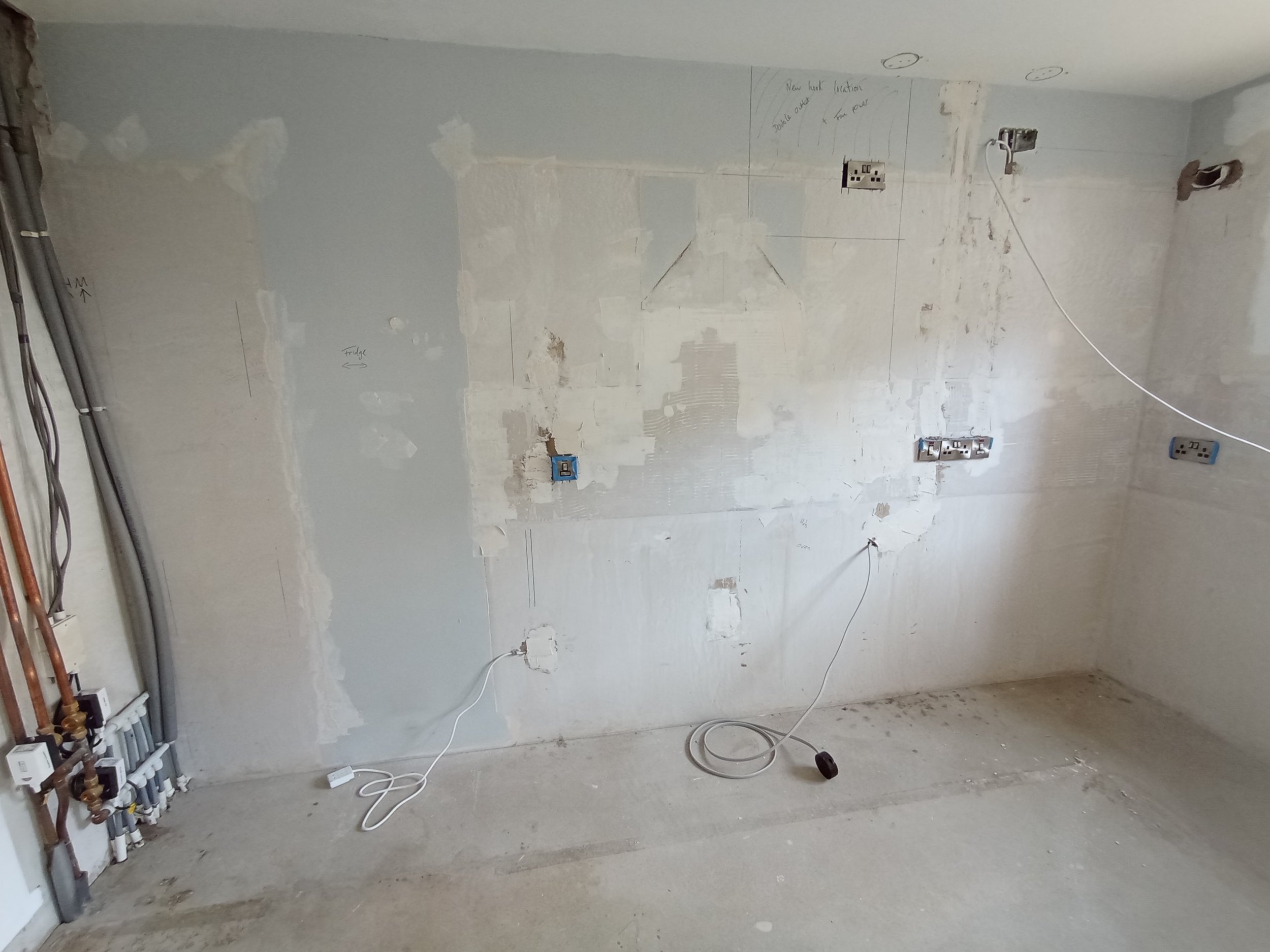
We employed several solutions to improve the existing kitchen. To do this we had to strip everything back and begin with the floor - from the ground up!
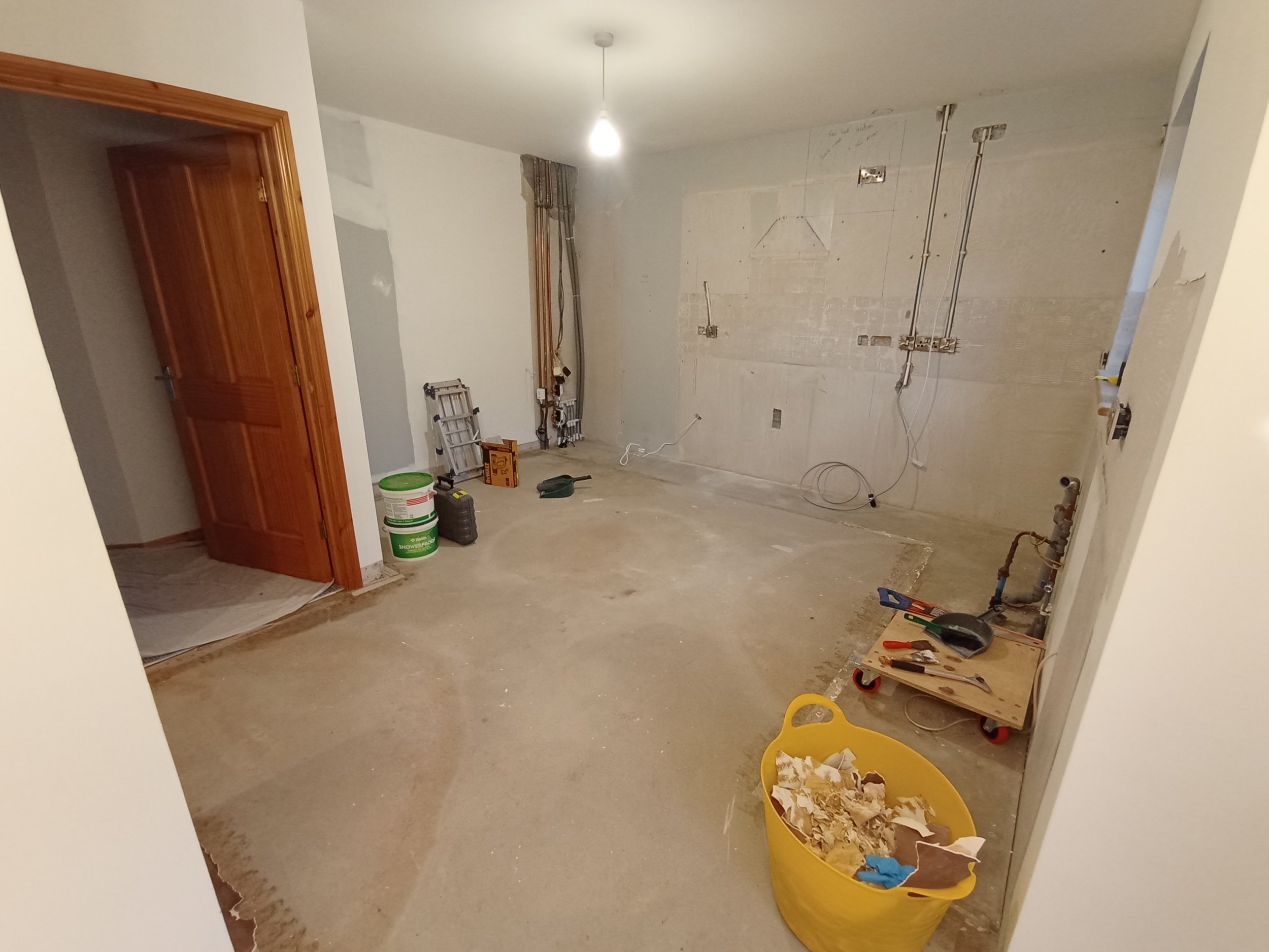
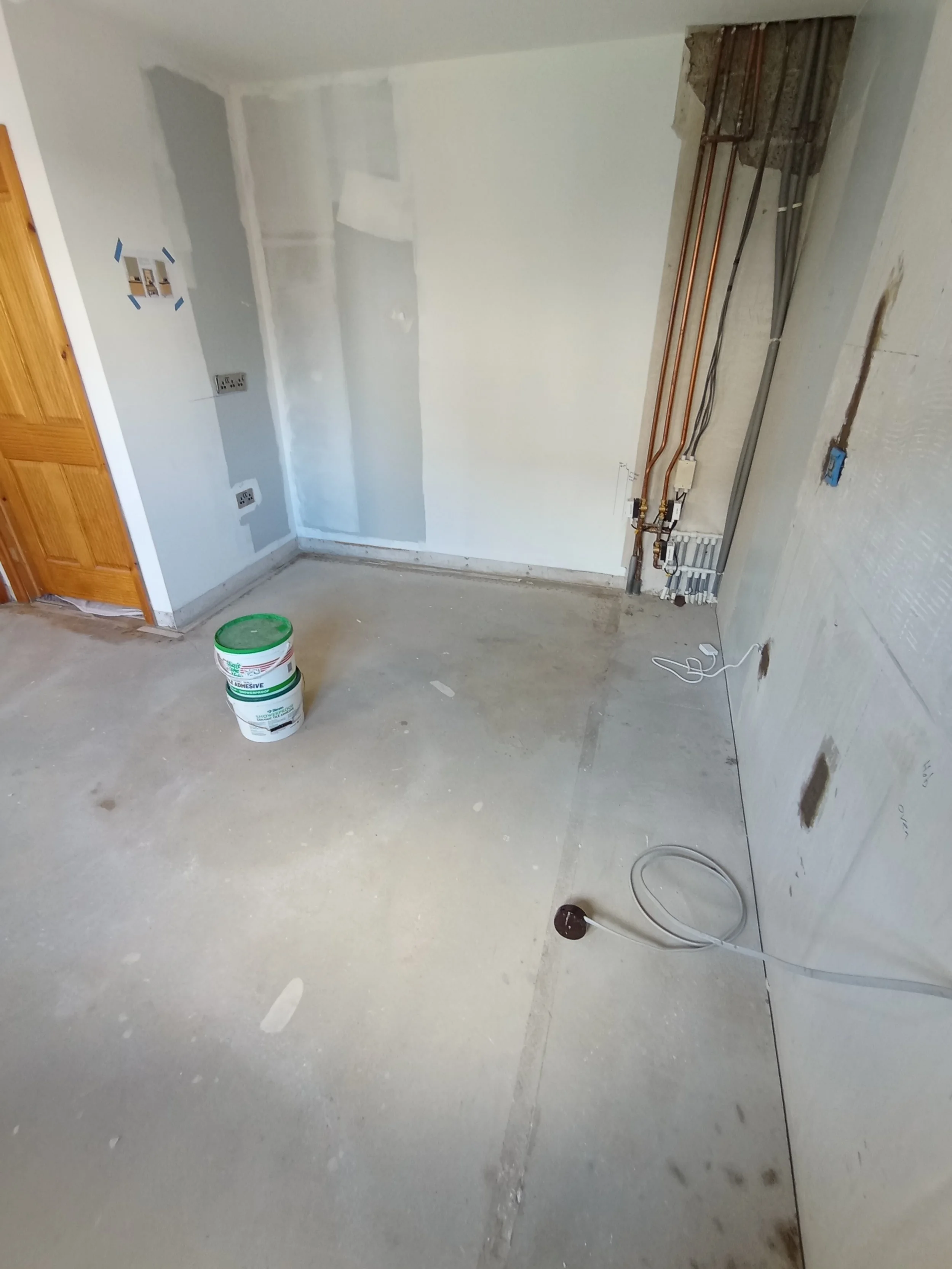
The old cabinets, floor vinyl, wall tiles were all removed.
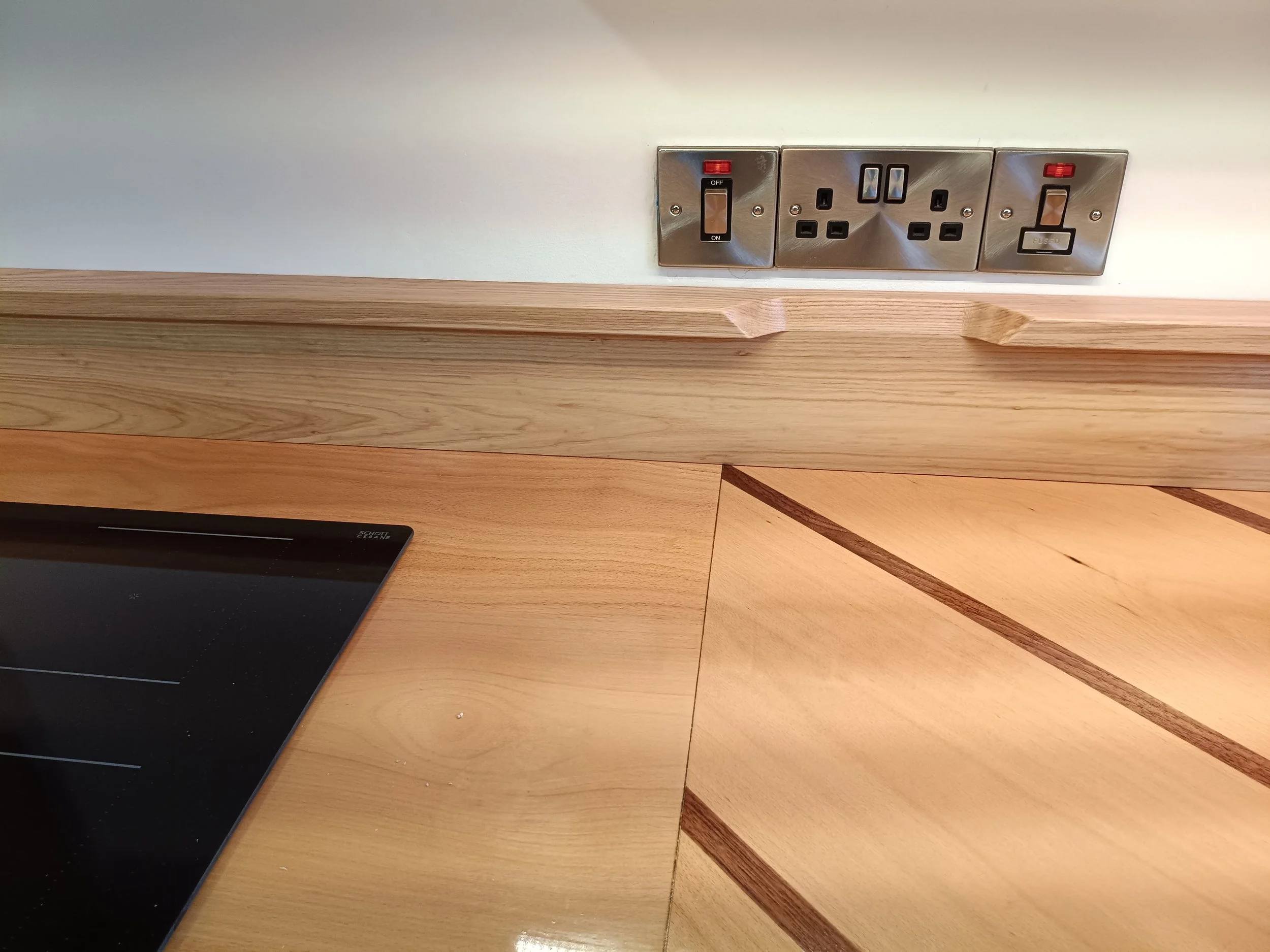
We were moving a few things around with the new layout so required some electrical conduit to be moved around in the walls.
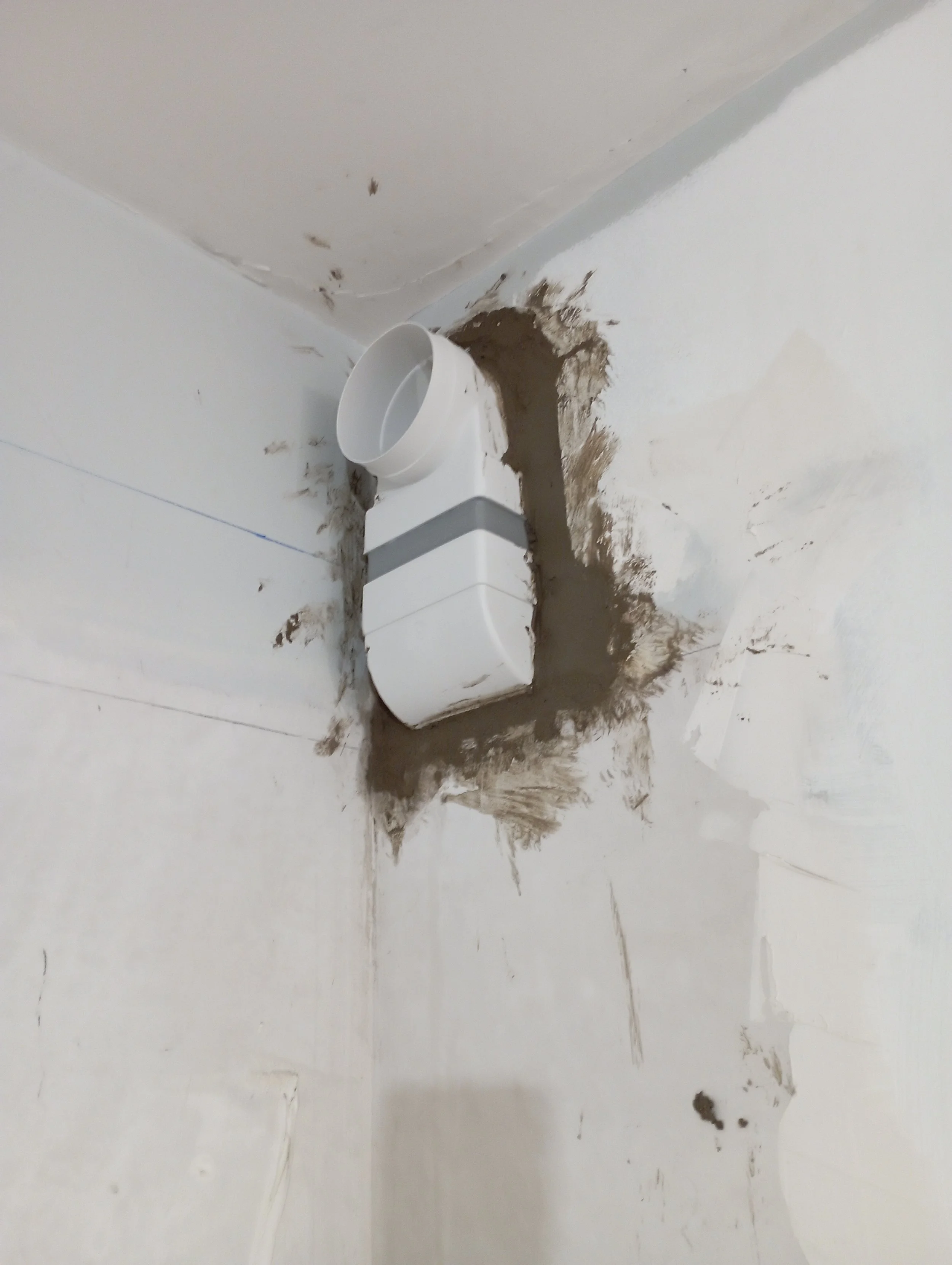
A proper exhaust port had to be added to allow the extractor fan to vent outside.
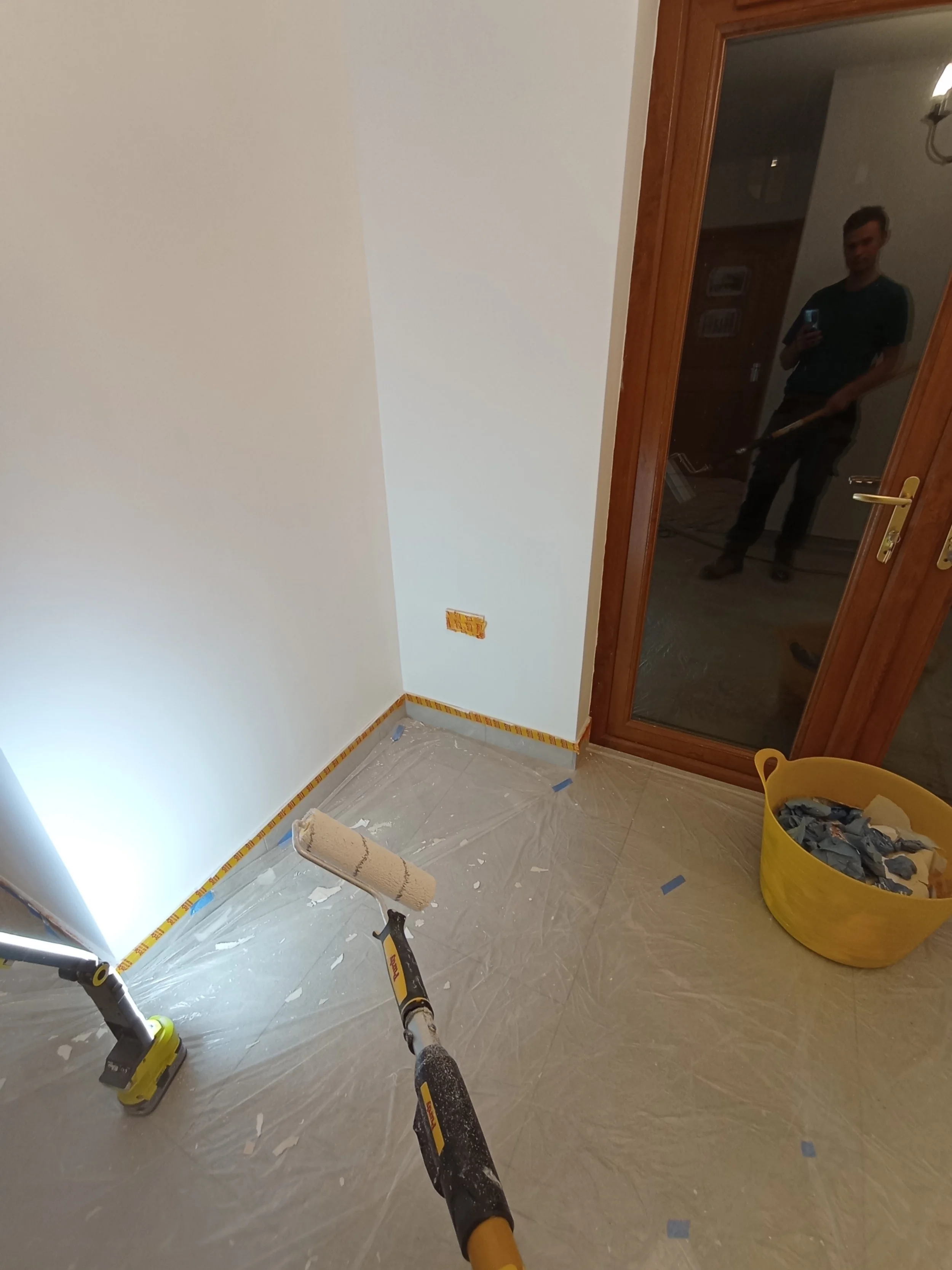
This pock-marked wall after patching was now ready for a lick of paint to brighten up the room.
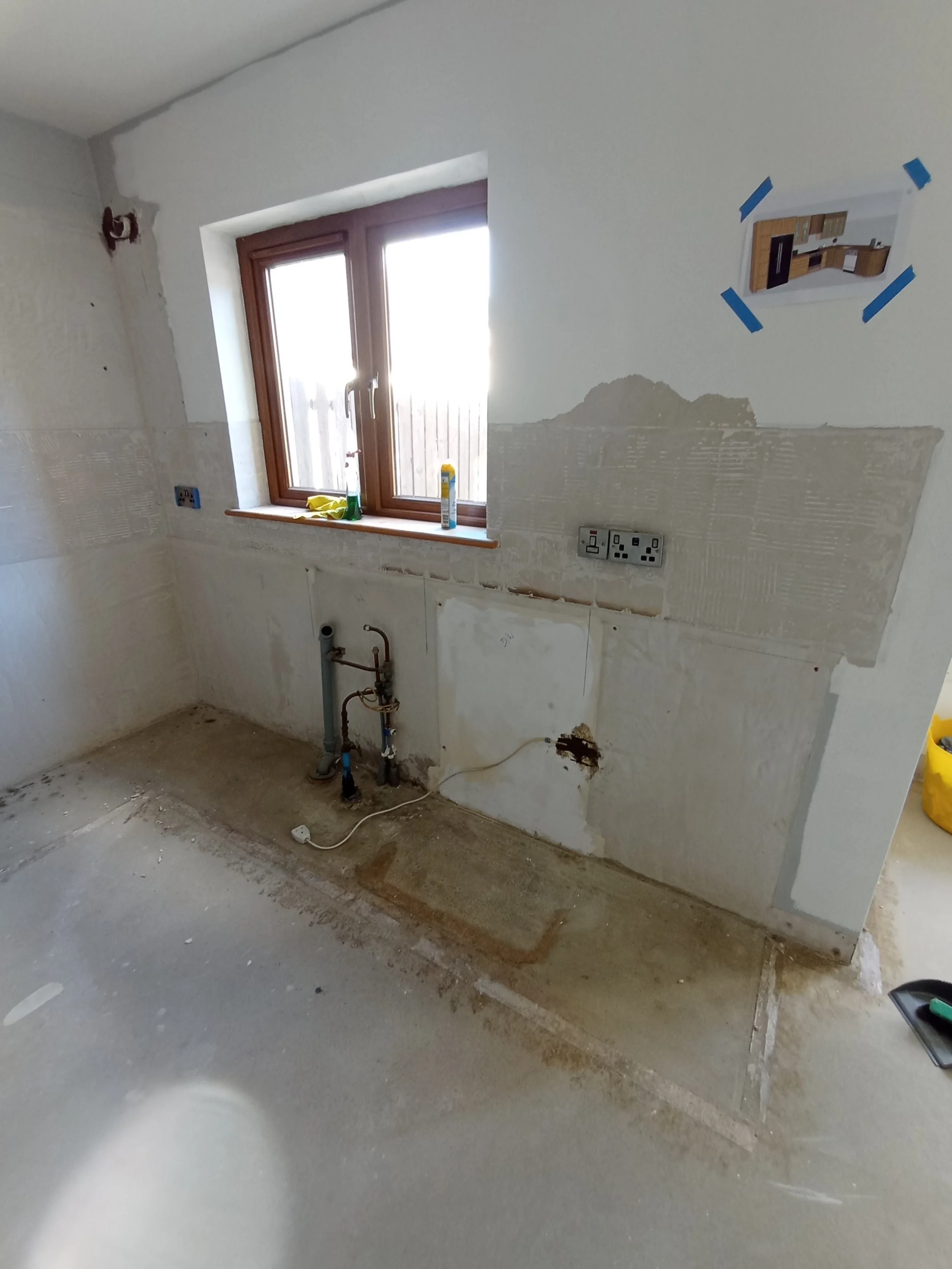
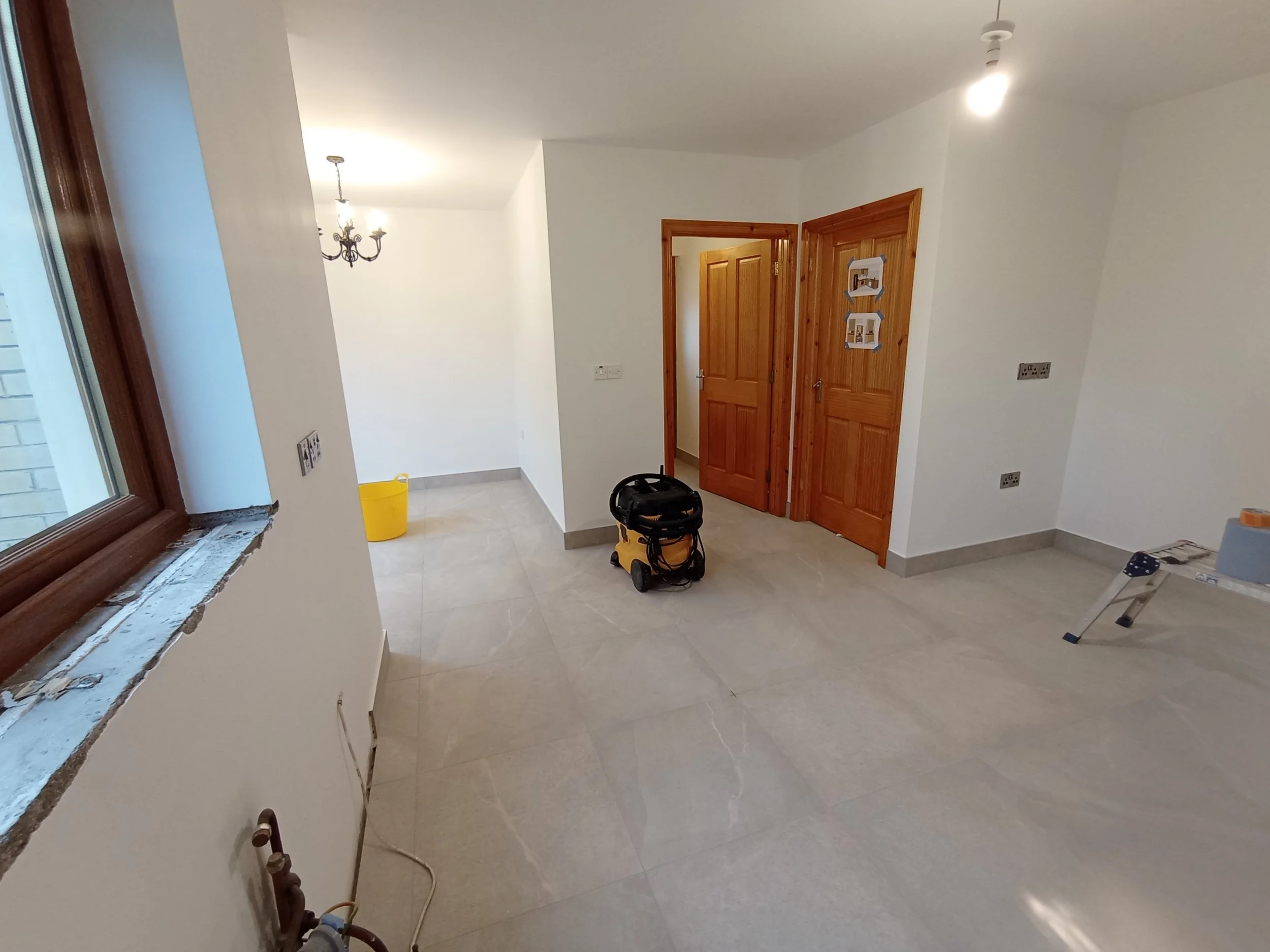
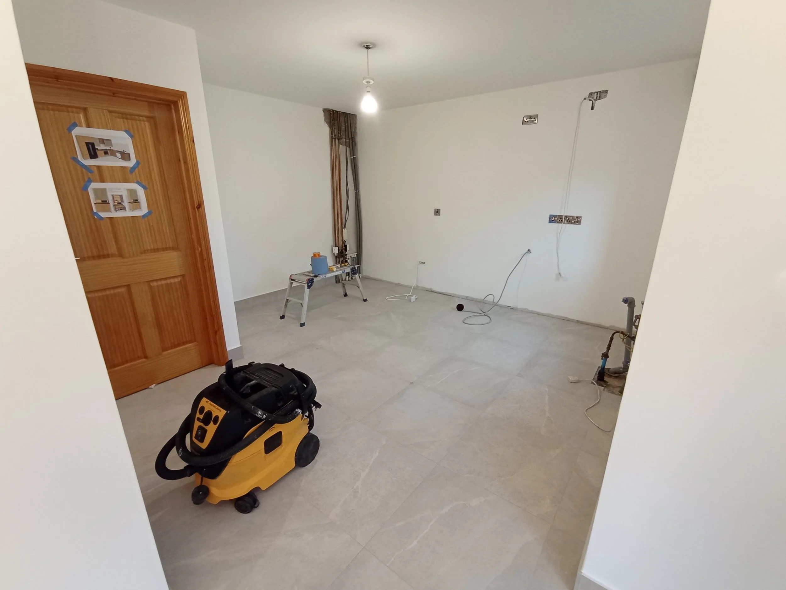
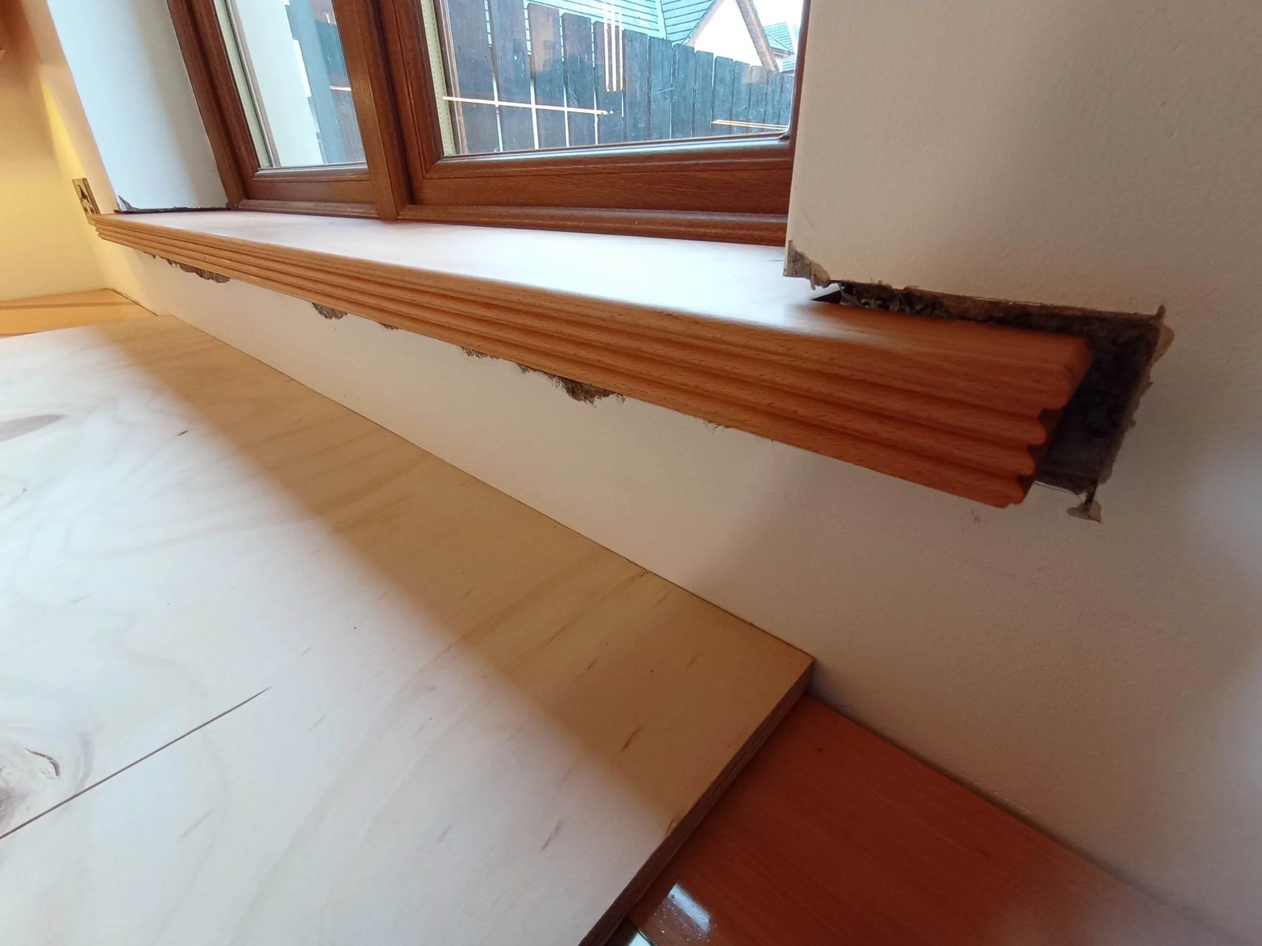
After painting and a new floor the room was nearly unrecognisable. We decided to go with a quality wide tile in a pale grey soapstone as a neutral background for the new kitchen which would be built on top. It is a refreshing change to the space and the matching tile upstands enhance the cleaner aesthetic.
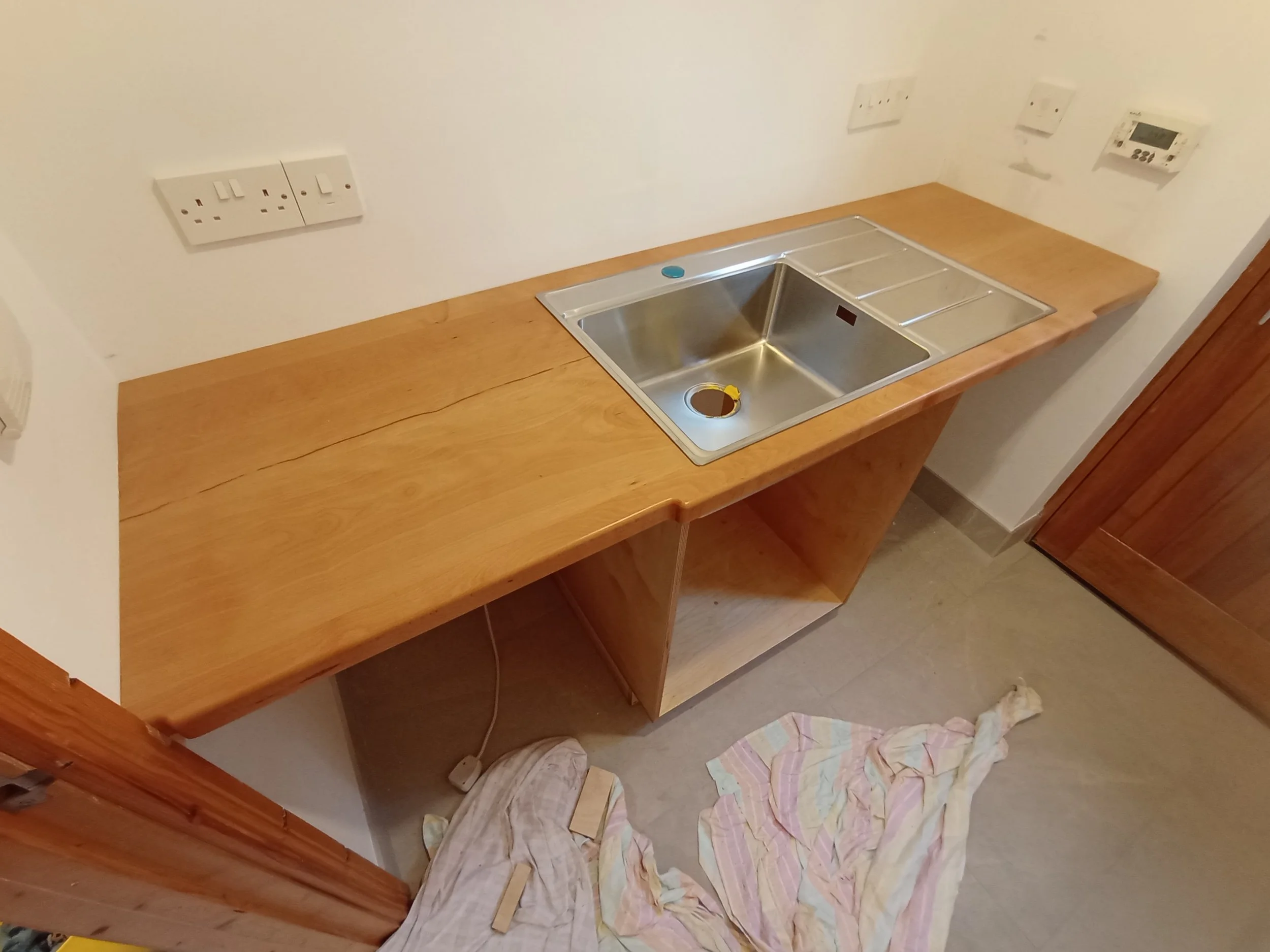
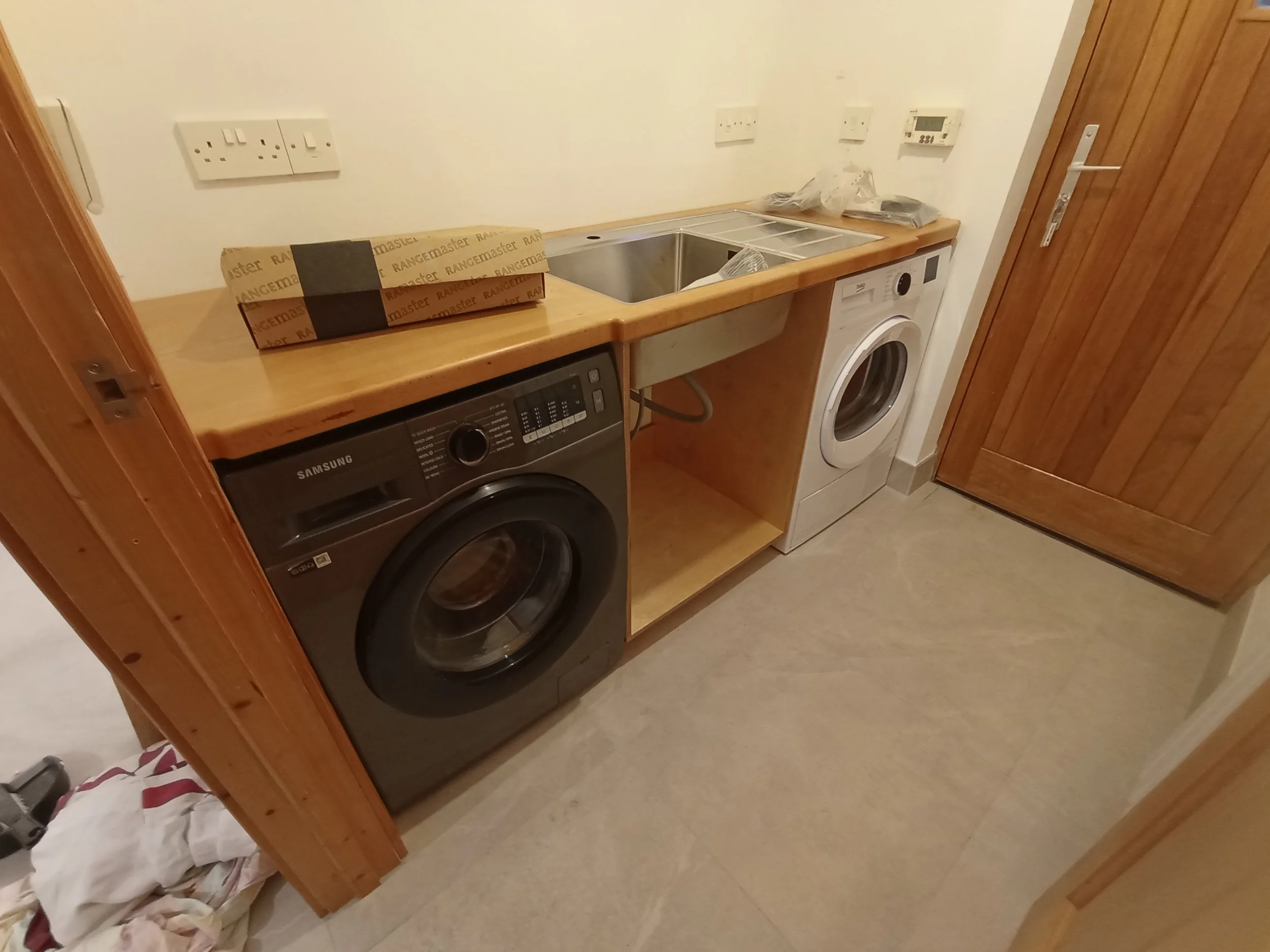
Building a kitchen can take some time so to provide running water and a minor workstation in the intervening period the utility room cabinet, countertop and sink was fitted first. With some imagination, perseverence and foresight this is a good way to provide a modest kitchenette for the household while the main kitchen is out of action.
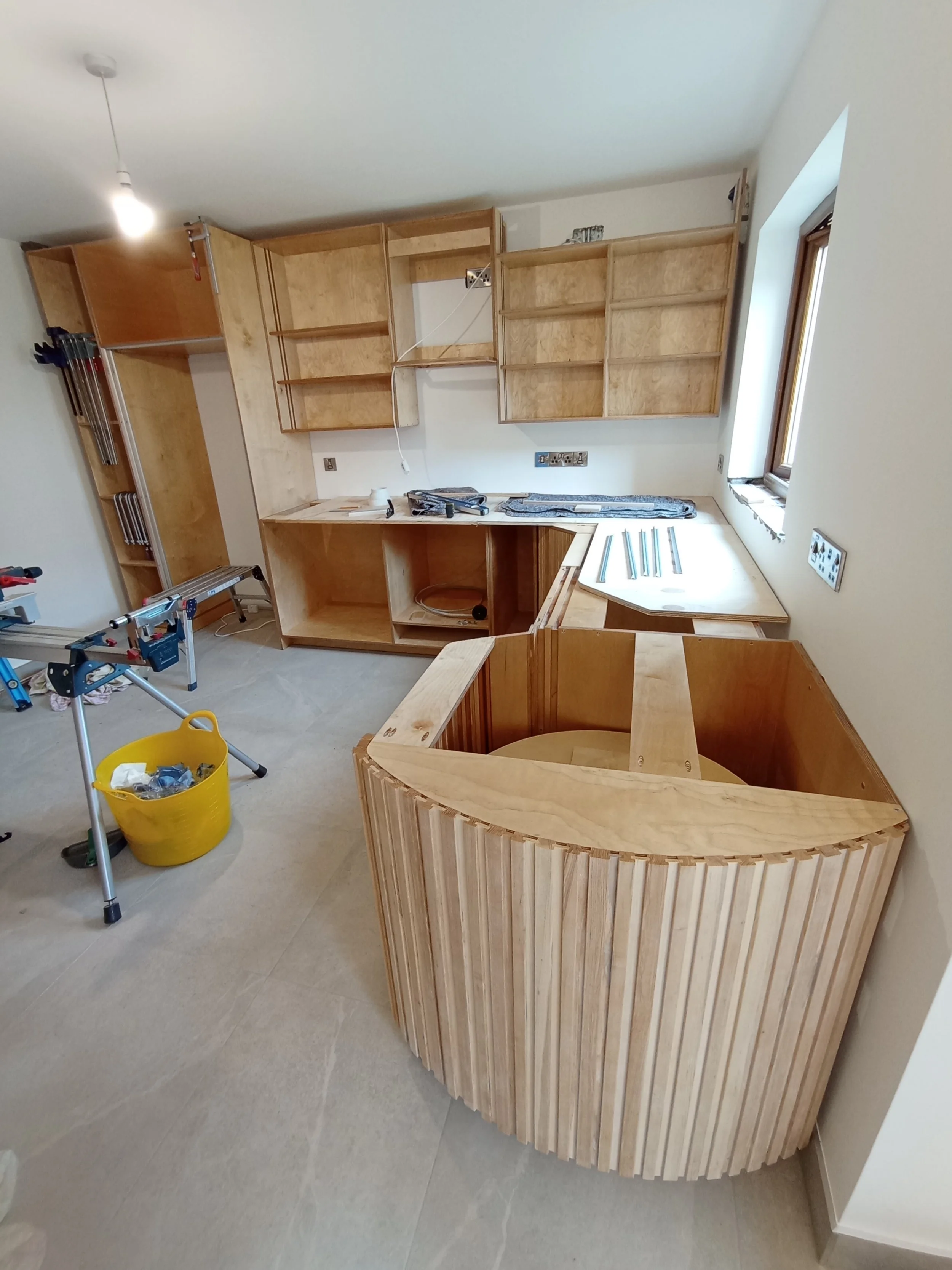
Work can then begin on fitting the main core of the cabinetry for the project.
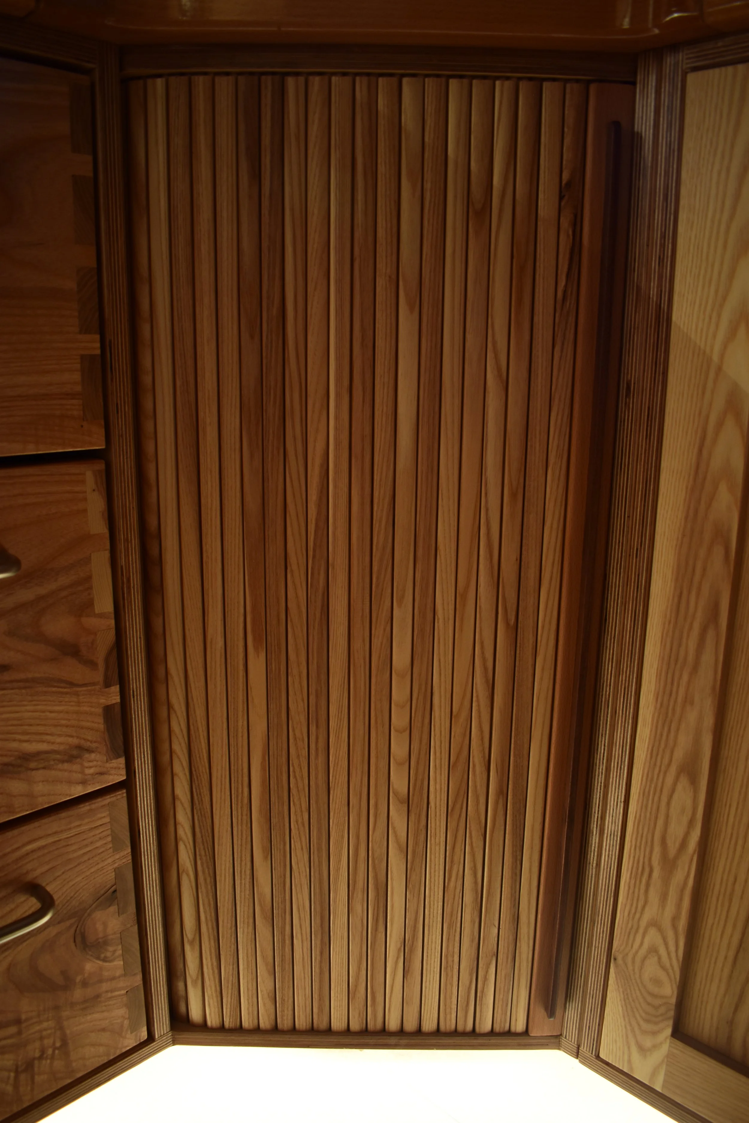
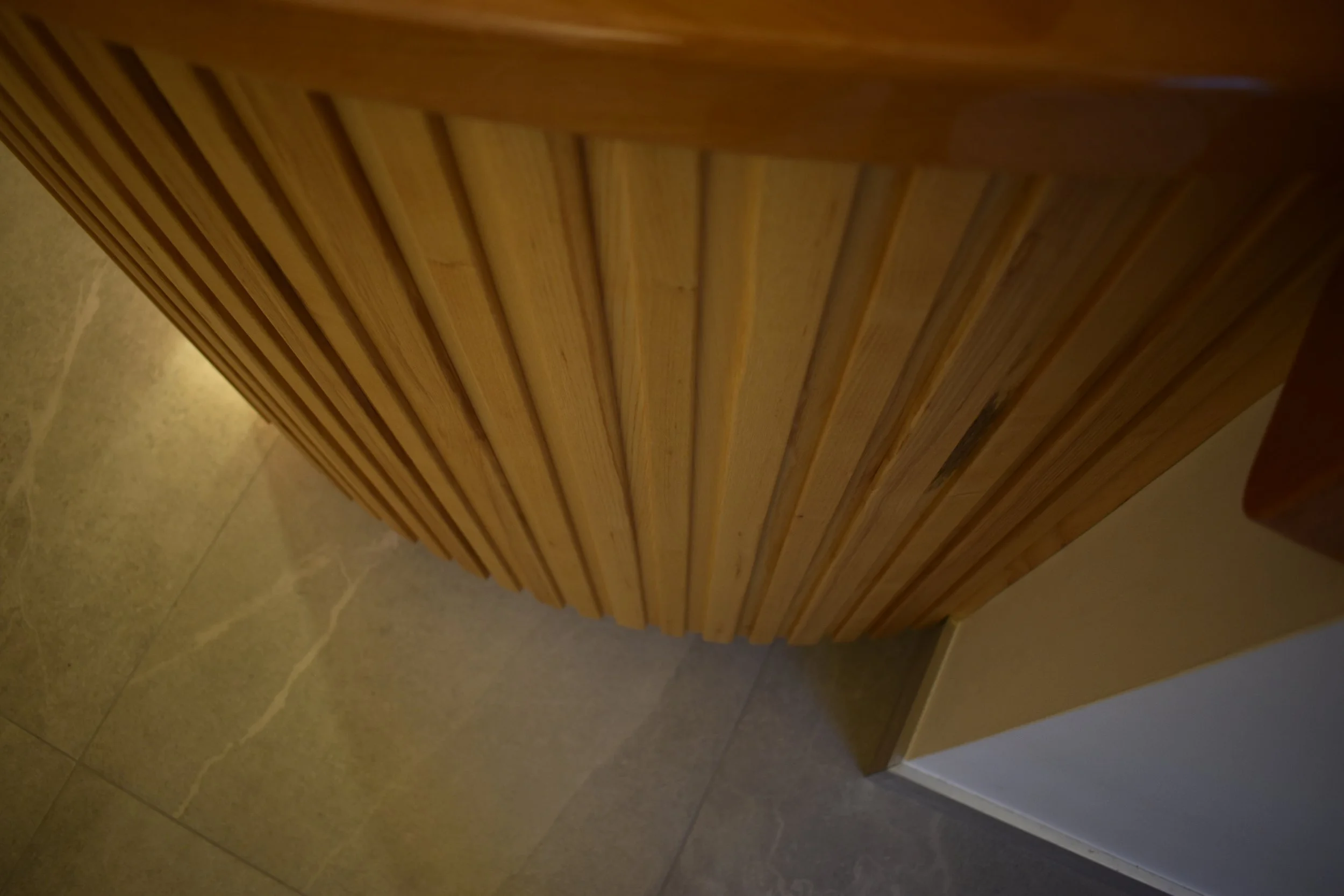
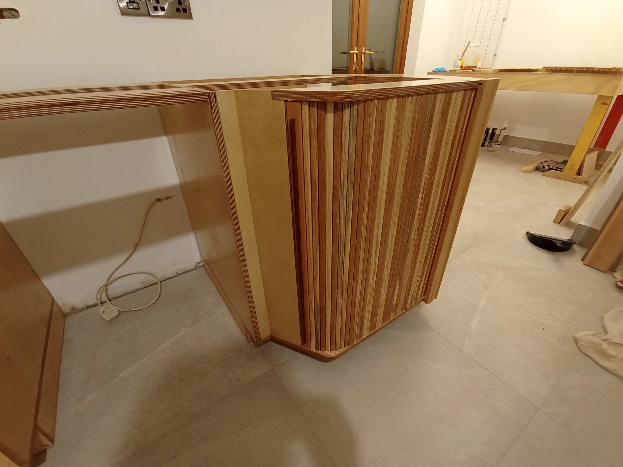
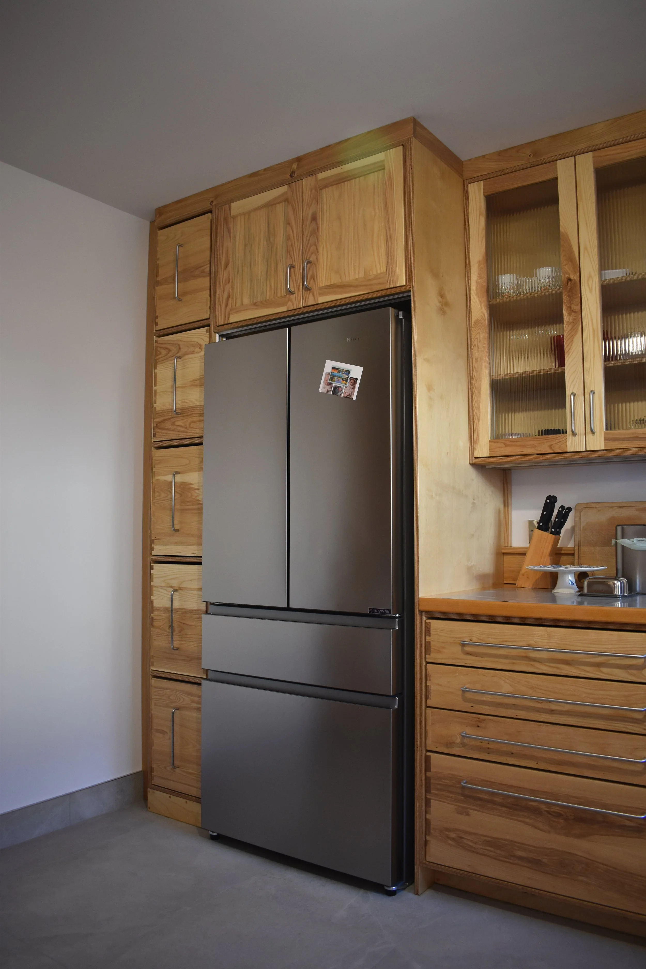
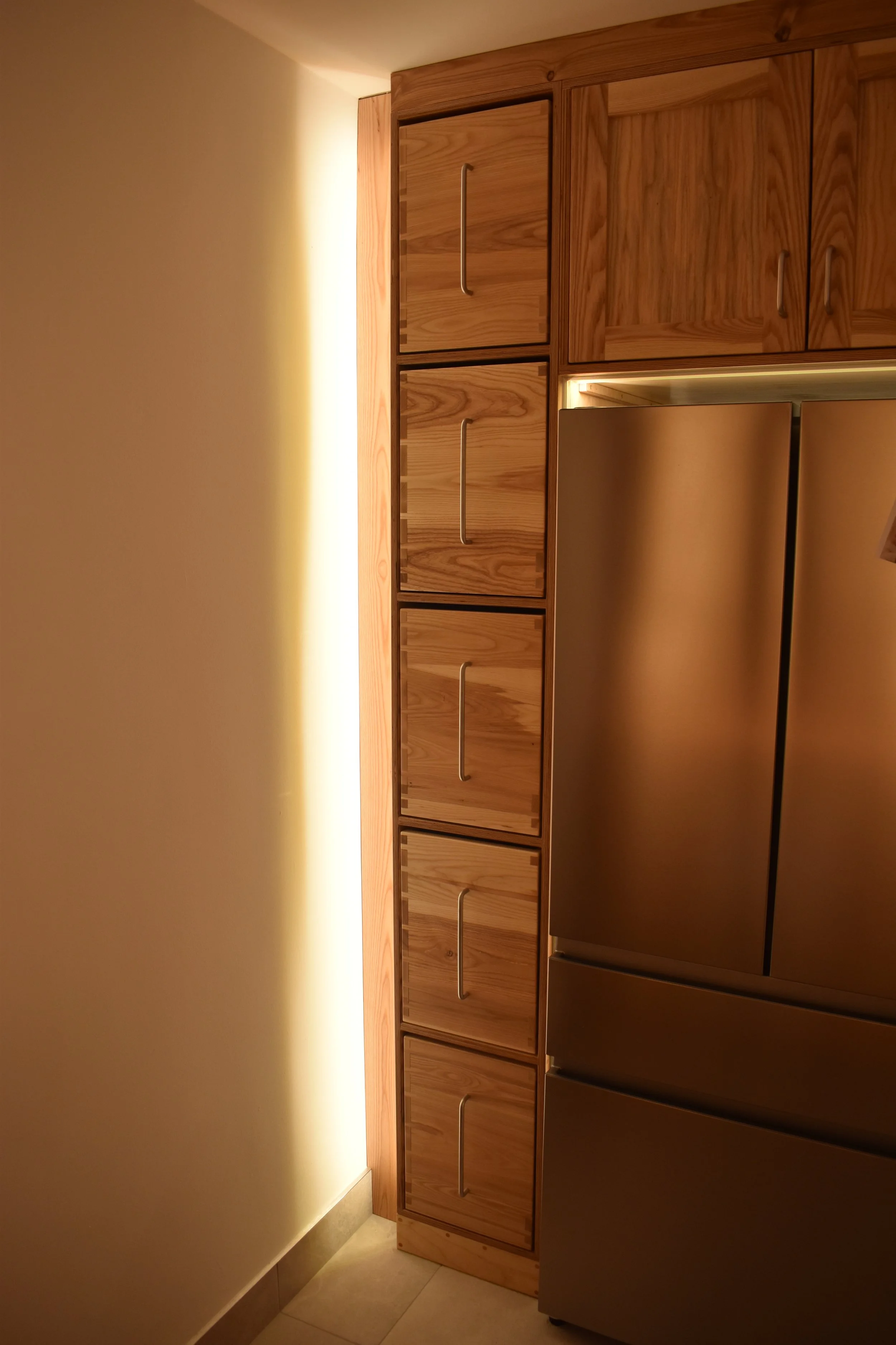
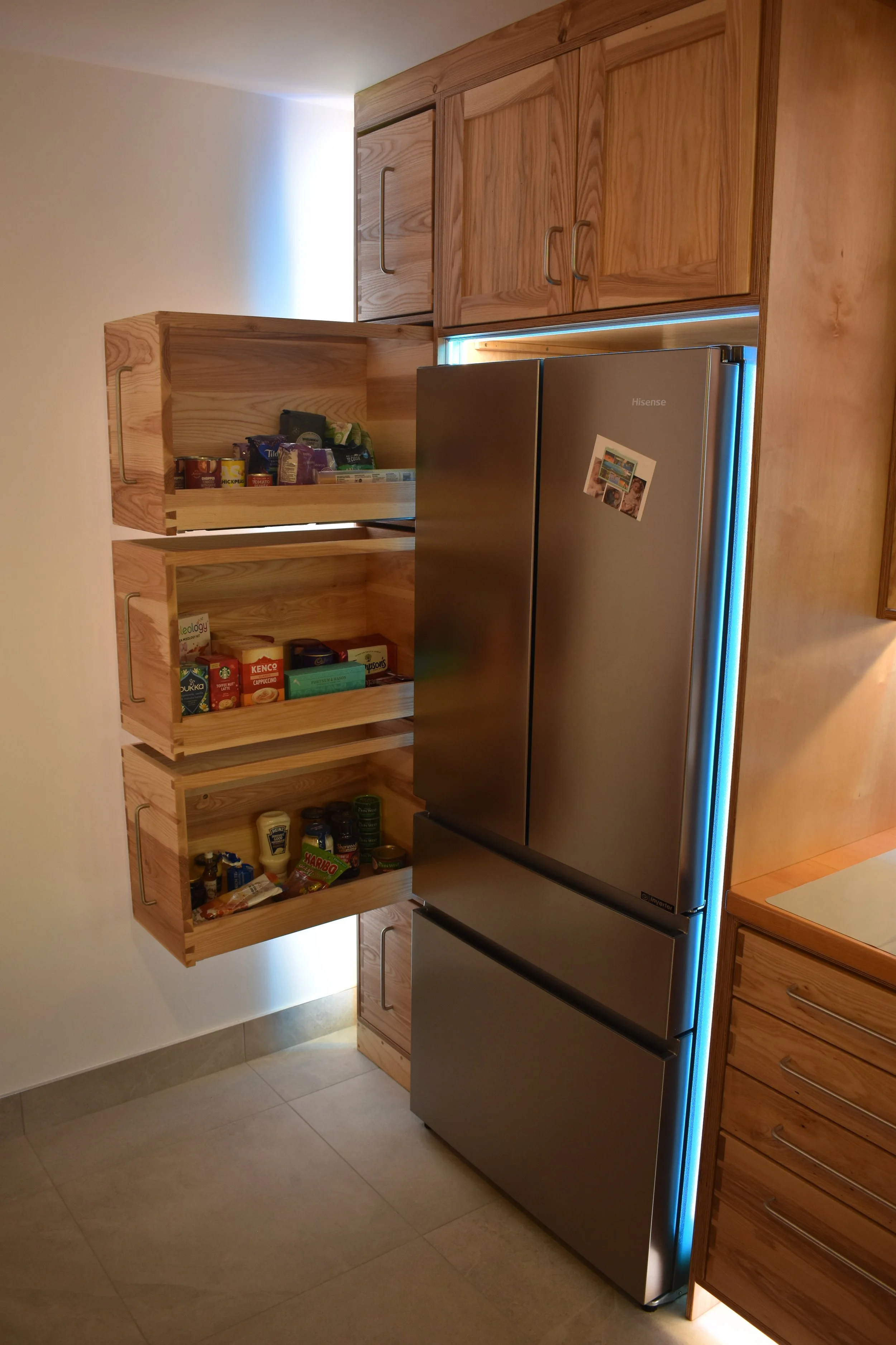
Here can be seen the fridge nook and larder cabinet alongside the lower level cabinetry for the main cookspace, including the first tambour of the project.
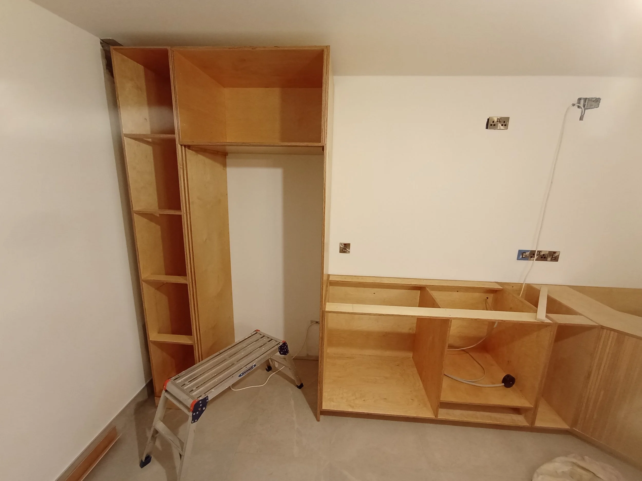
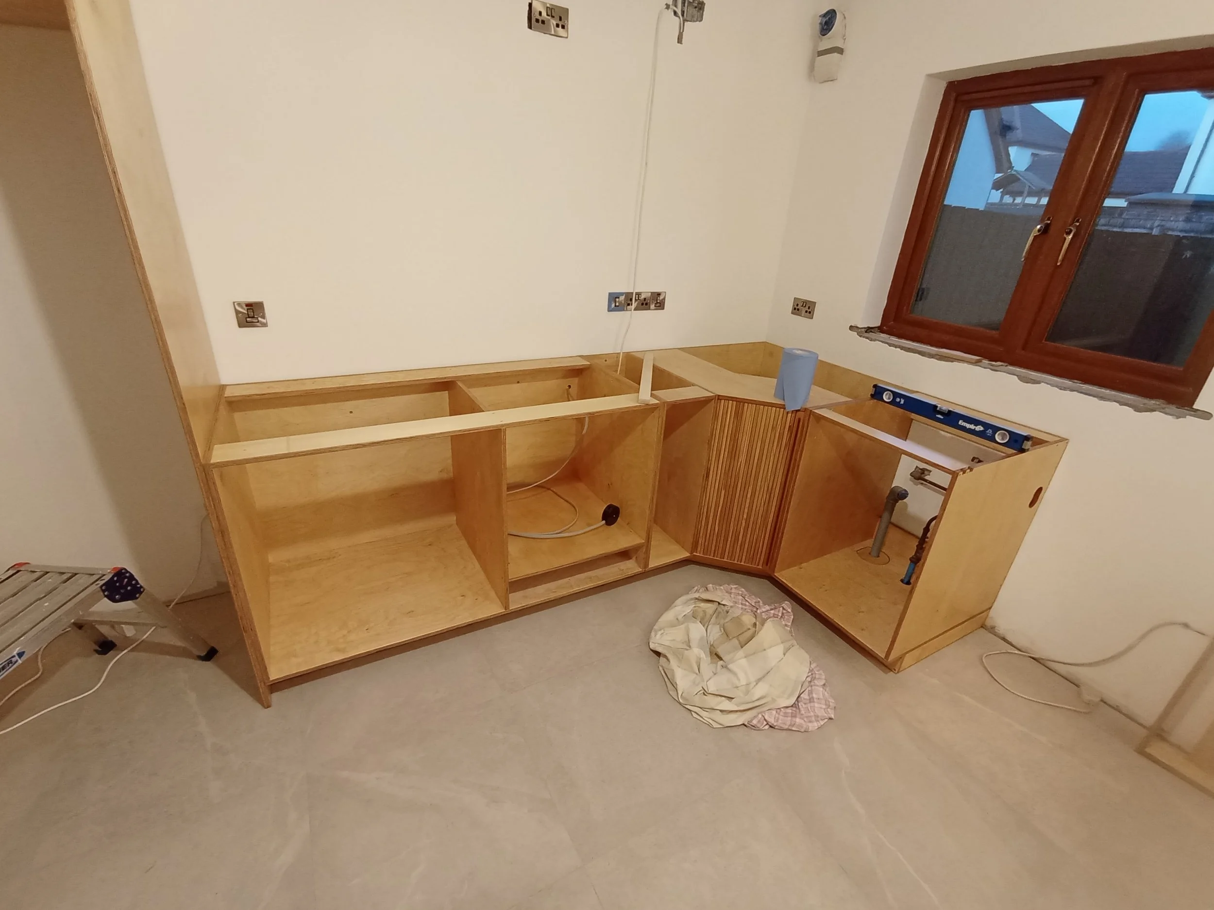
While it may look like significant progress it is good to appreciate that there is still a long way to go as the finer details such as drawers, doors lighting and facings are still to be fitted. These parts of the kitchen which follow the main cabinet bodies can take more finesse, and therefore more time to complete which is why it is so important to have a temporary kitchenette if possible.
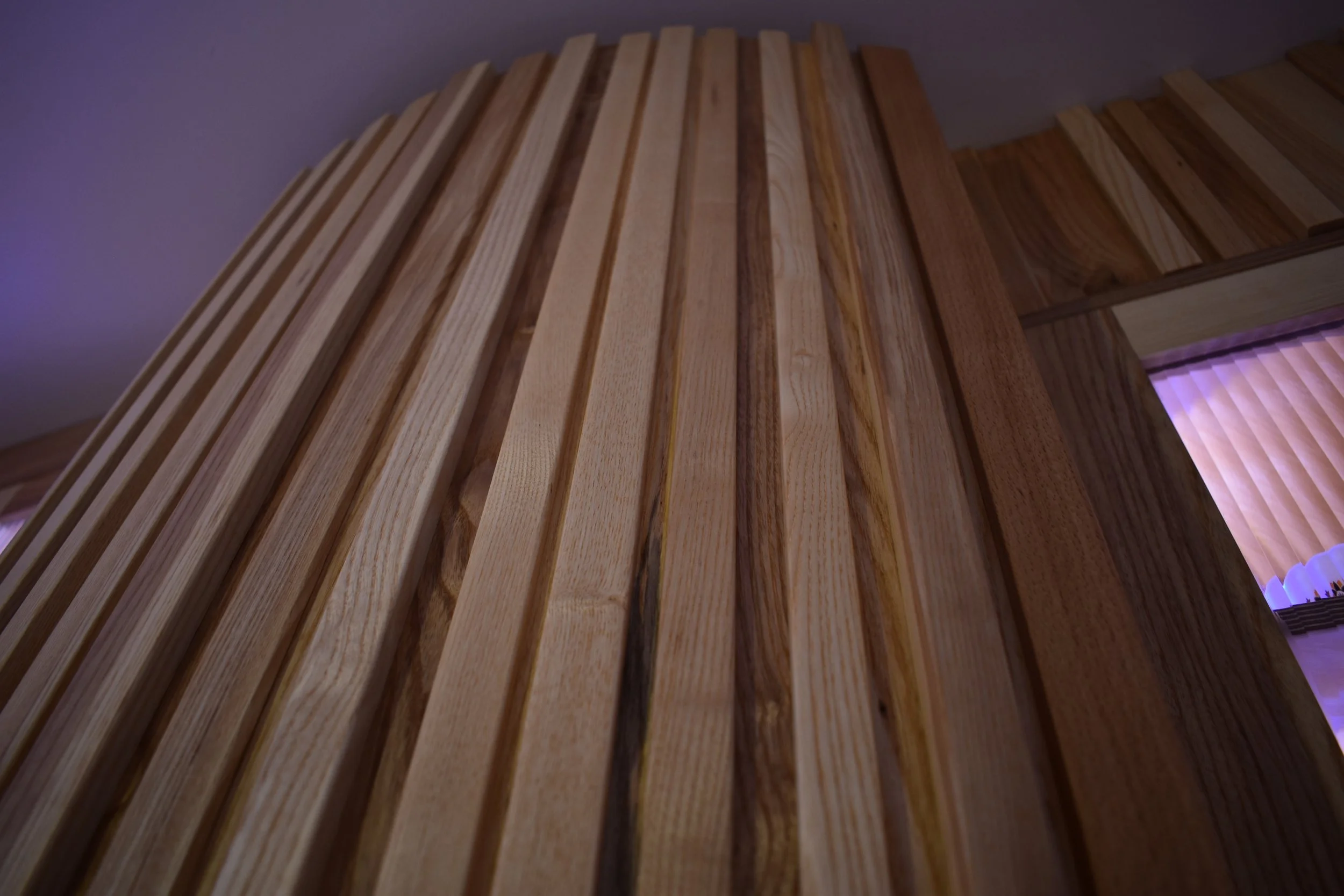
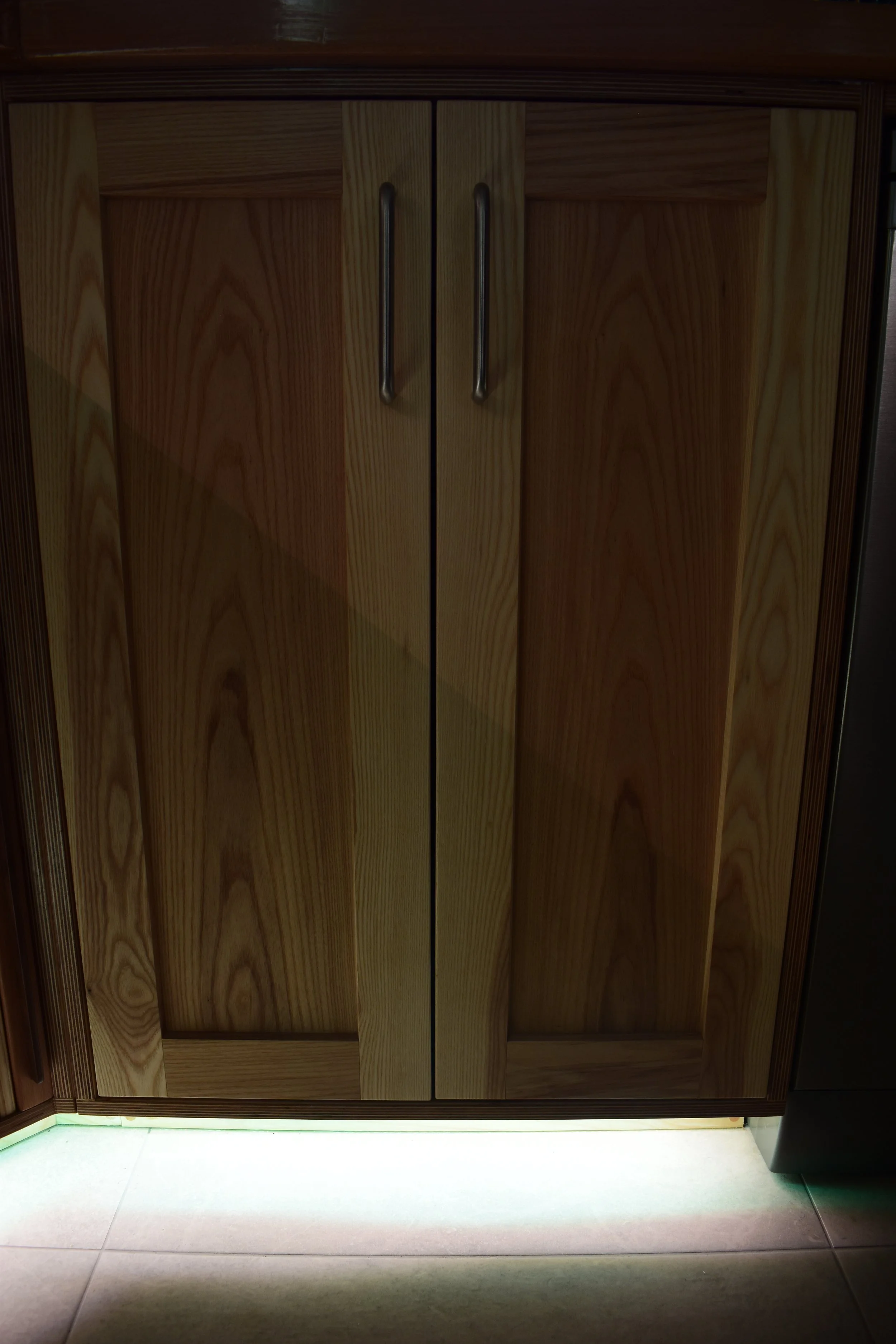
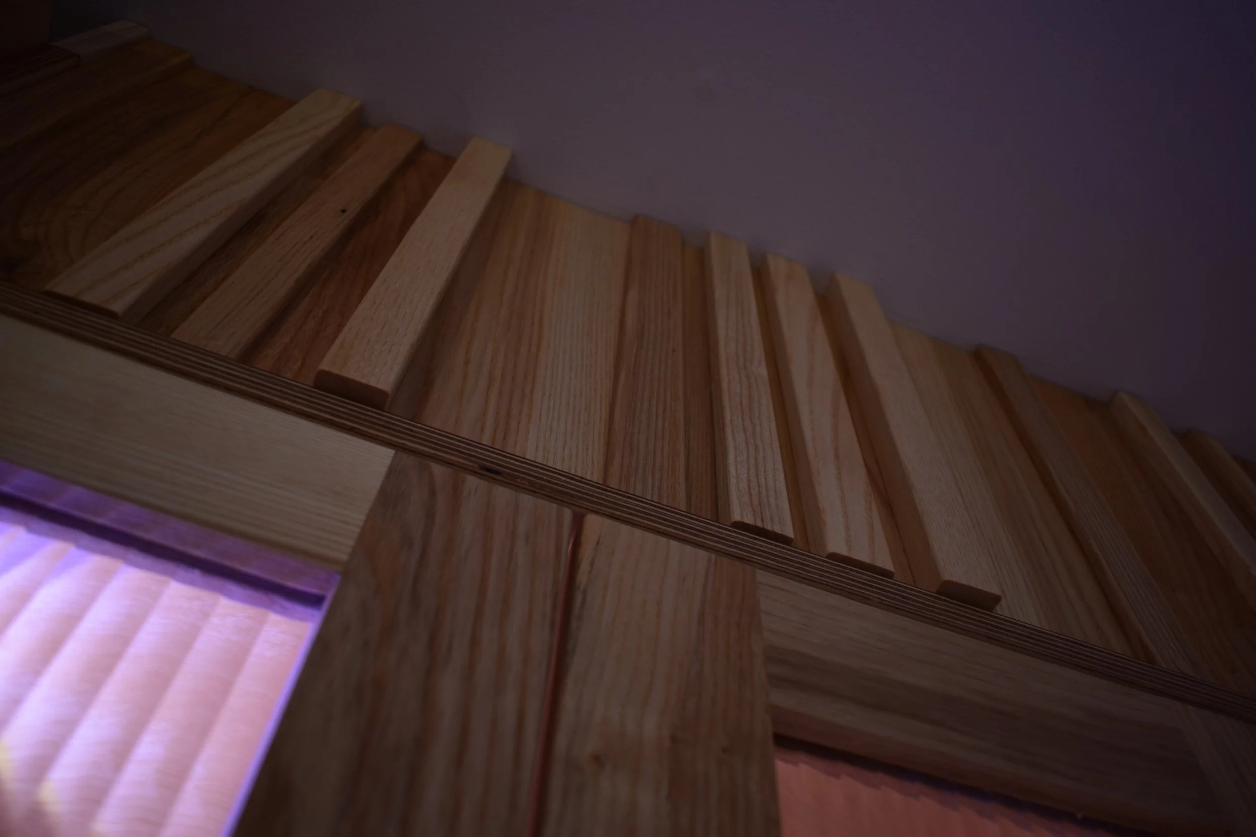
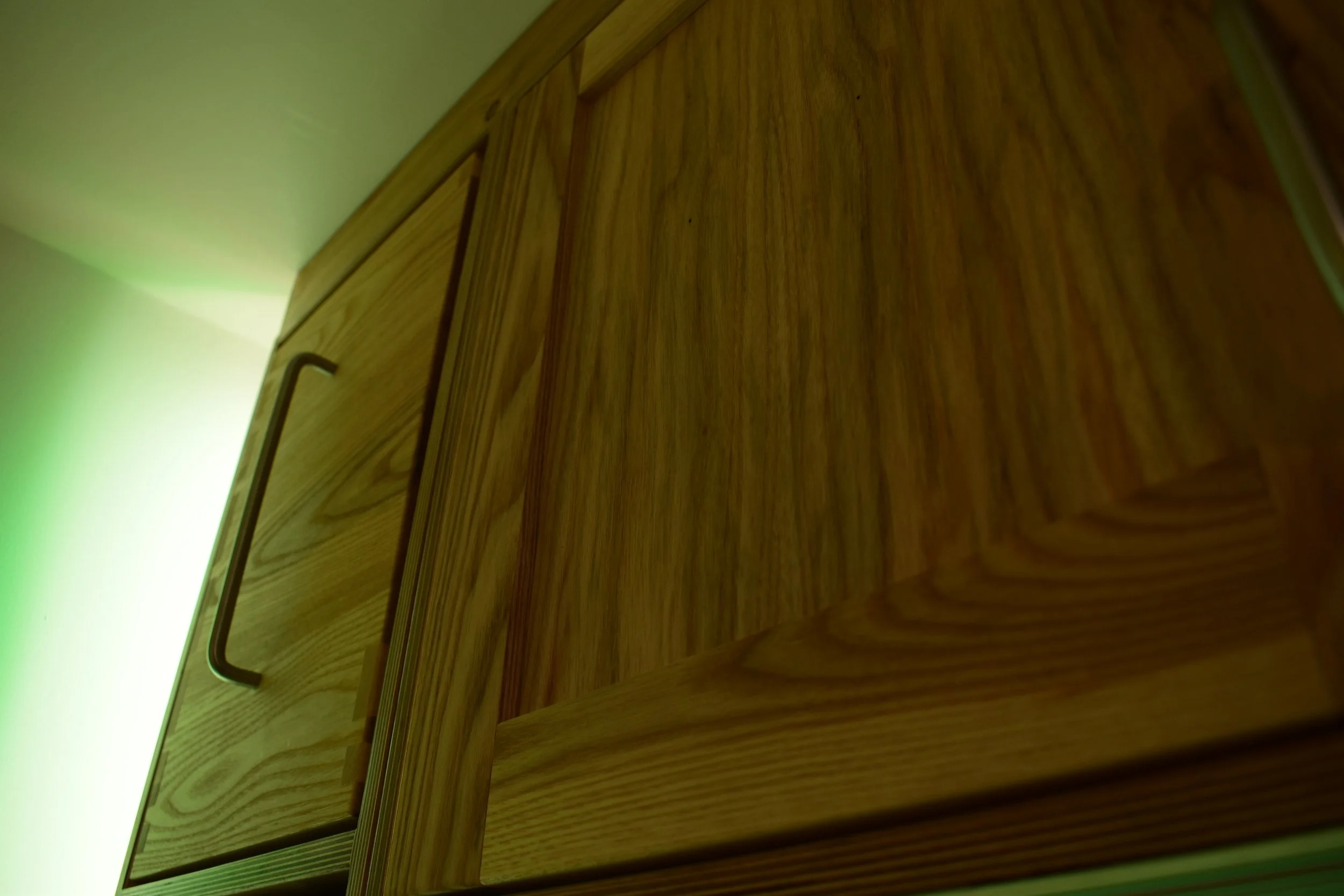
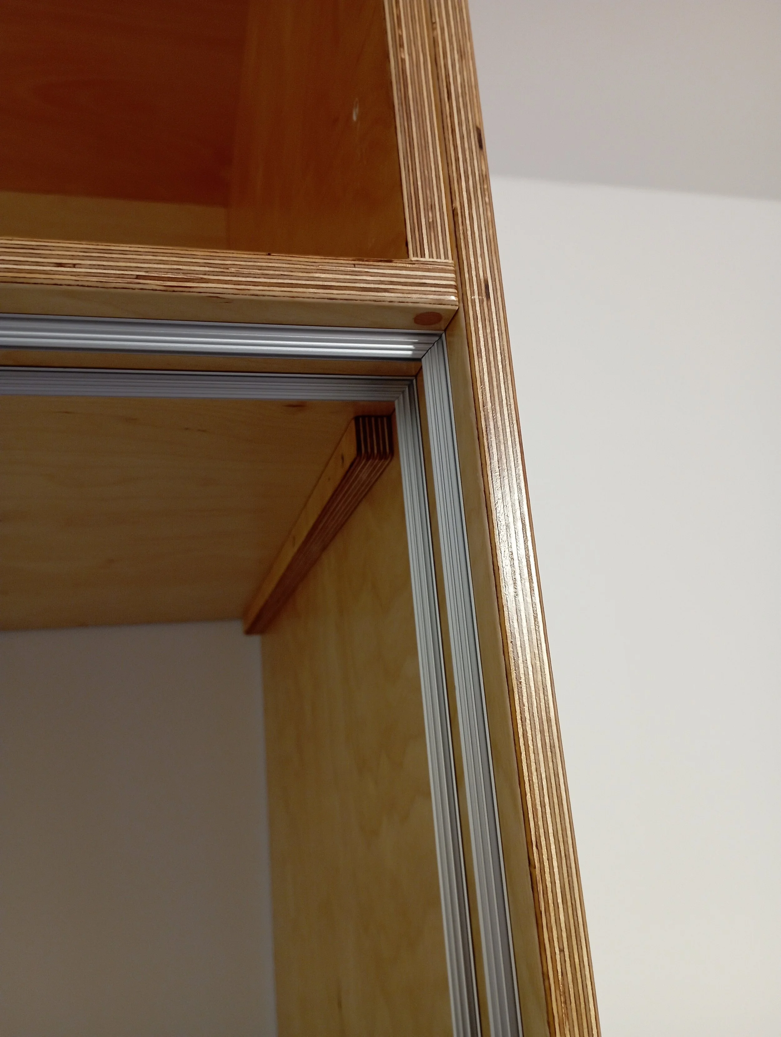
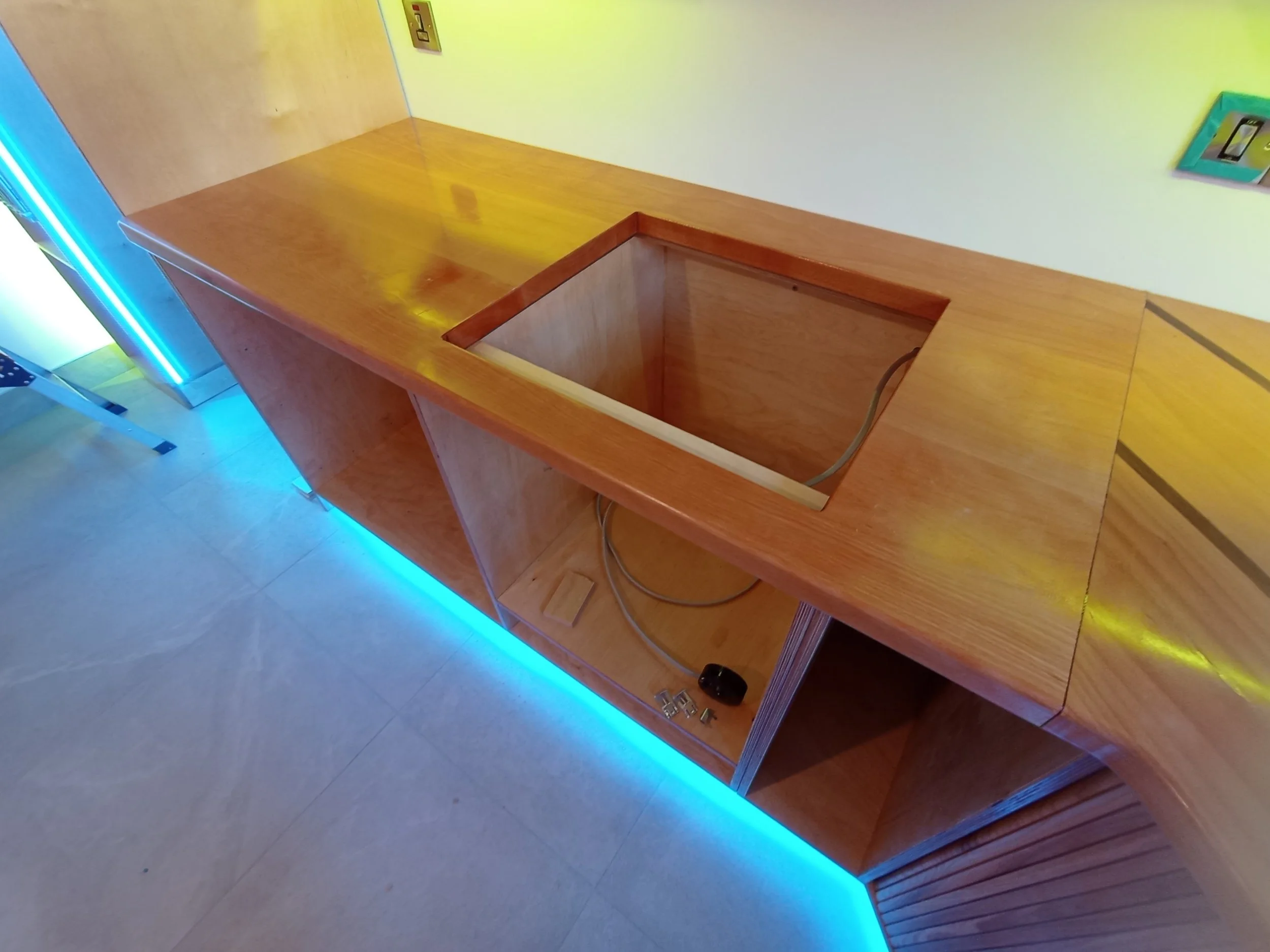
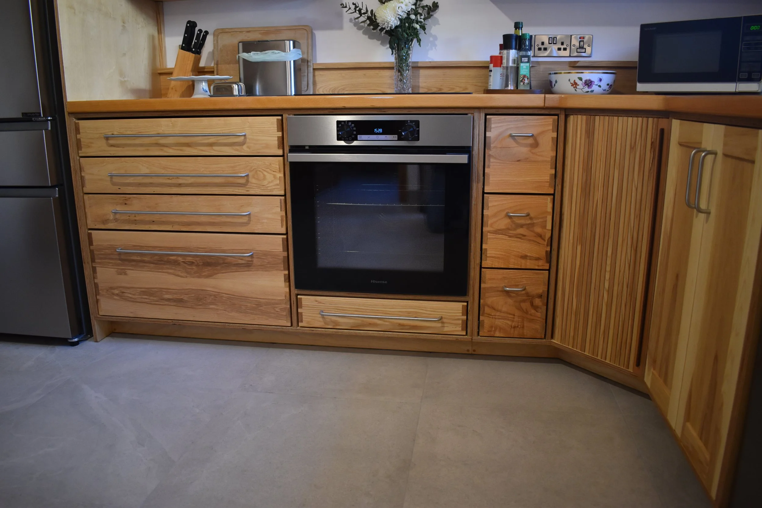
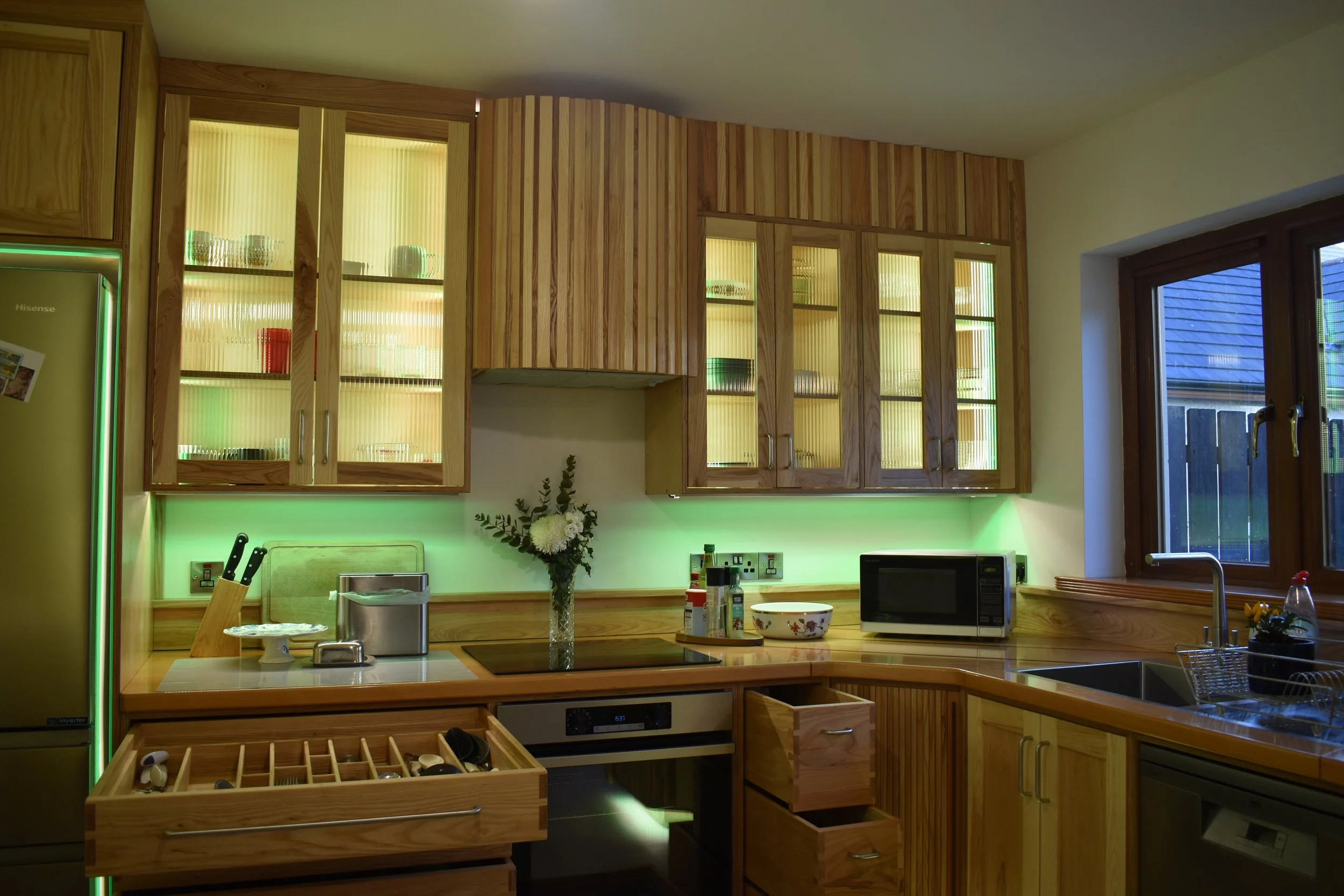
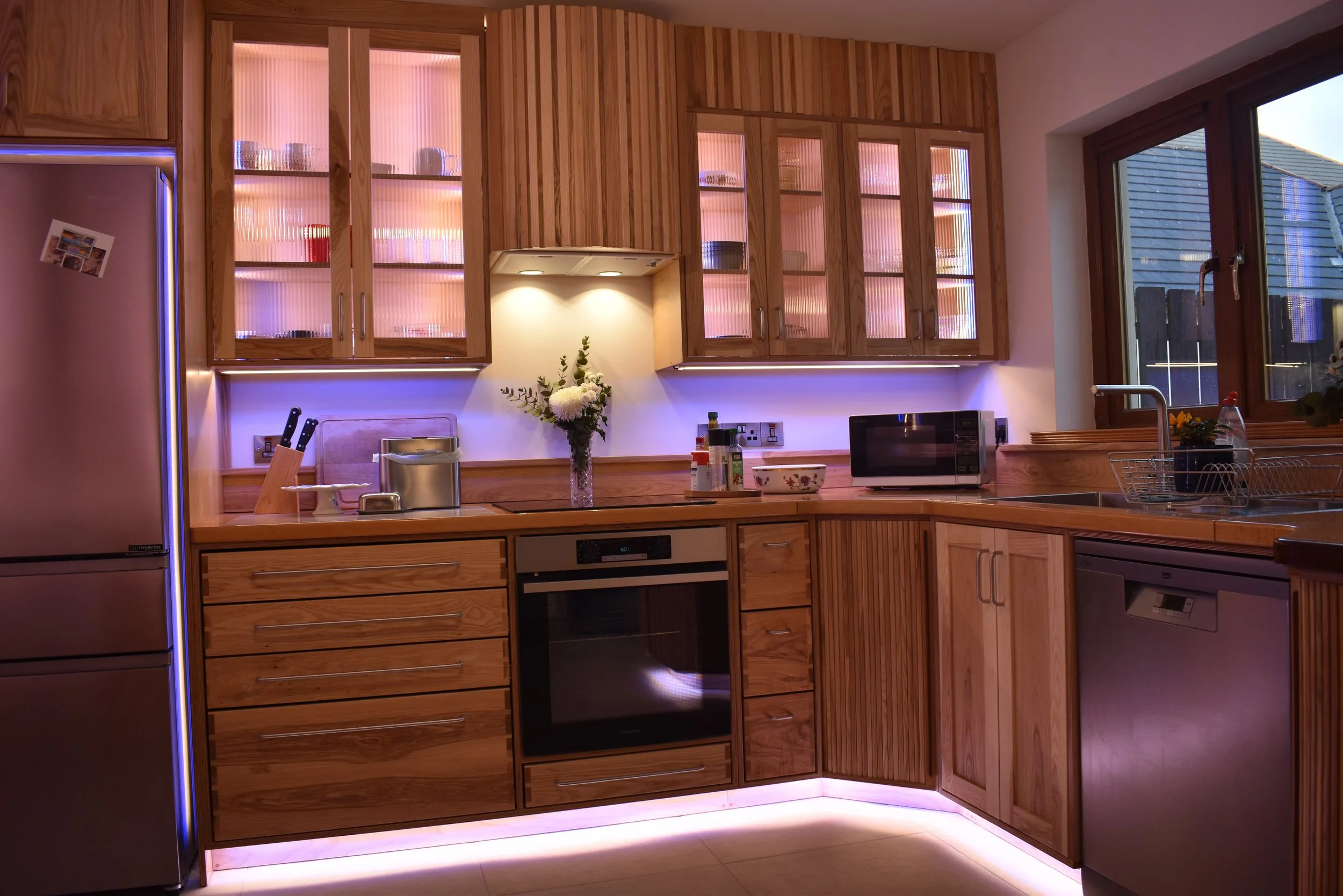
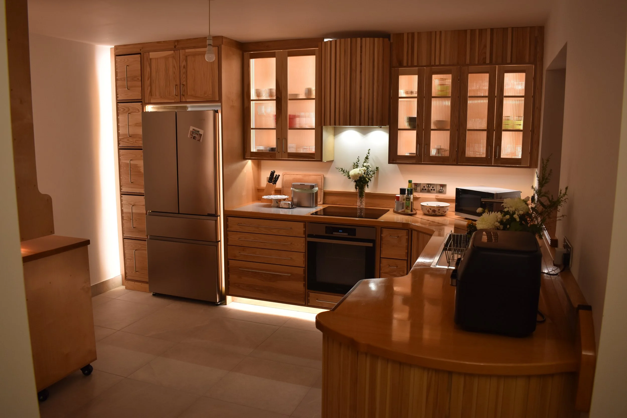
With the installation of the first cabinet carcasses it becomes possible to see how the form and feel of the kitchen will be. Birch is the ideal choice of plywood for the cabinet bodies, it is incredibly water resistant, as a hardwood it is a very durable material and with it’s complementary lighter colour and minimal grain pattern it can be incorporated into almost any design. Because it is so well made the plywood has no voids and the edges can be put on display which is what we have done here - we will be using inset doors and drawers here for a neater look and so we can show off the plywood edges.
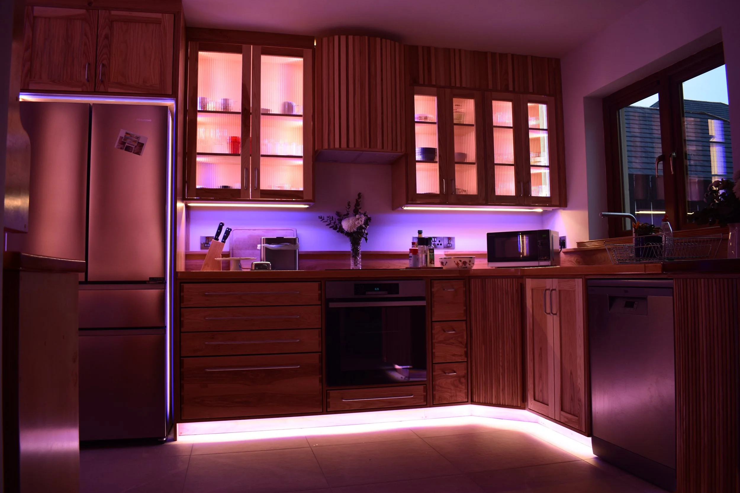
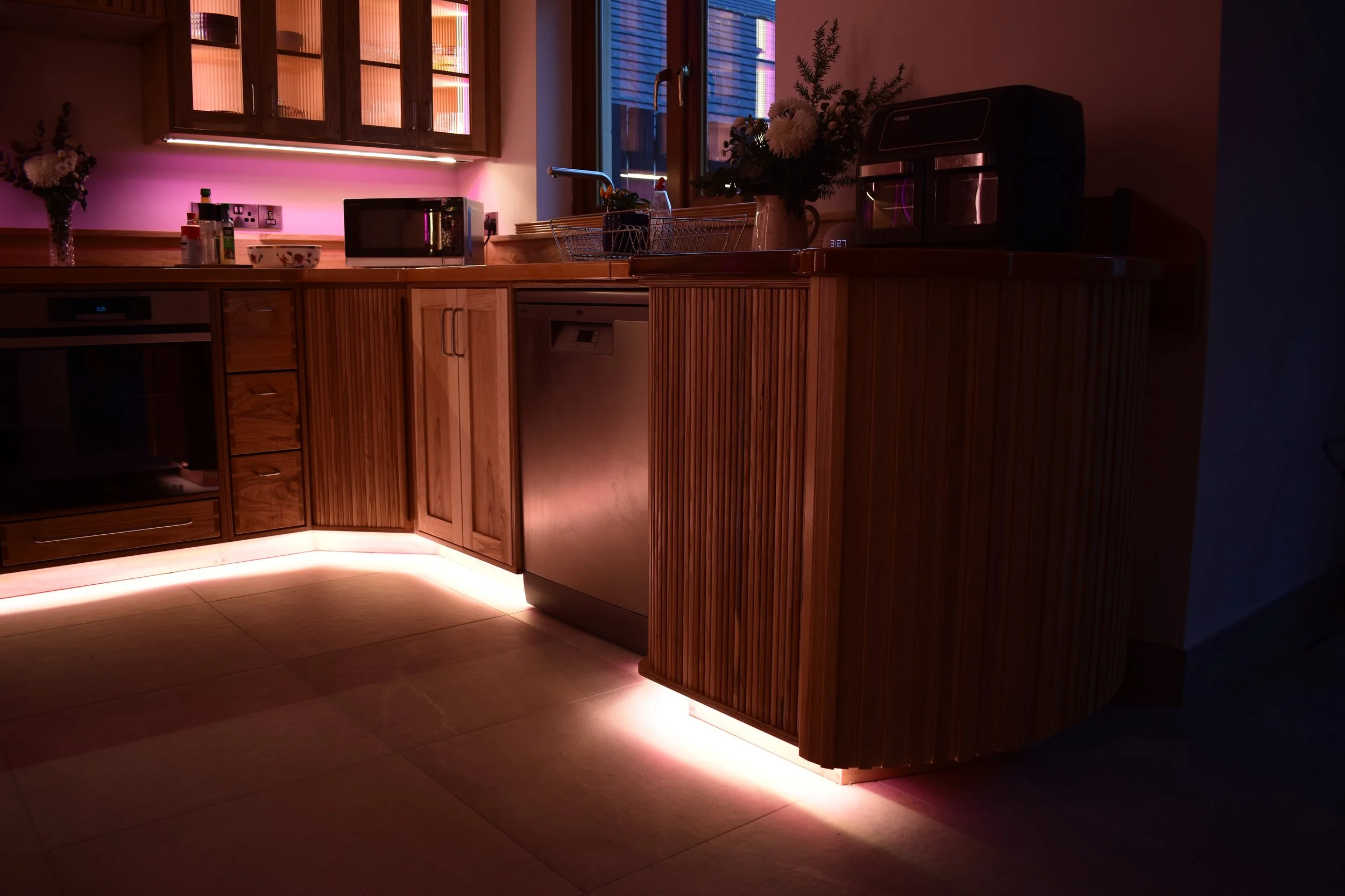
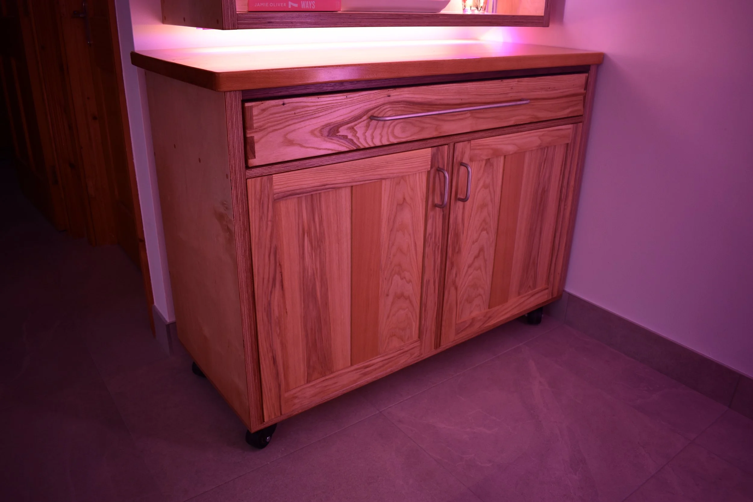
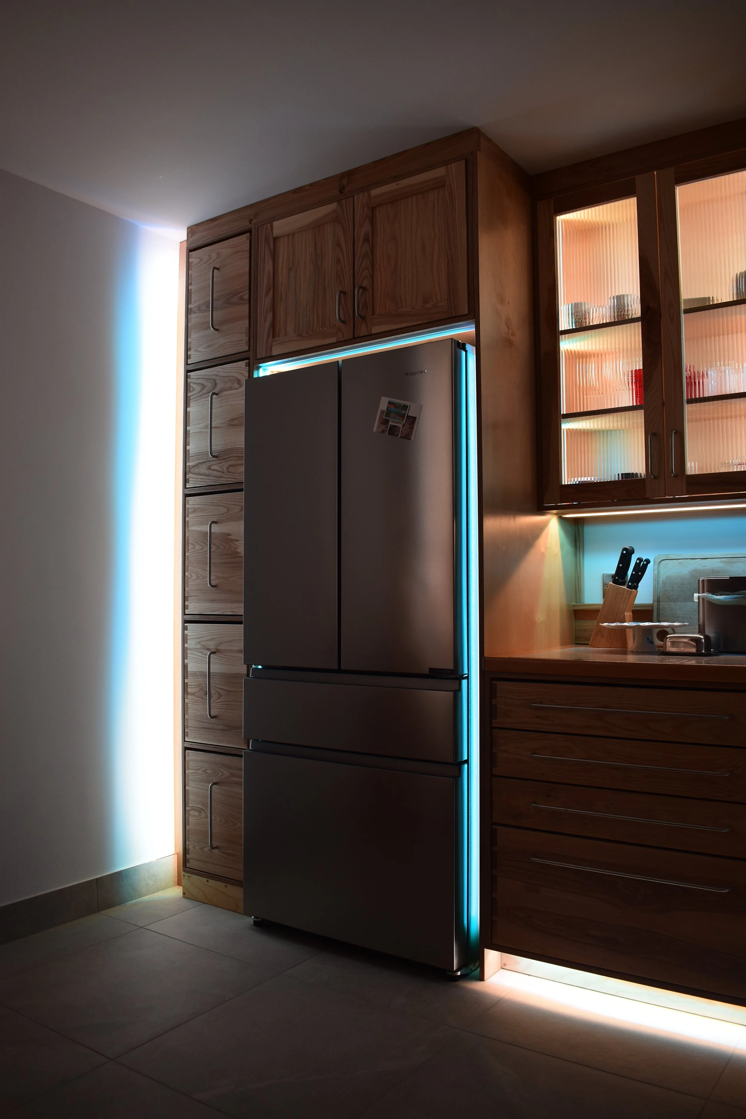
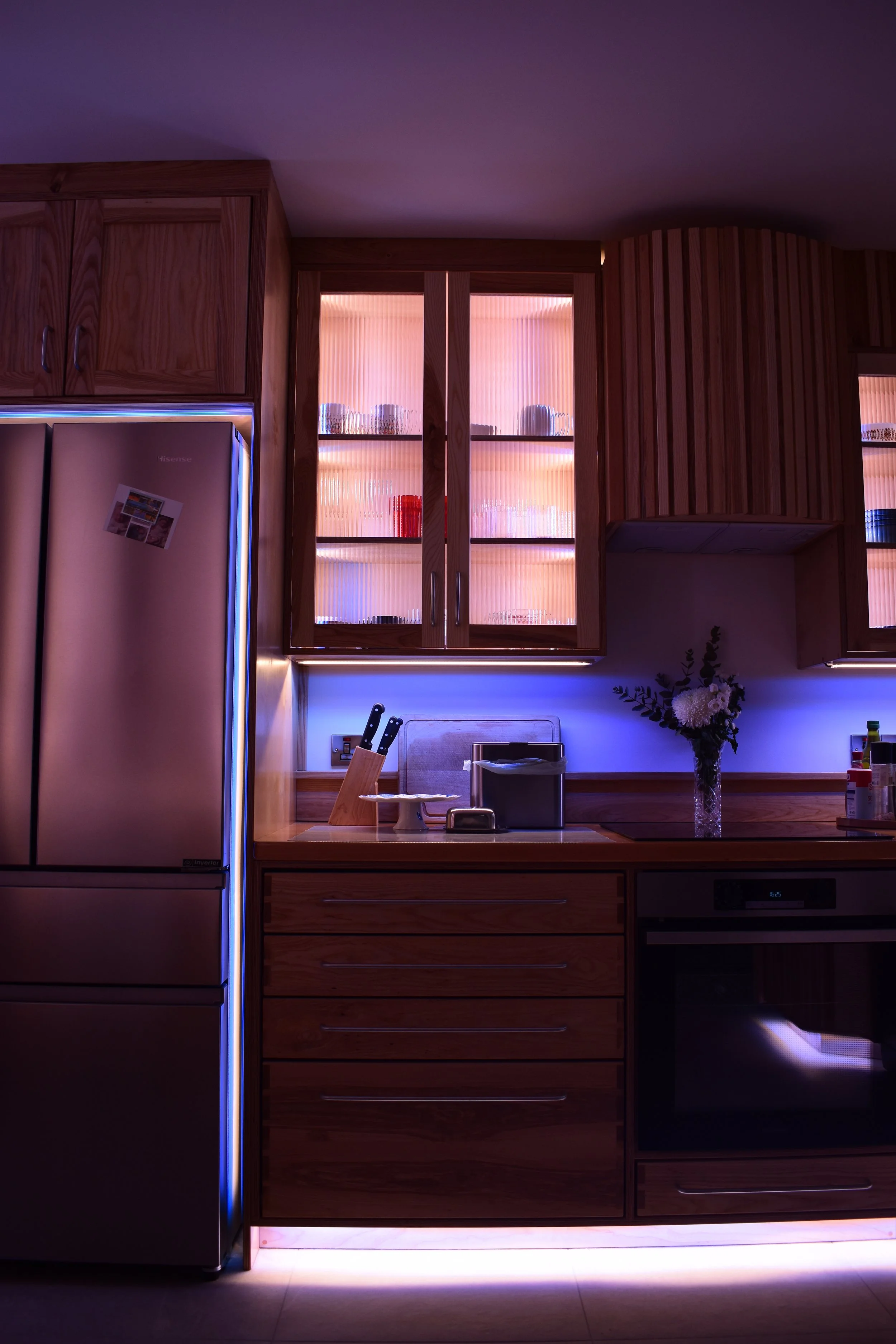
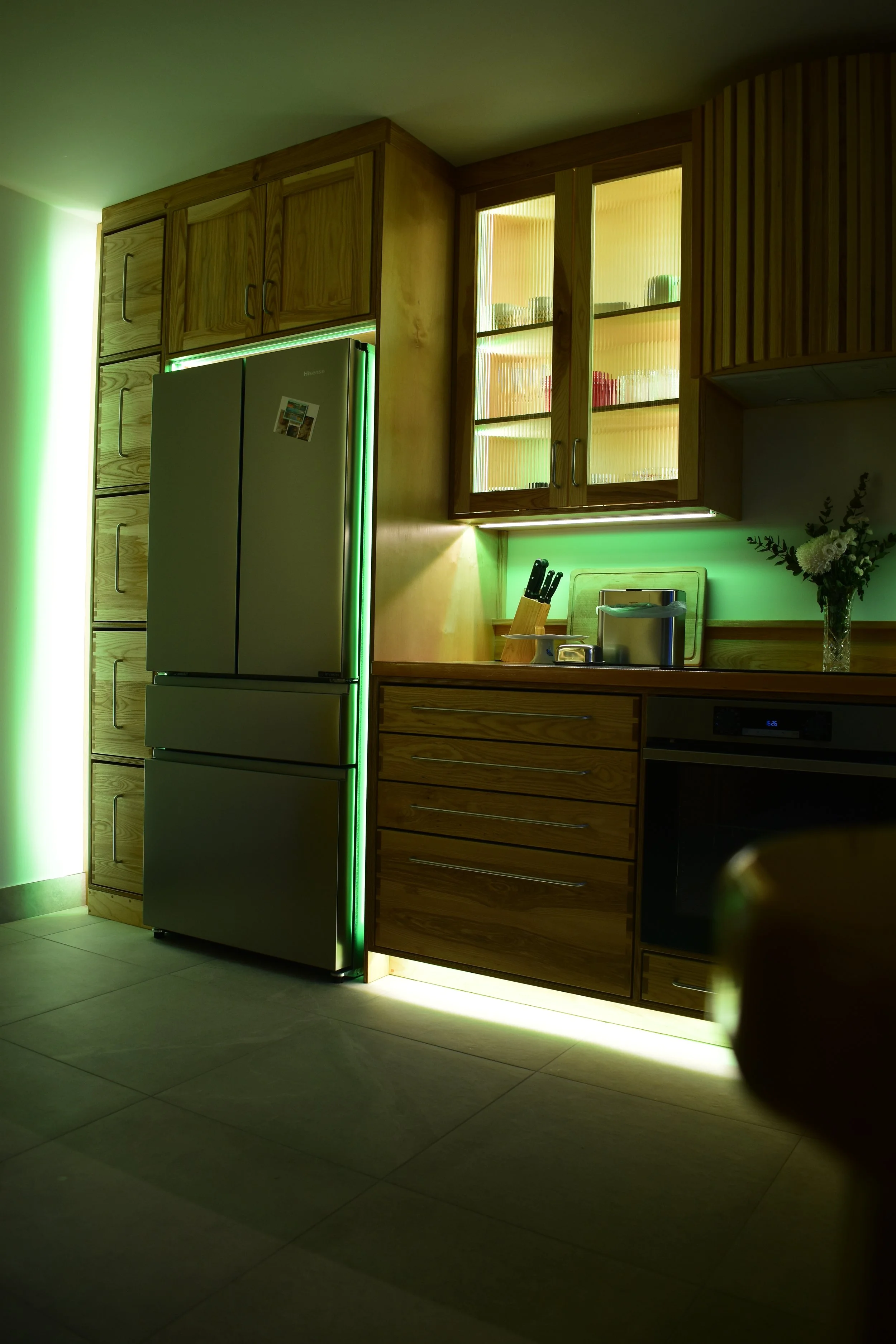
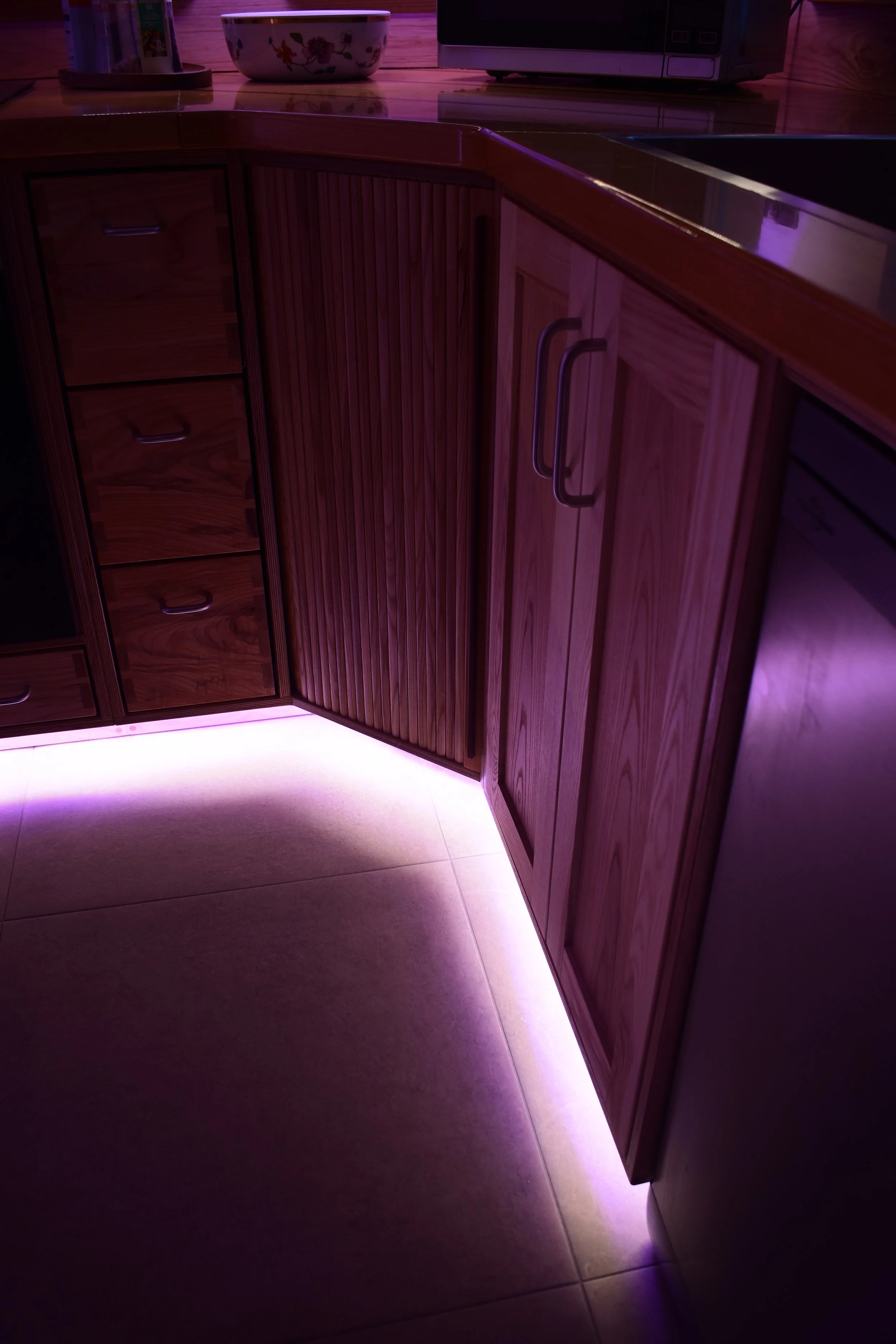
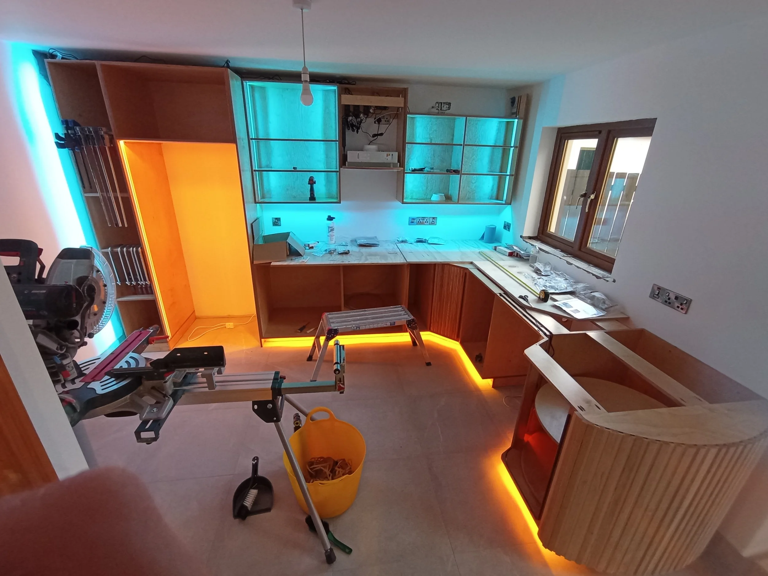
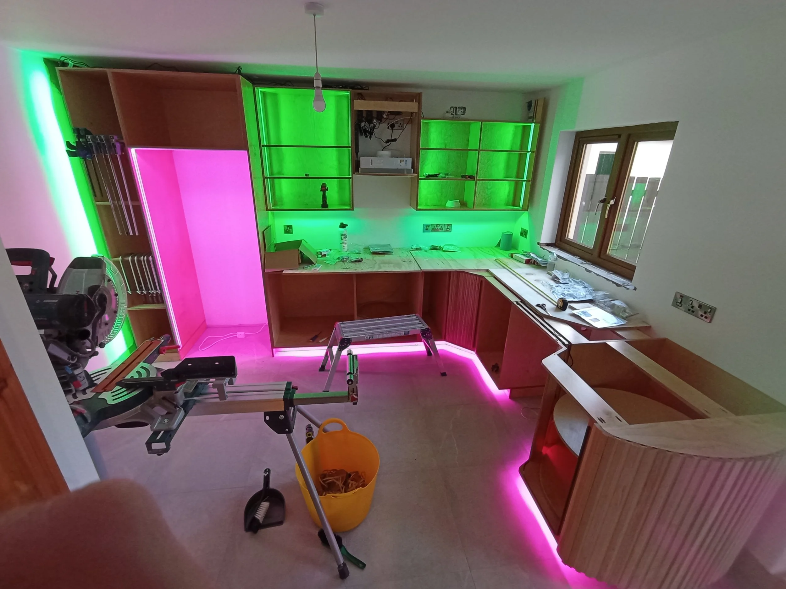
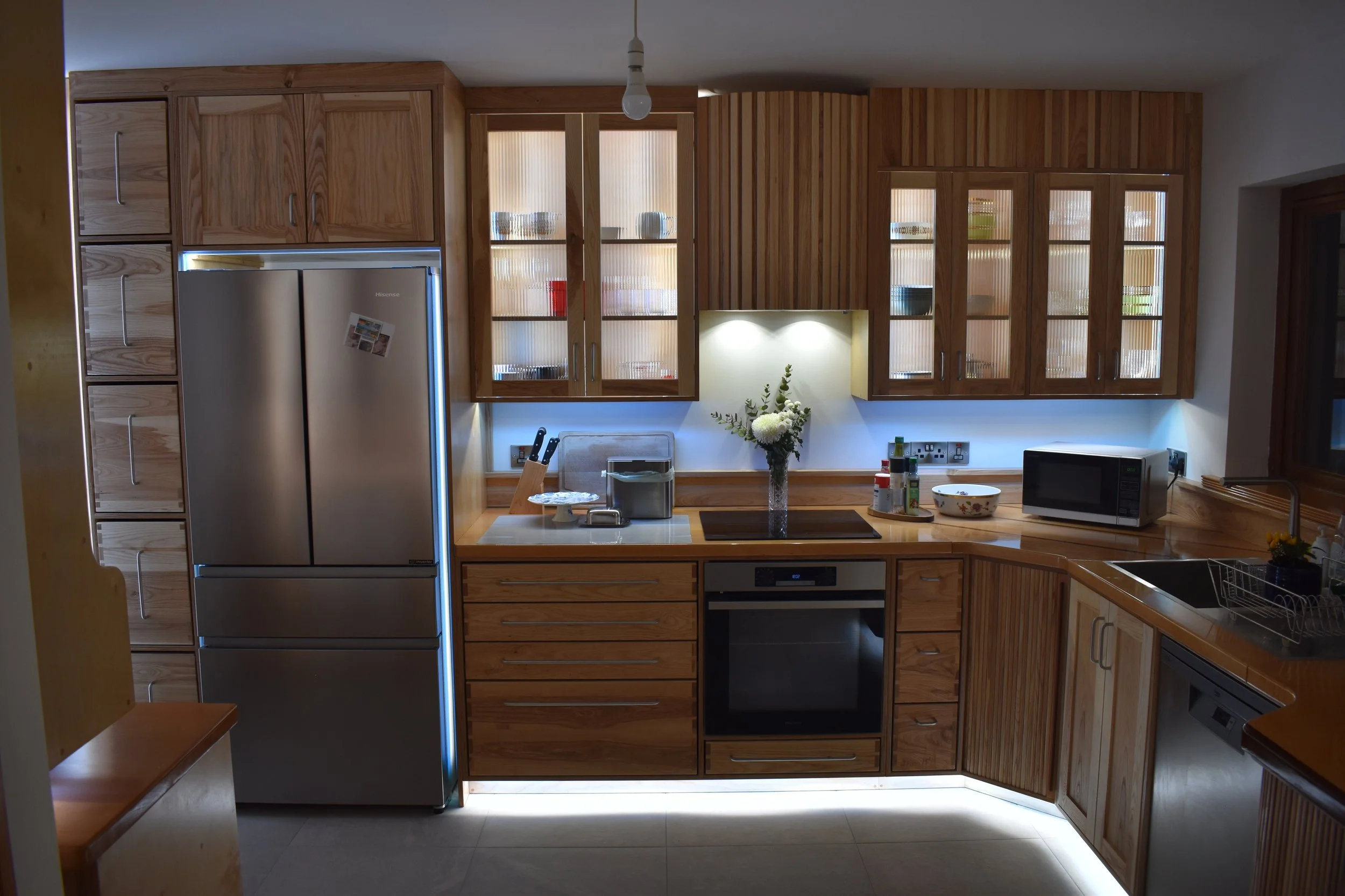
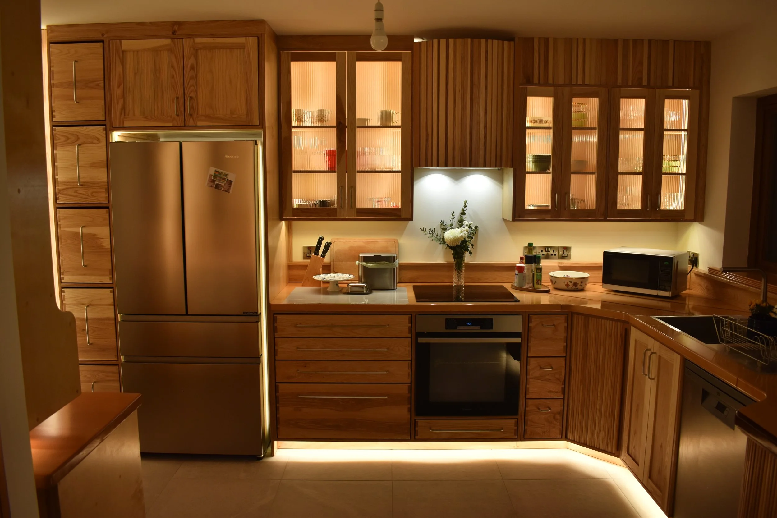
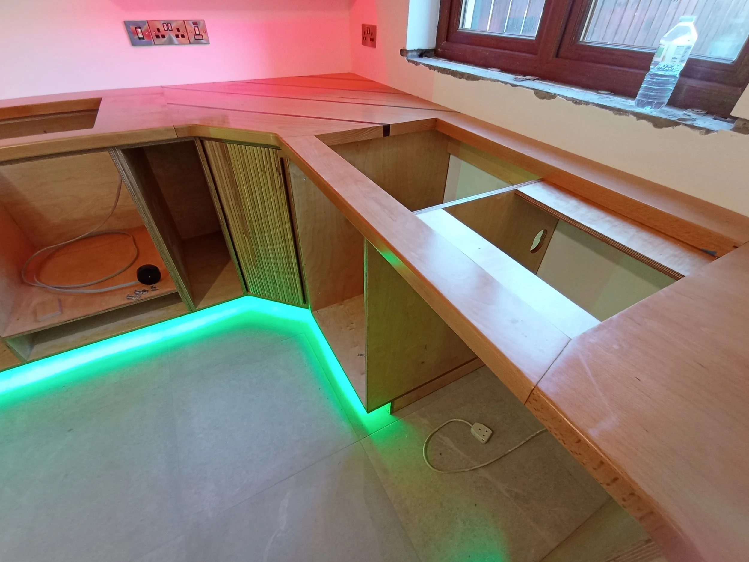
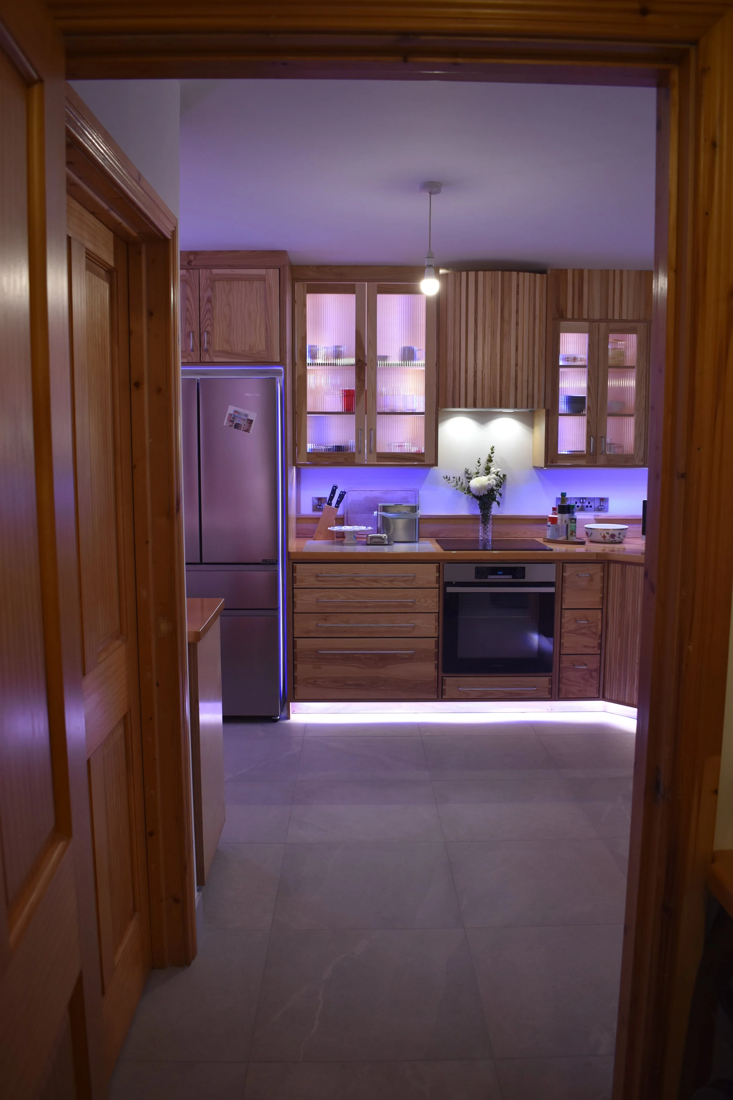
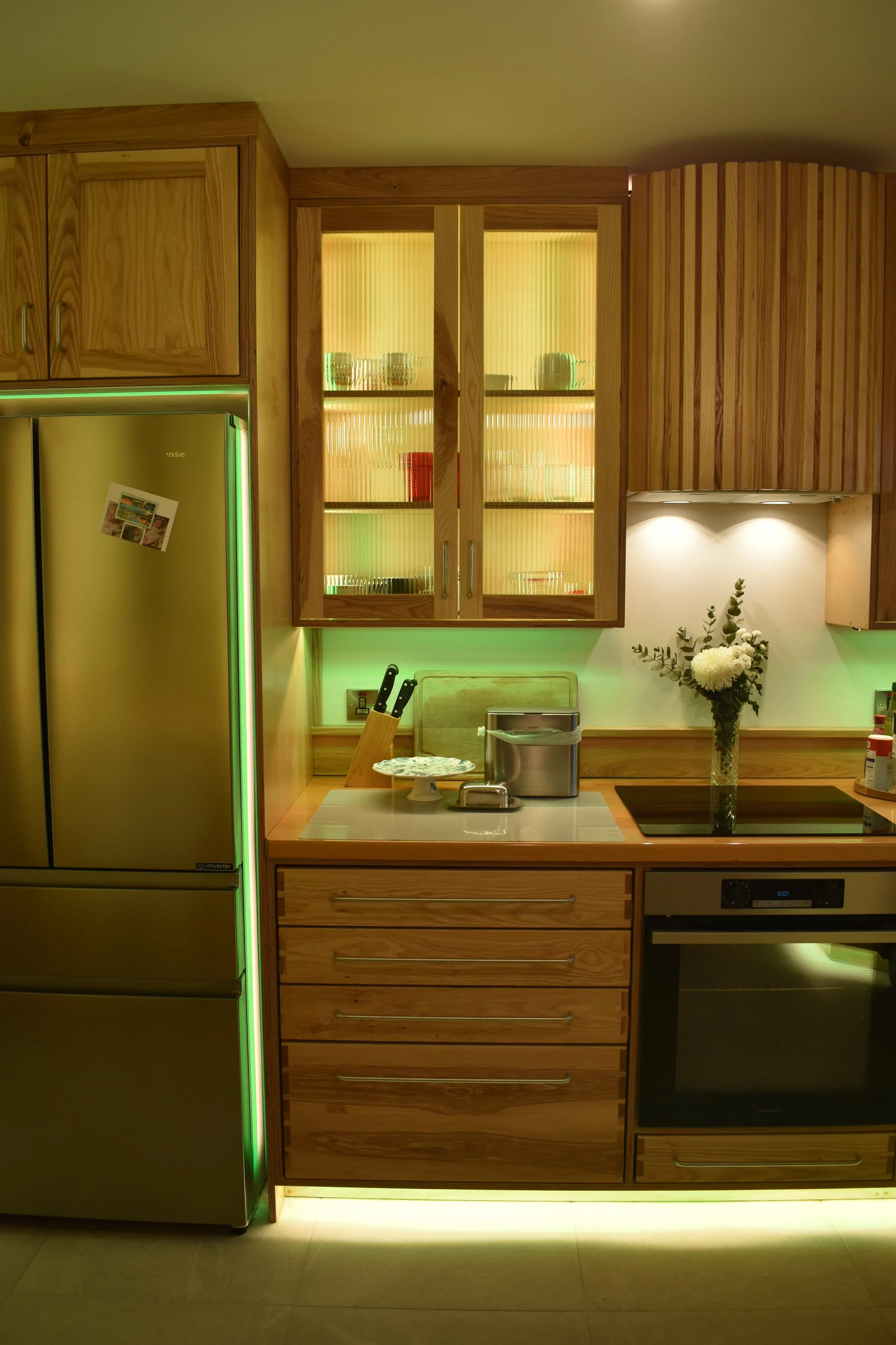
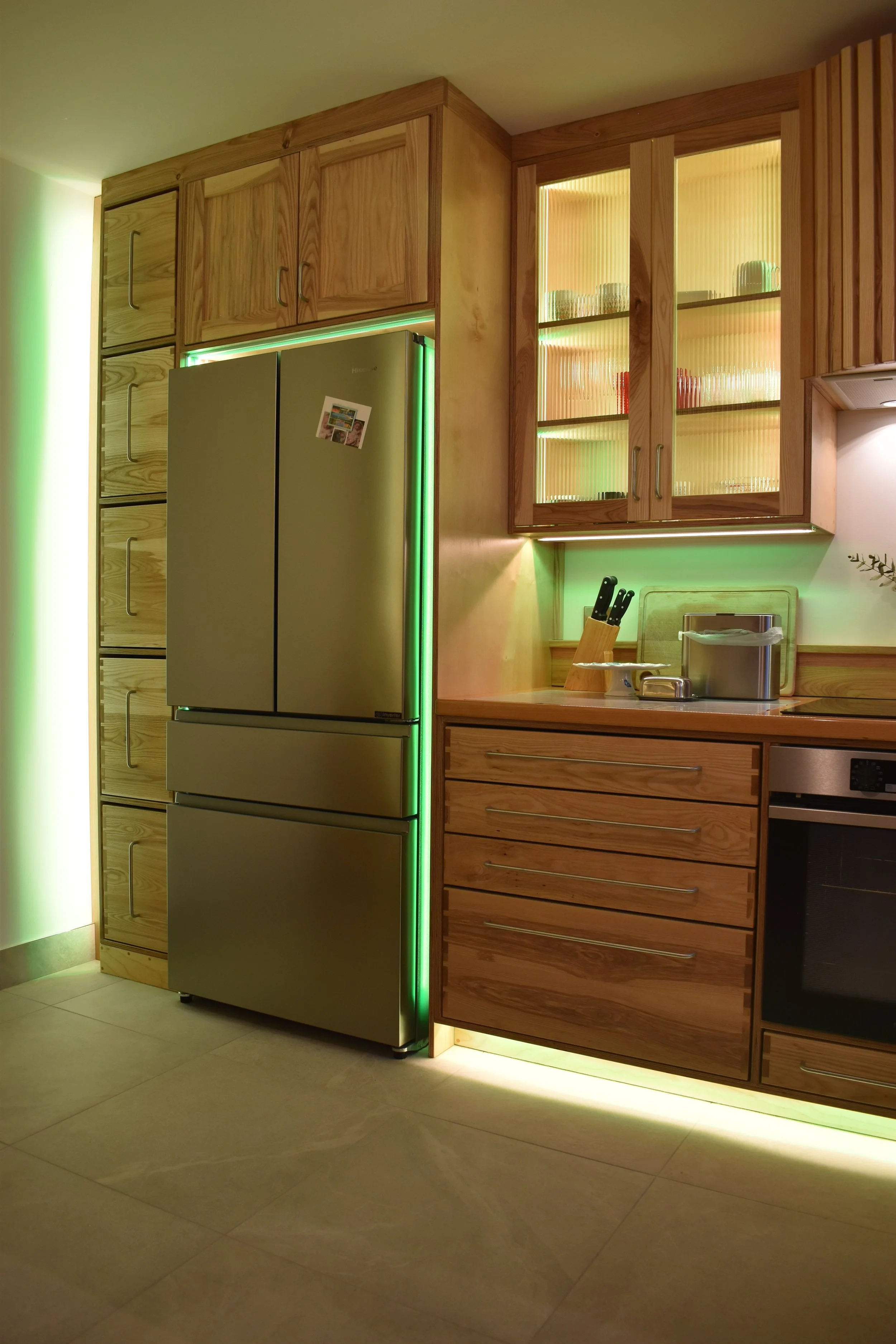
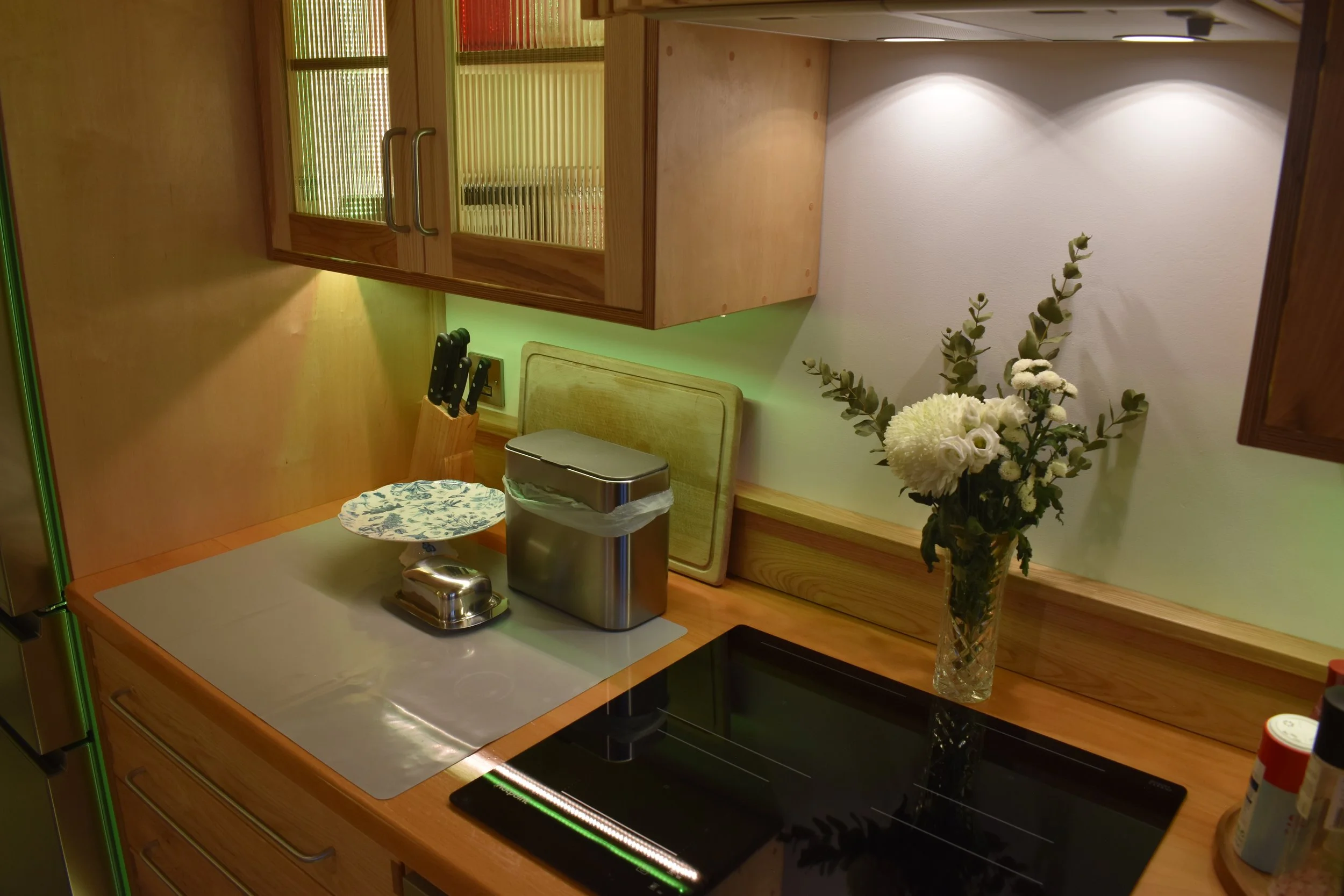
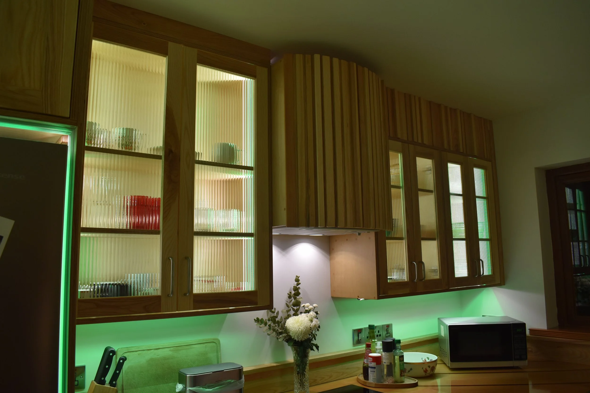
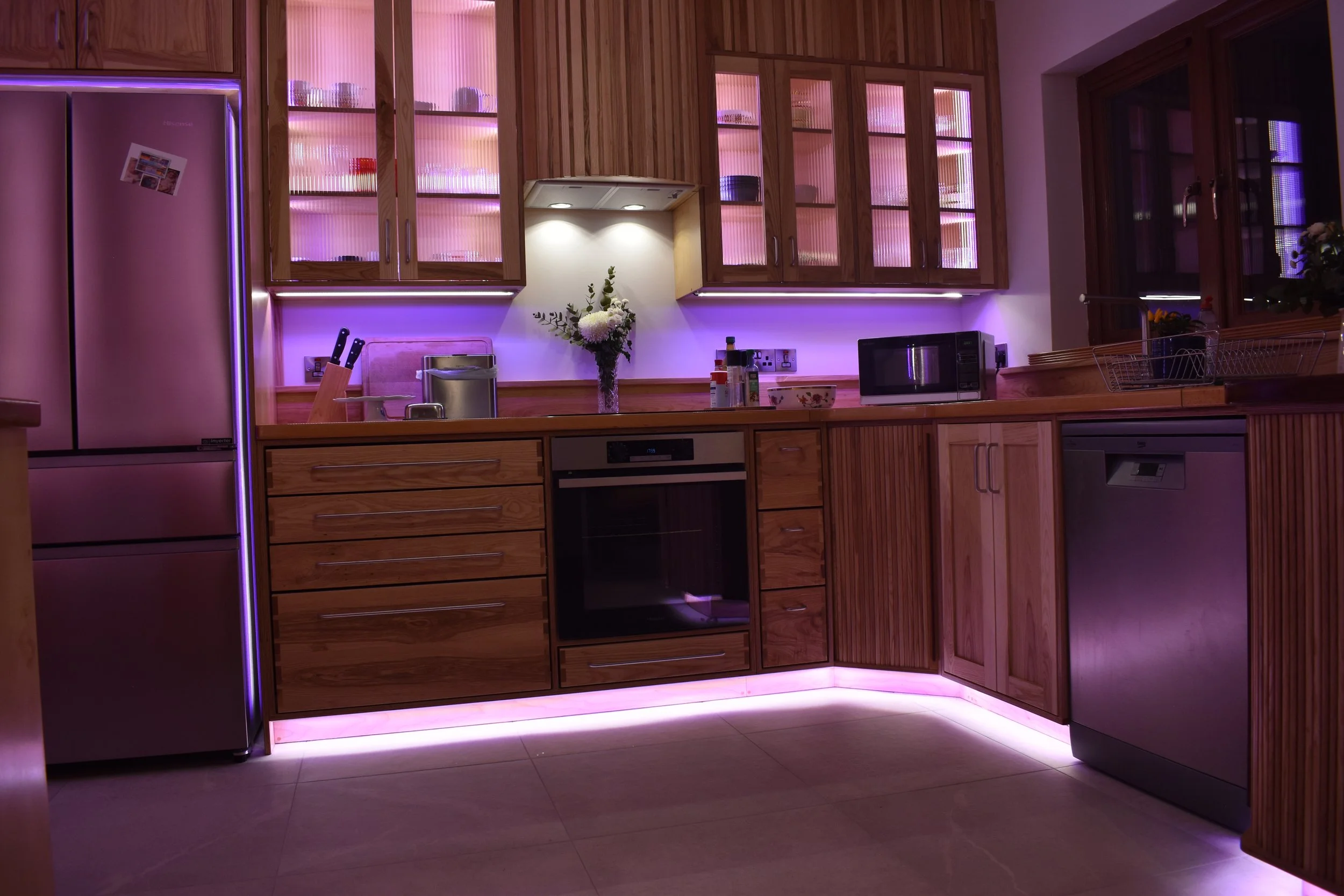
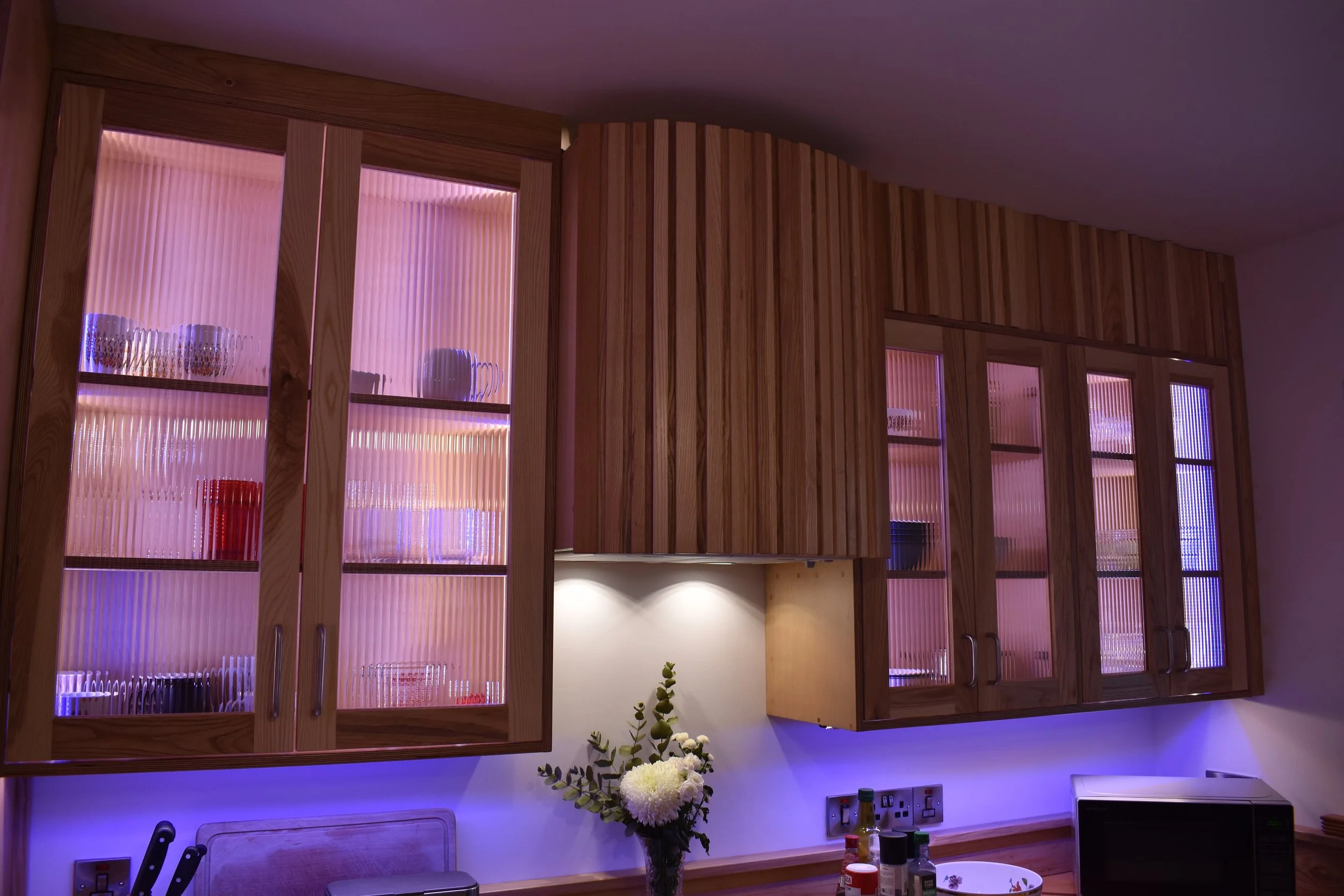
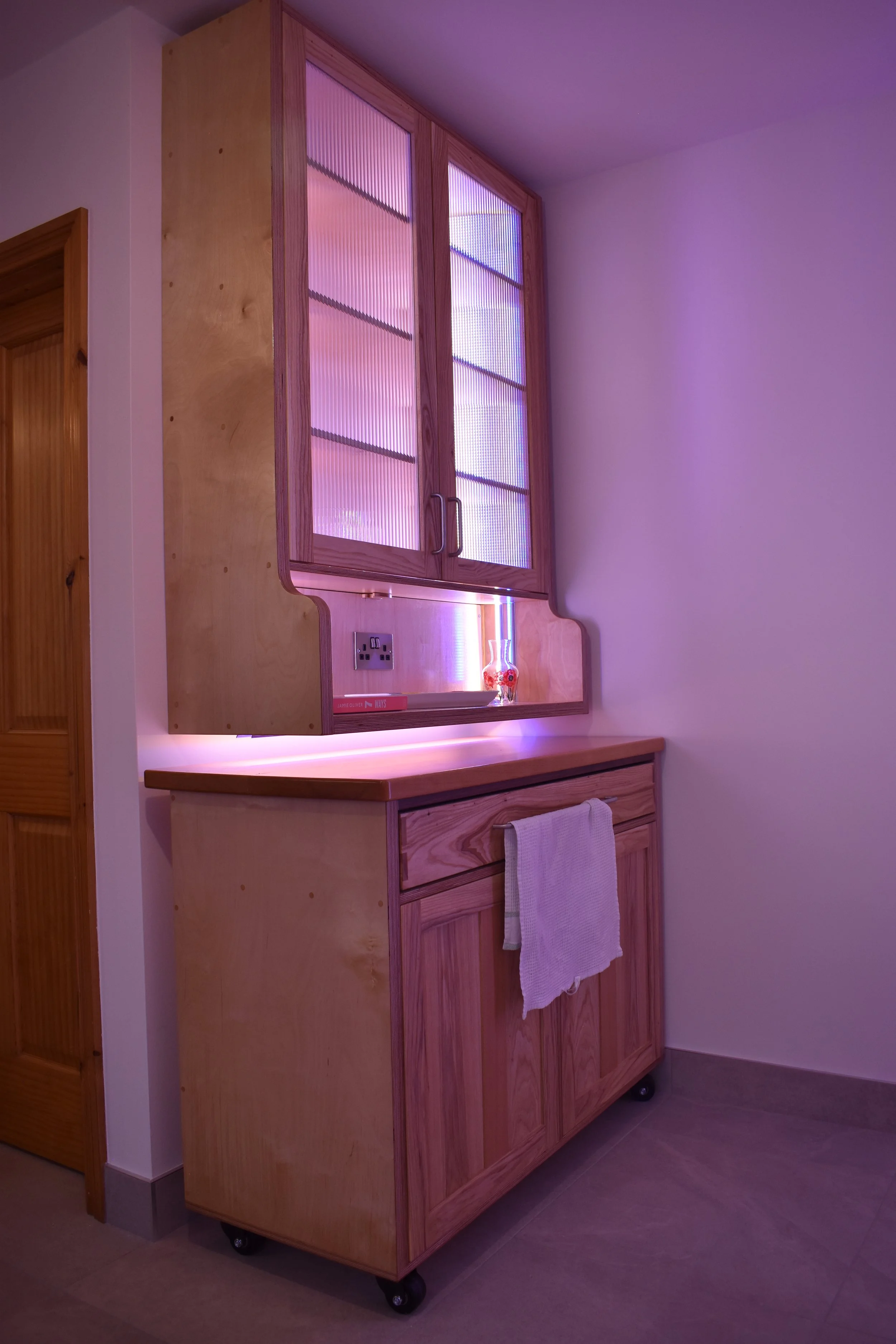
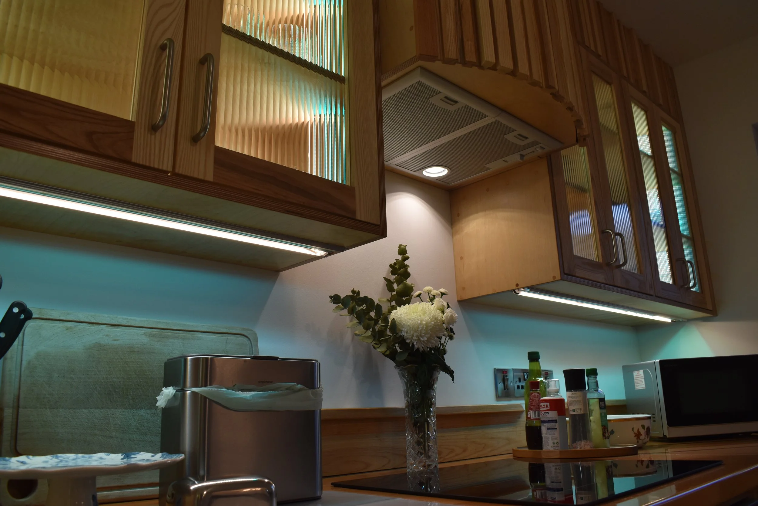
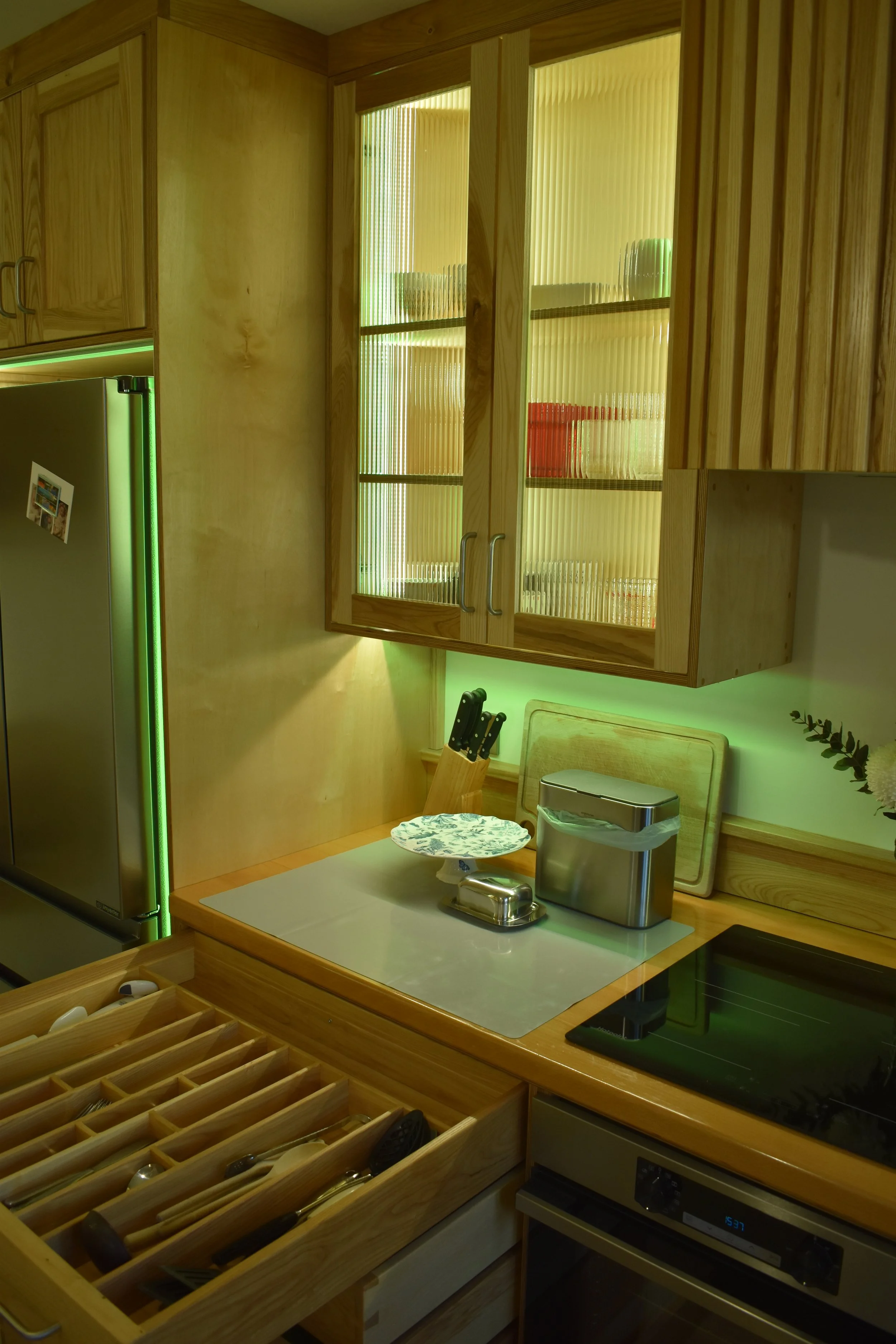
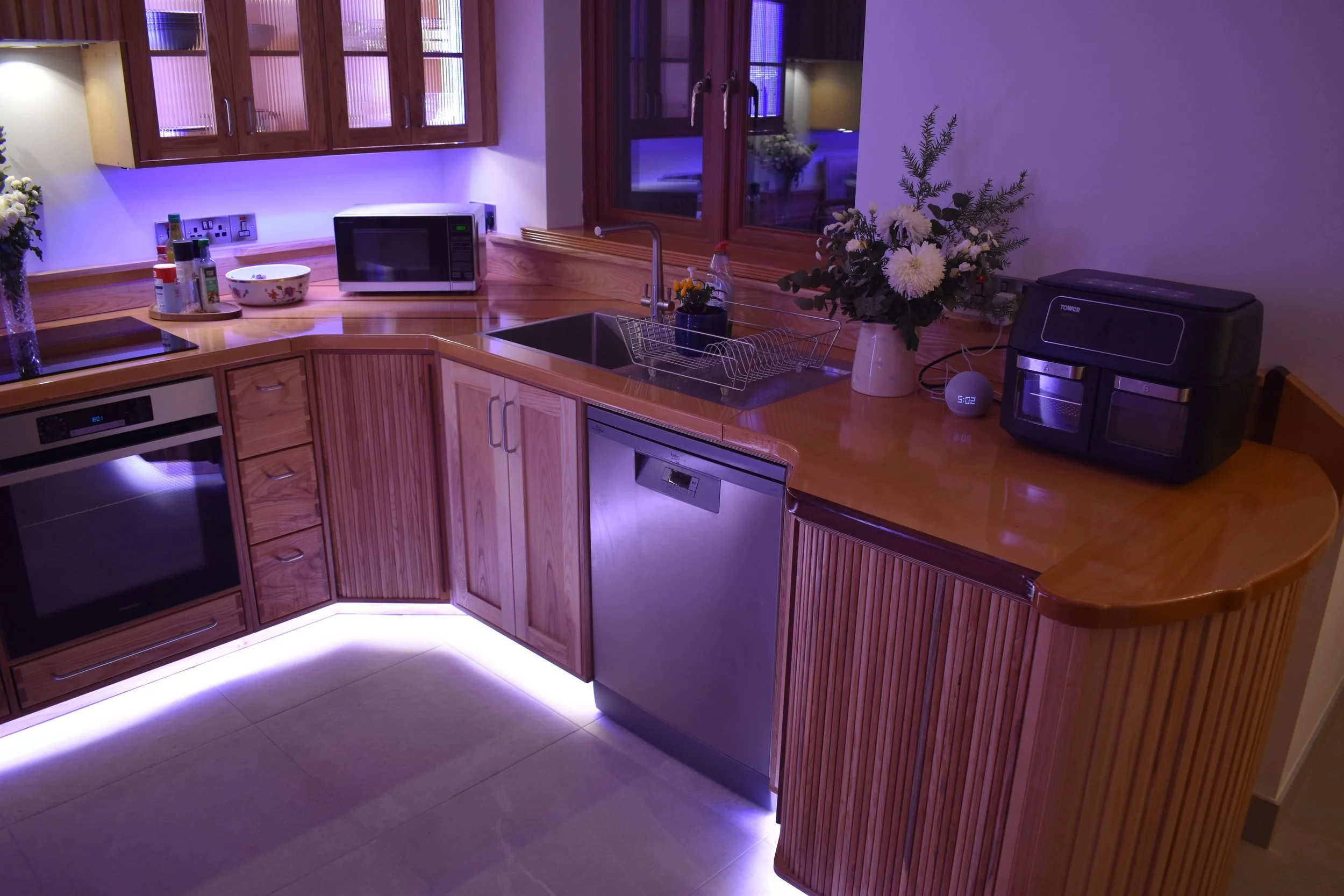
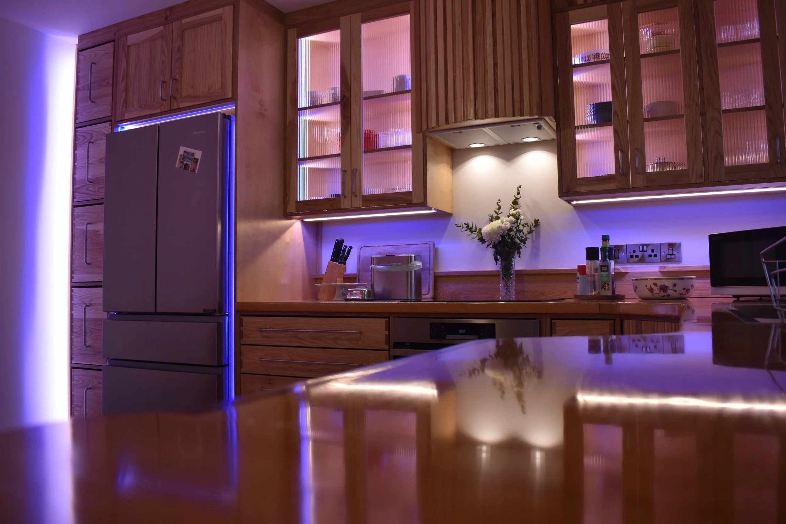
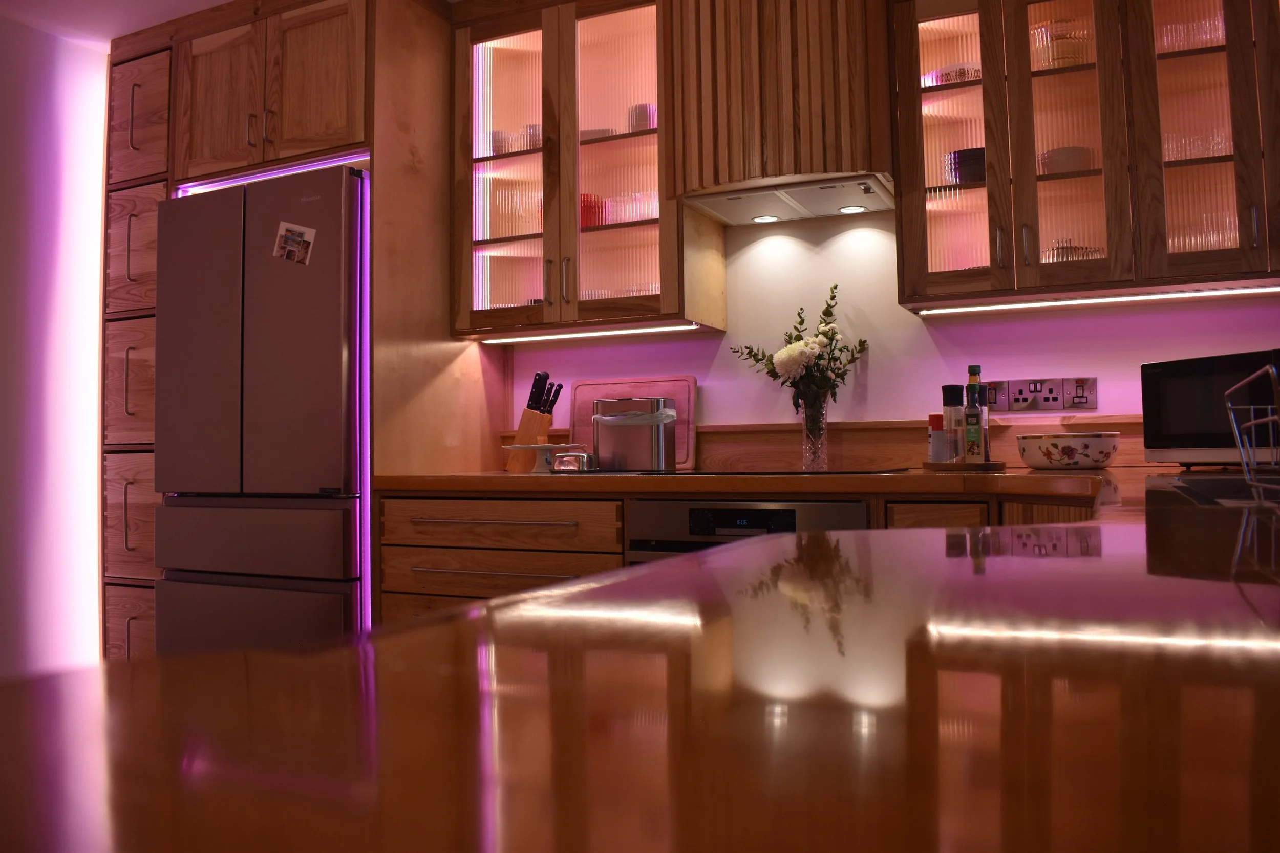
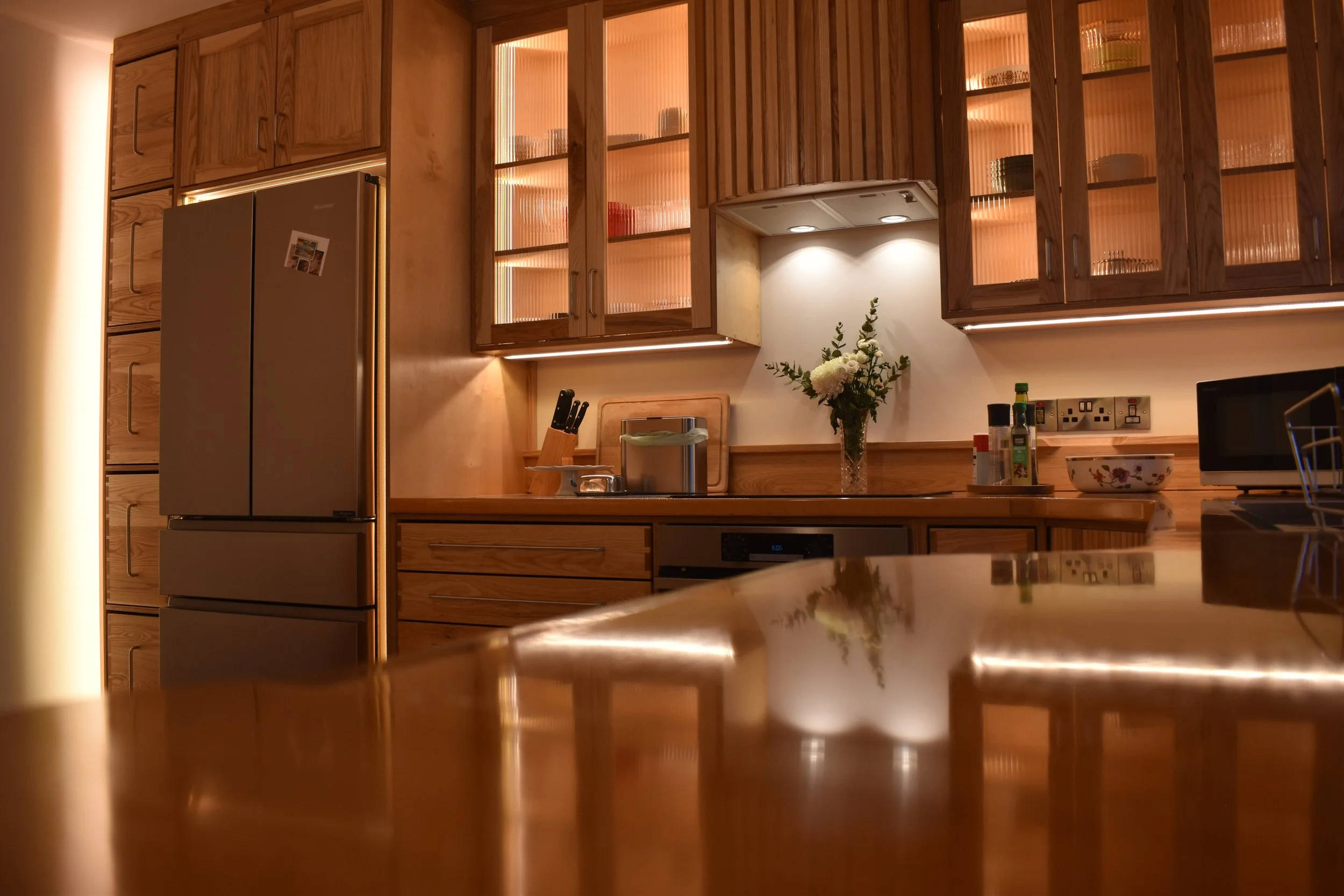
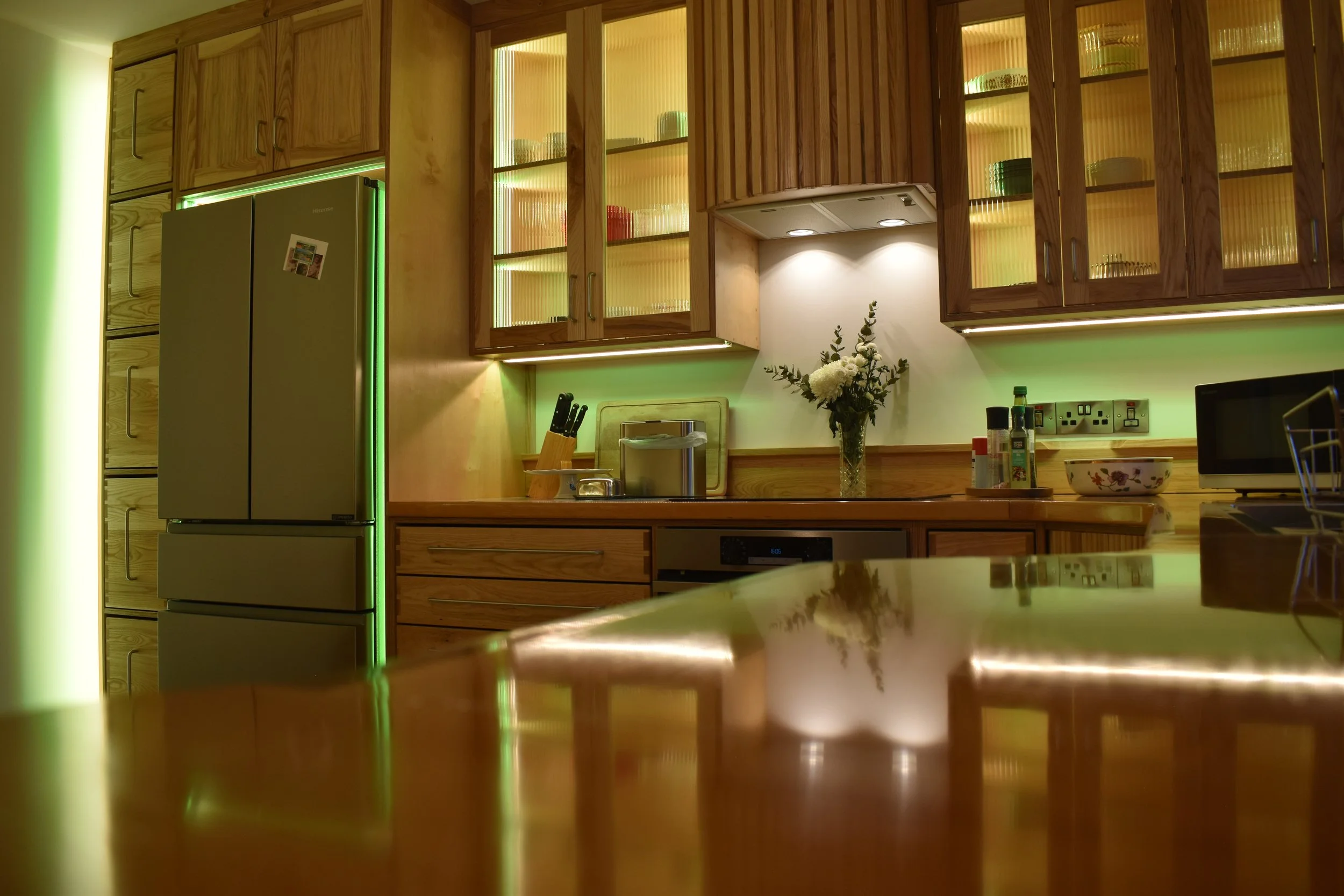
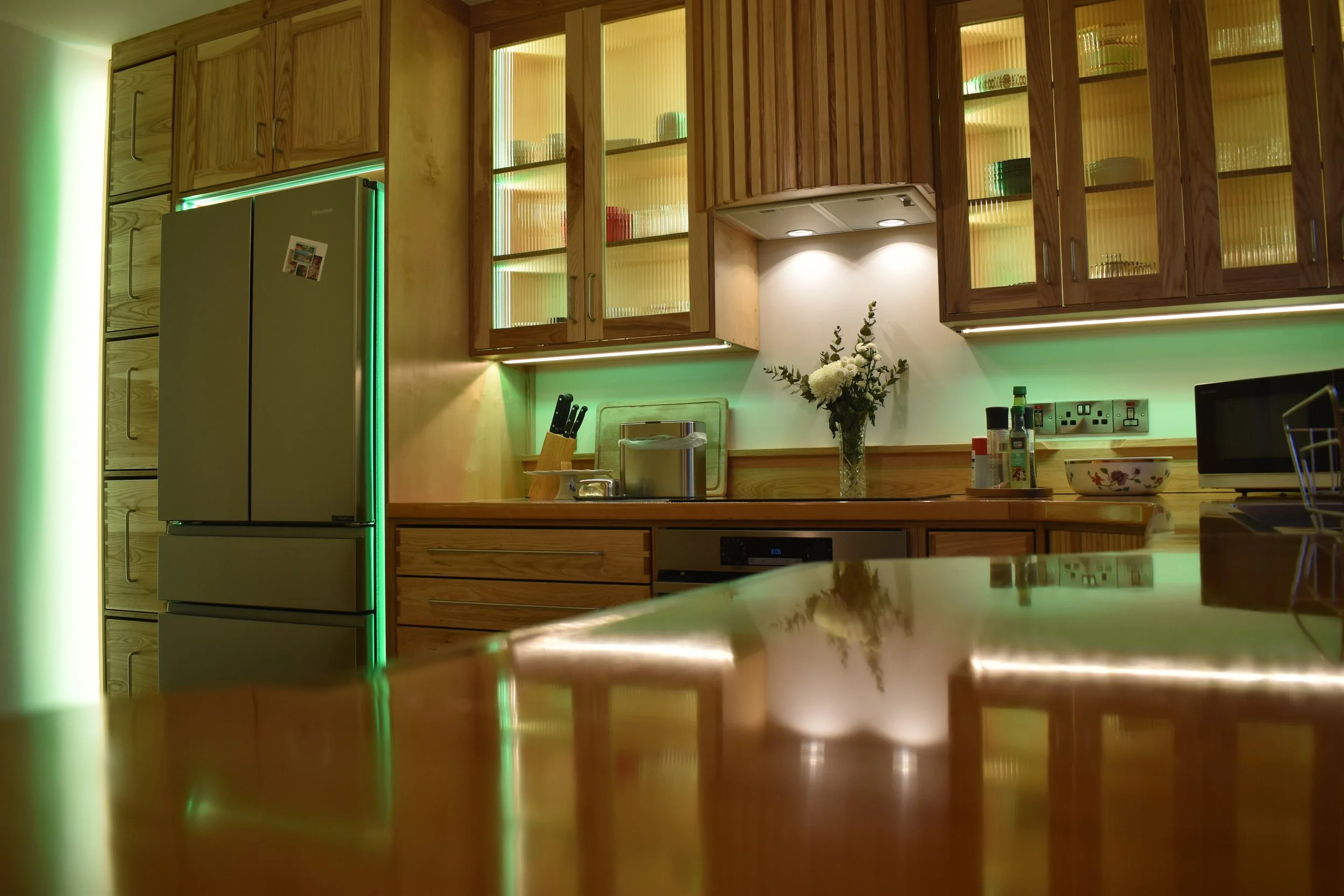
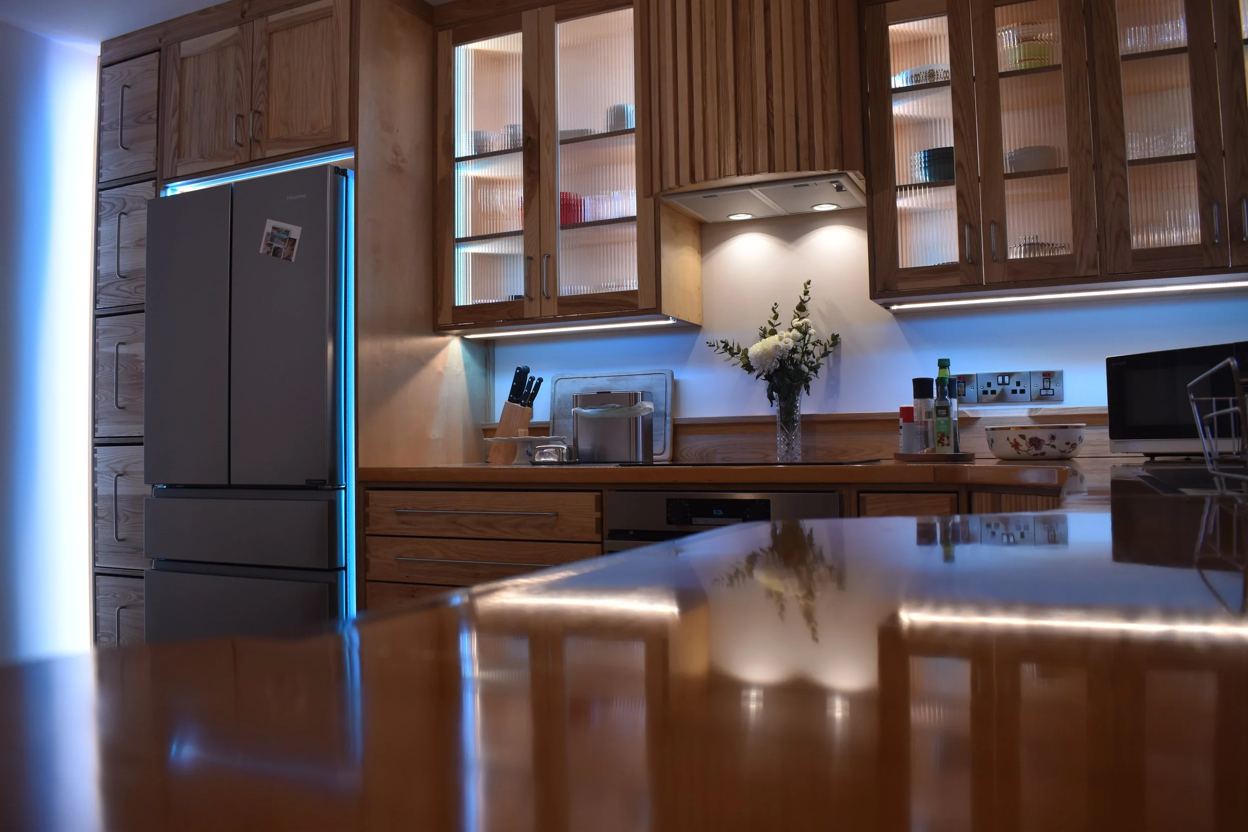
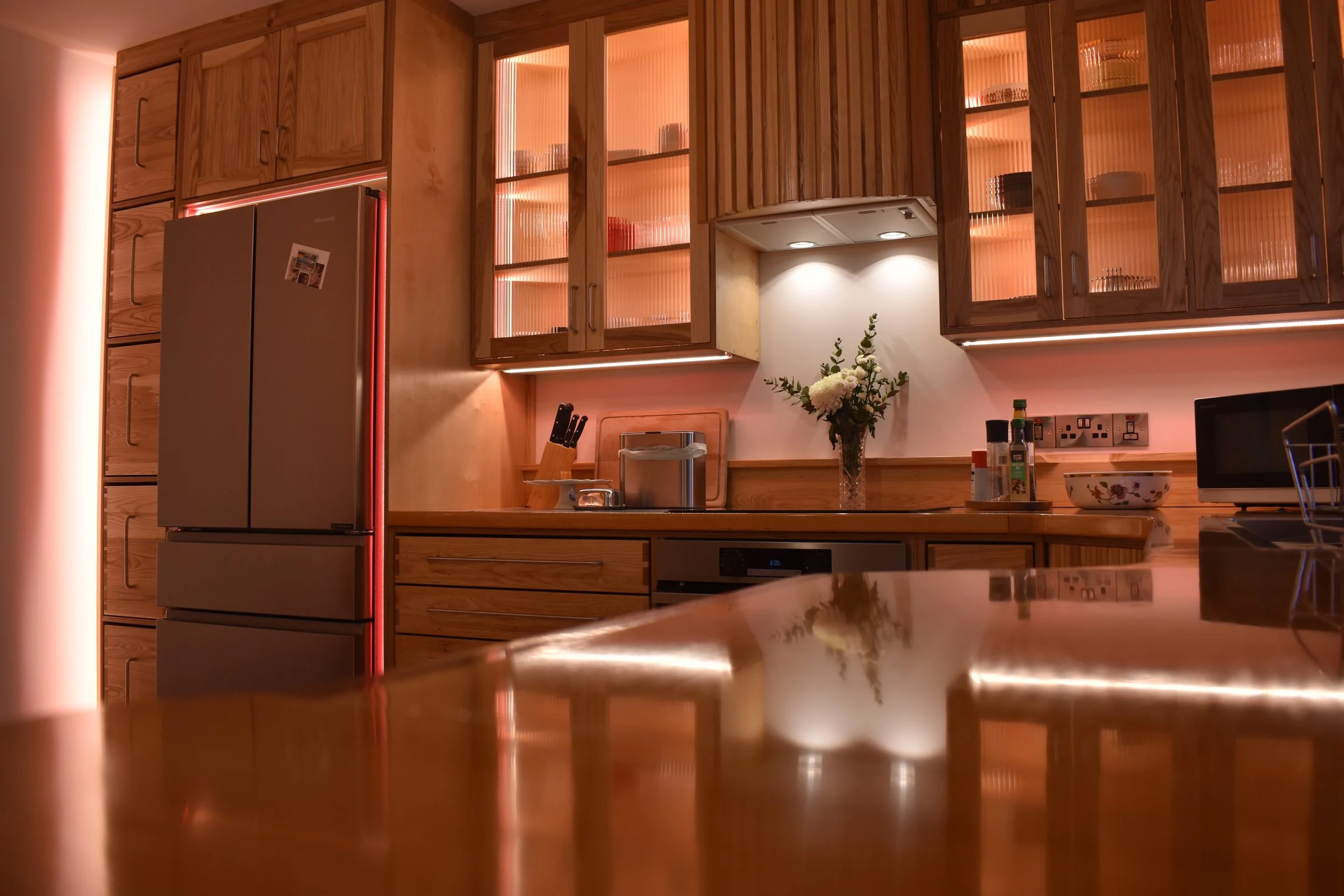
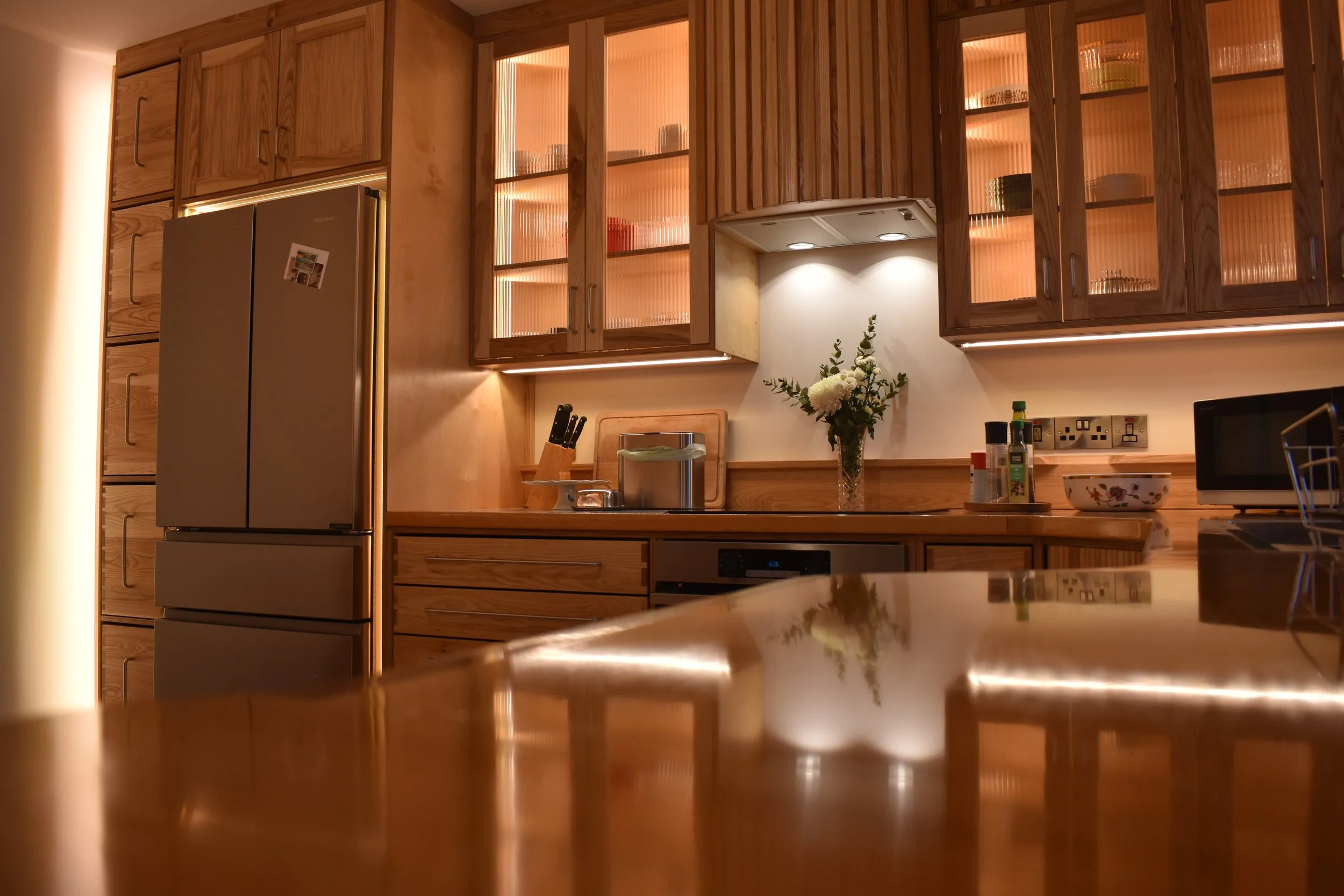
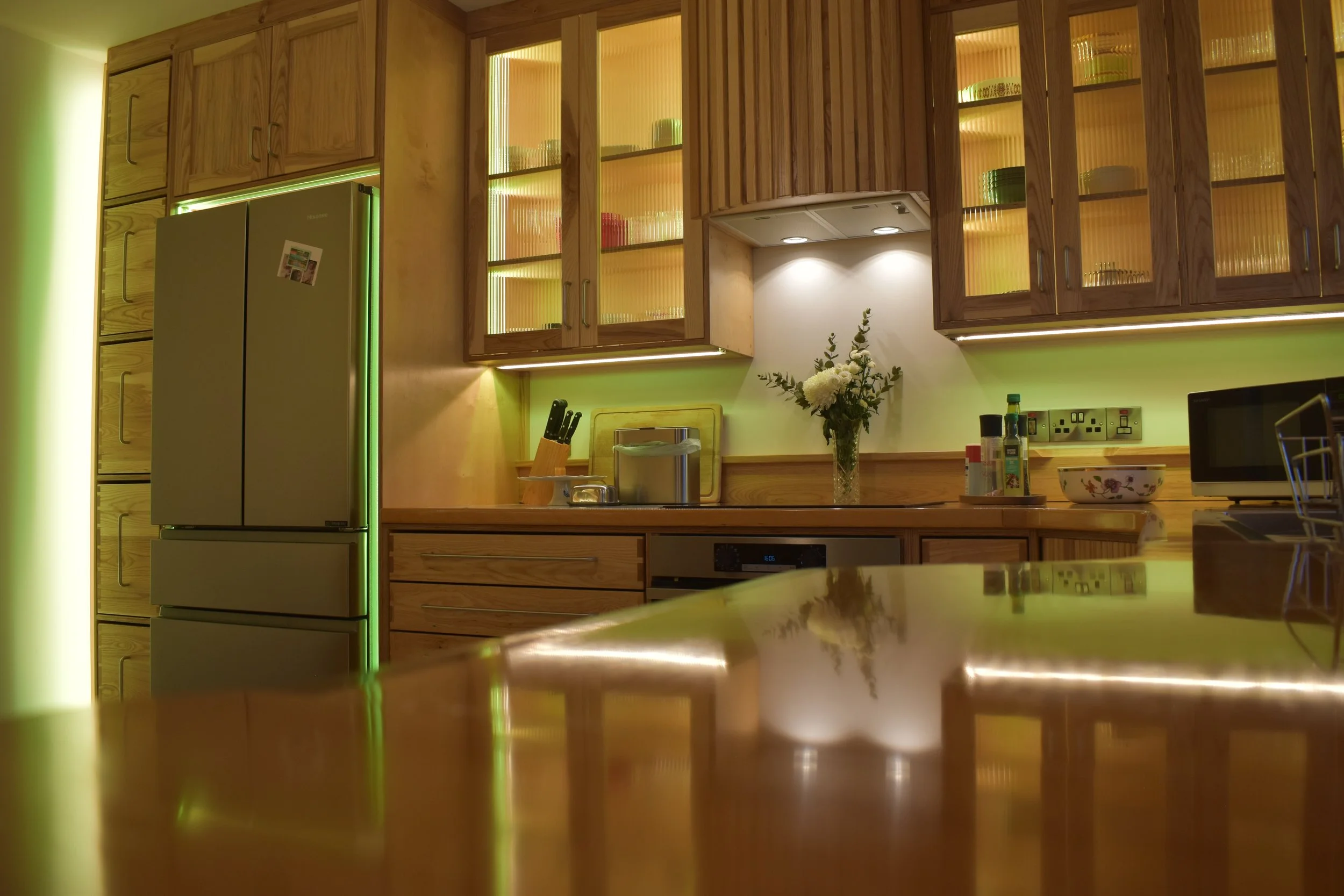
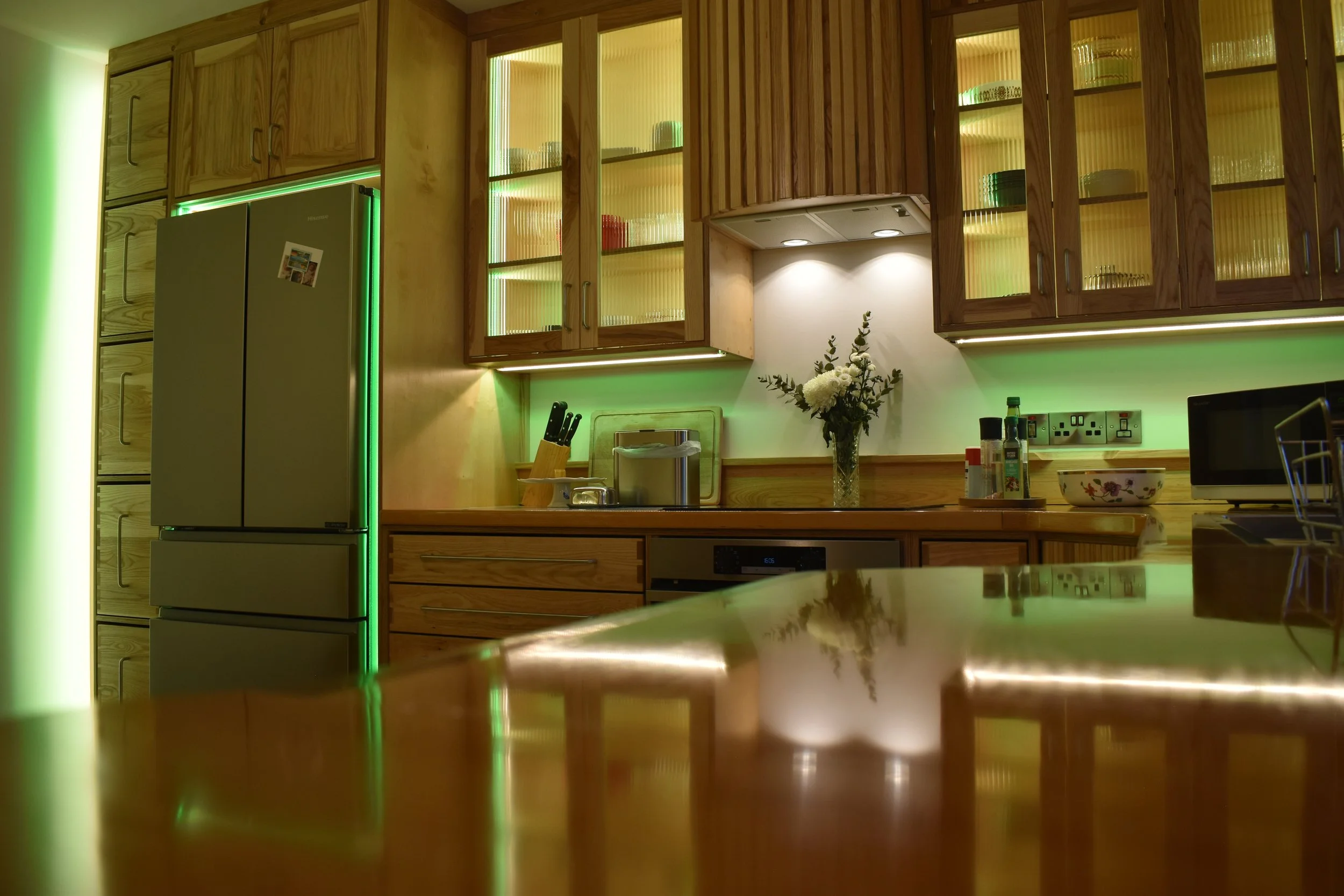
Throughout the cabinetry is recessed built in lighting. Not only does this lighting have variable white lights, which can be warm or cool, but they also can tint to any colour of choice.
As this kitchen doesn’t receive any direct natural light it is important for it to be able to produce light. This makes for a far more uplifting workspace and a very amiable place to be.
Cool
Warm
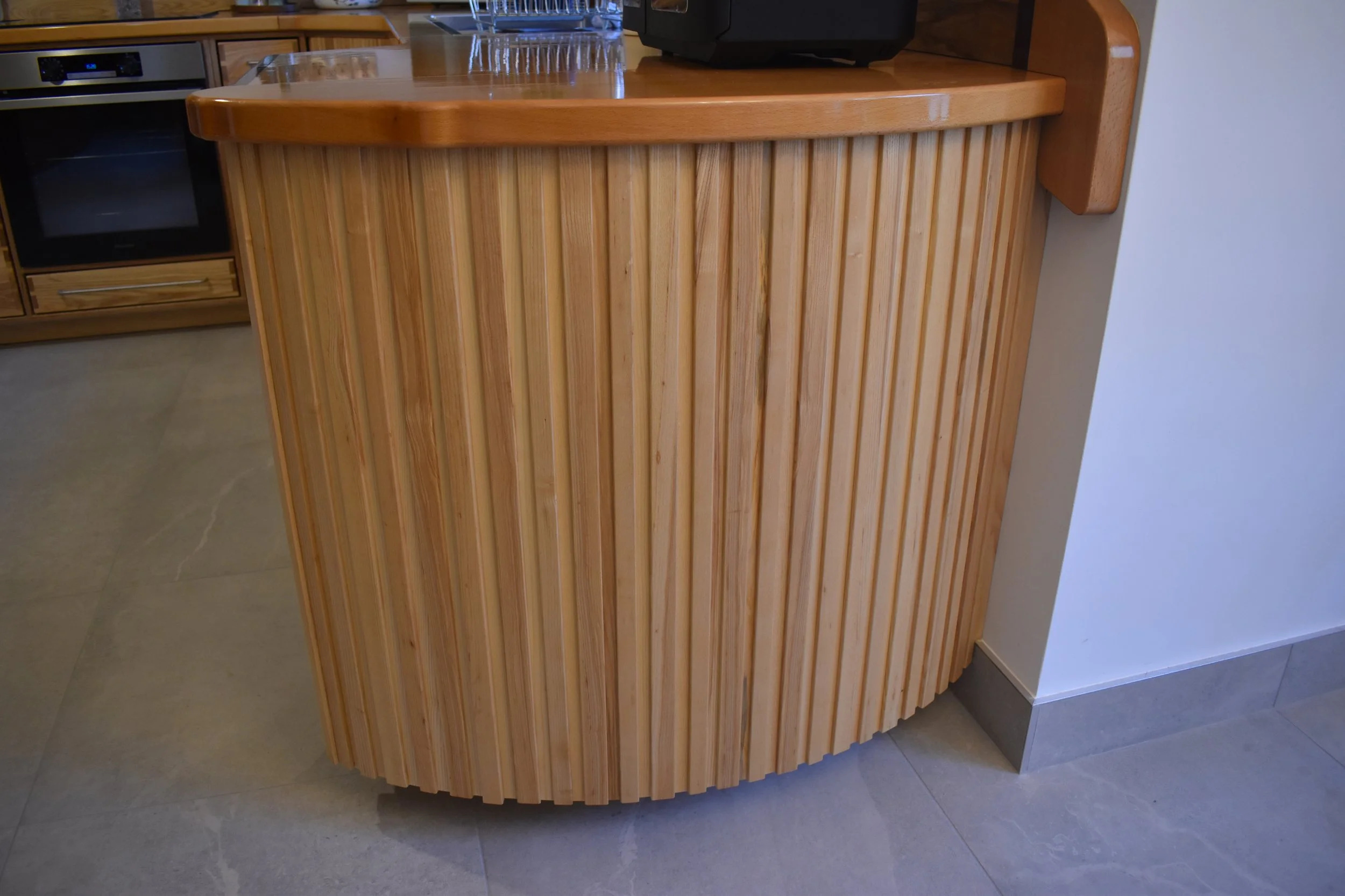
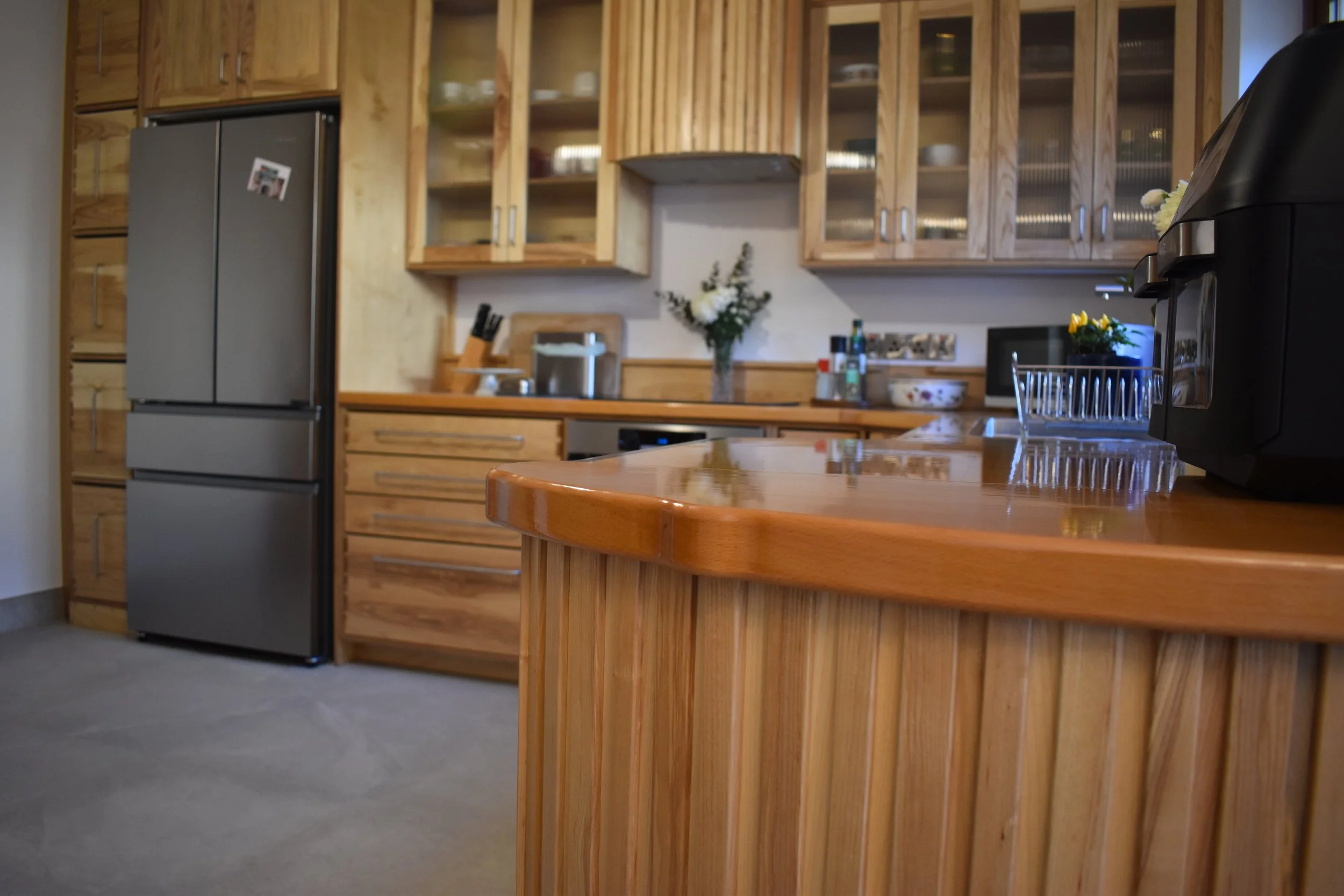
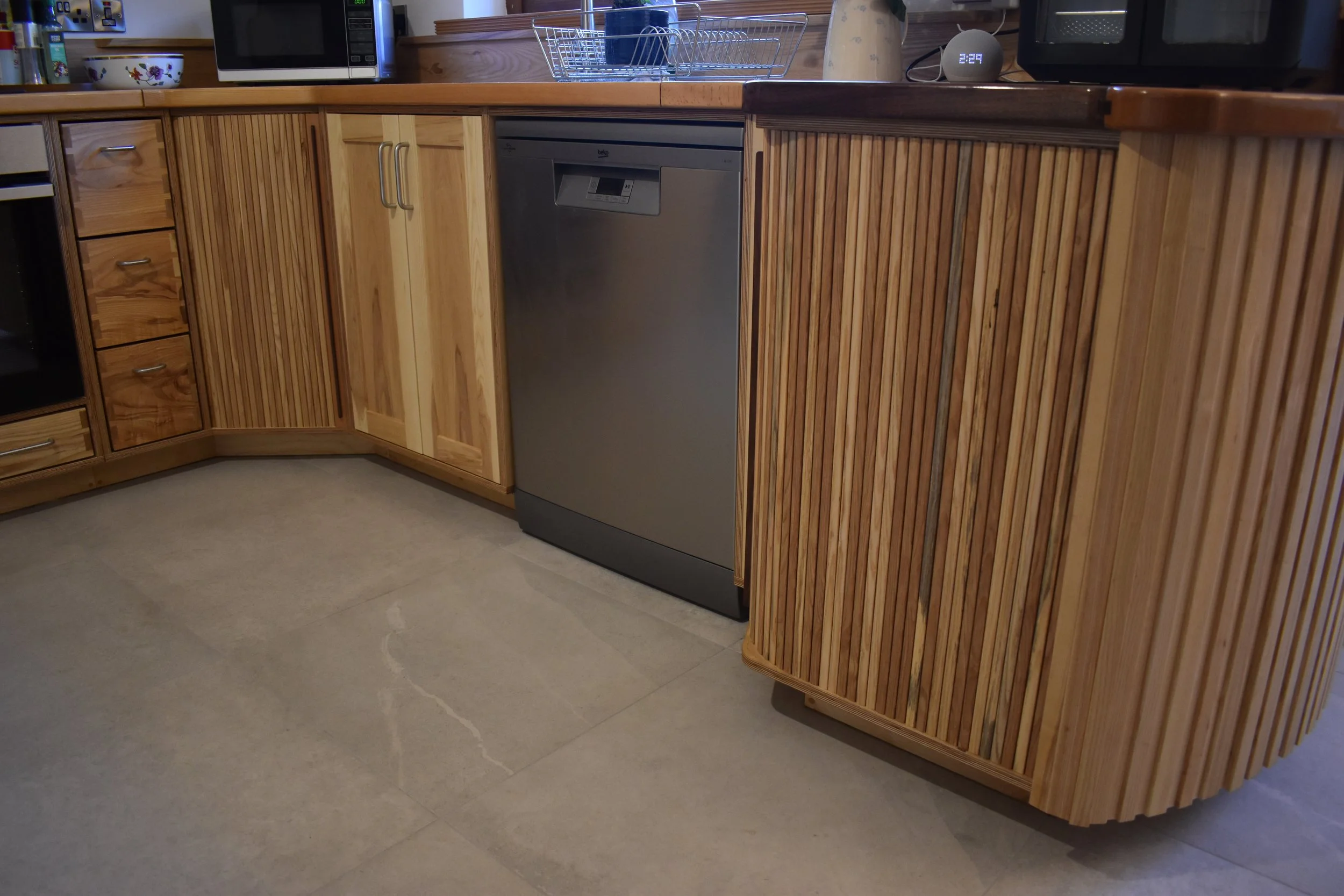
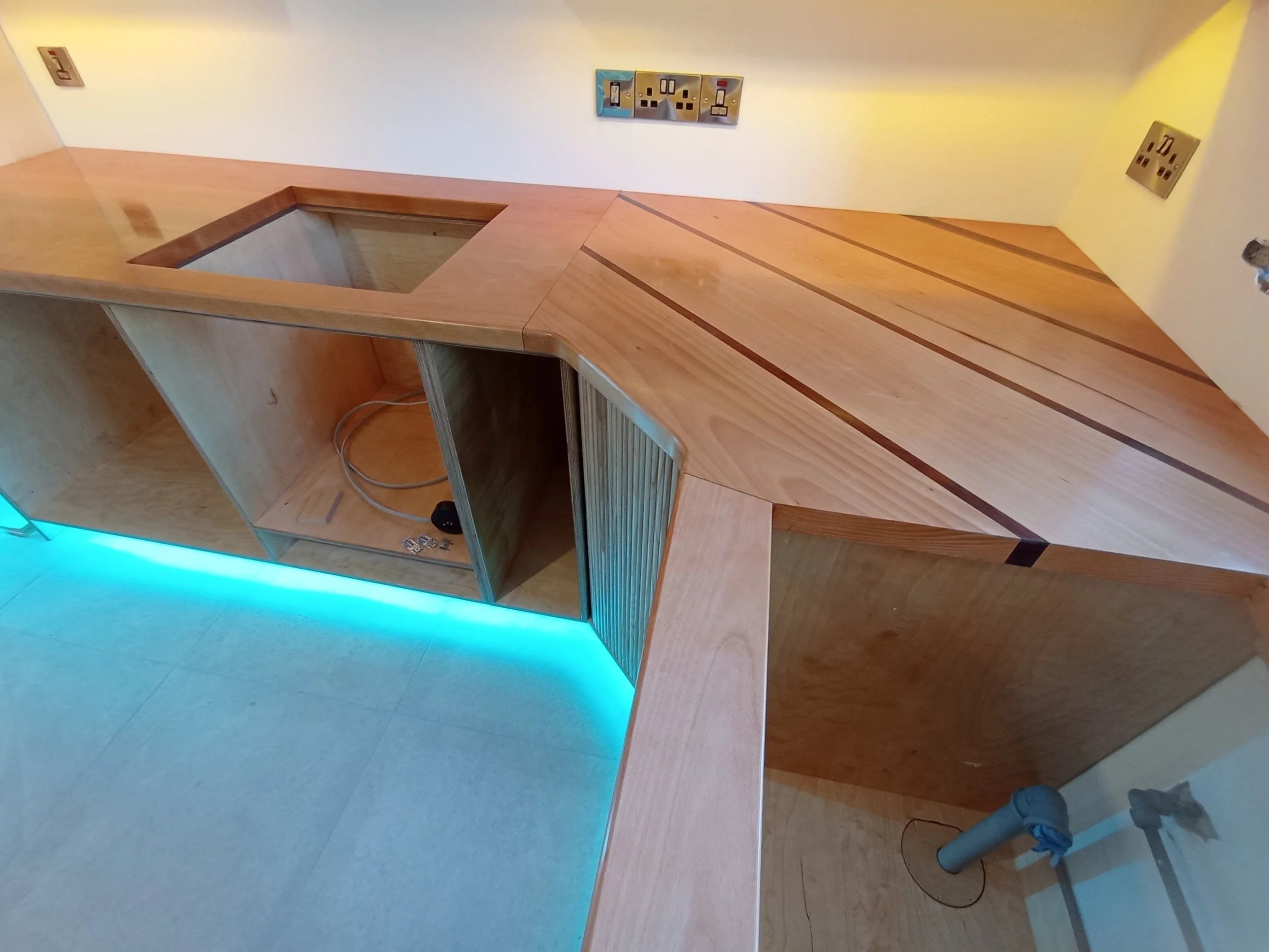
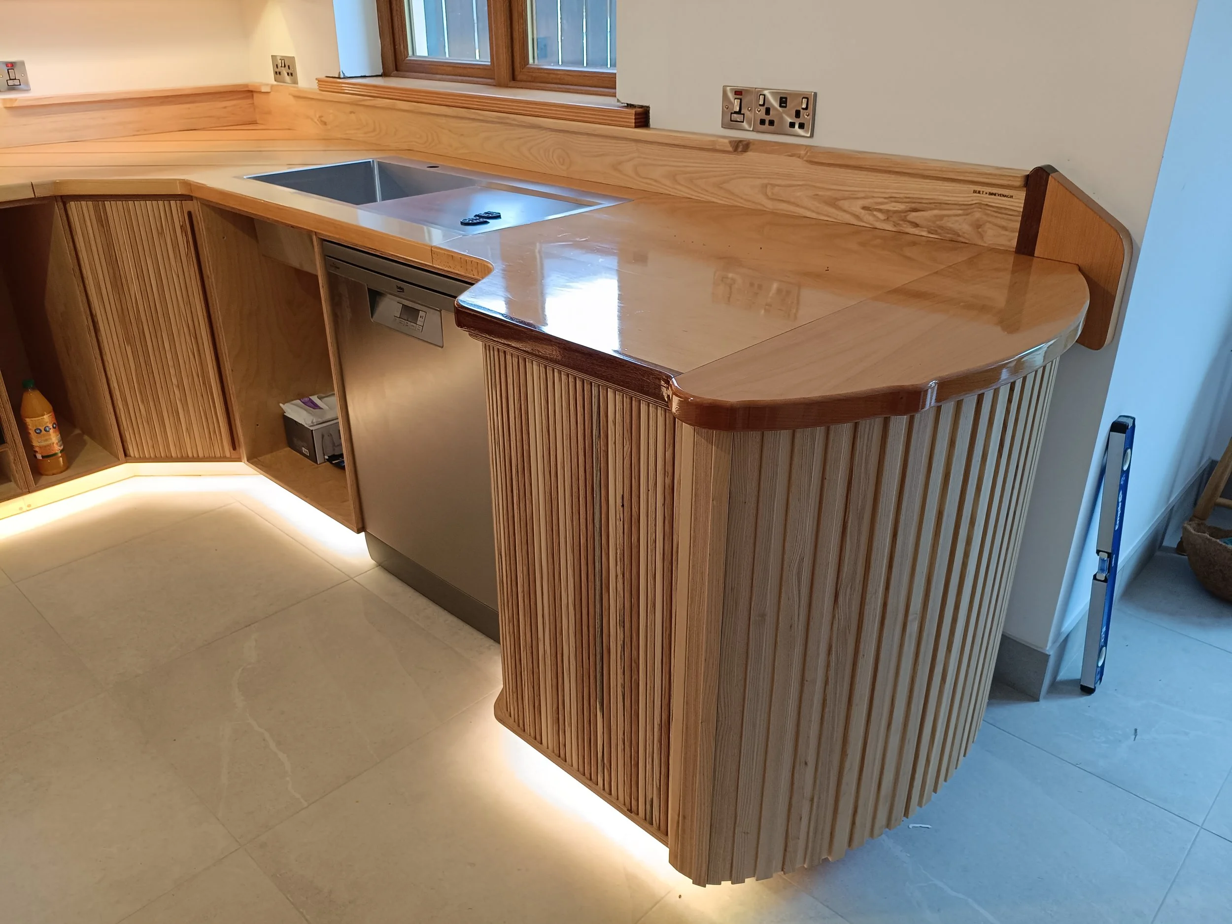
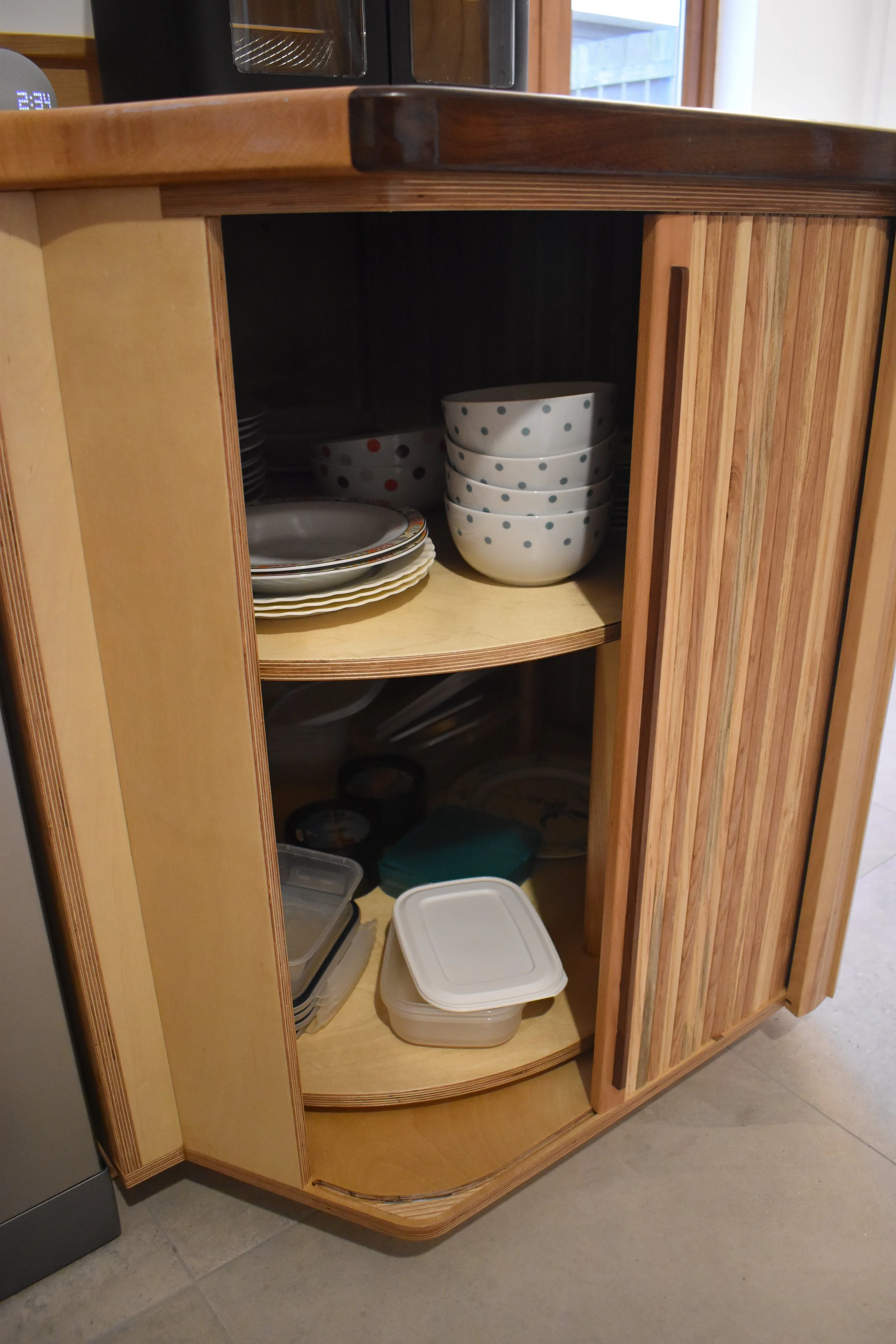
The peninsula and corner cabinets were designed with sliding doors so that they could be left open for constant and easy access when the kitchen was in use. Inside these cabinets are large bearing mounted carousels with acres of storage space which can be easily accessed, all while not impacting exterior gangways.
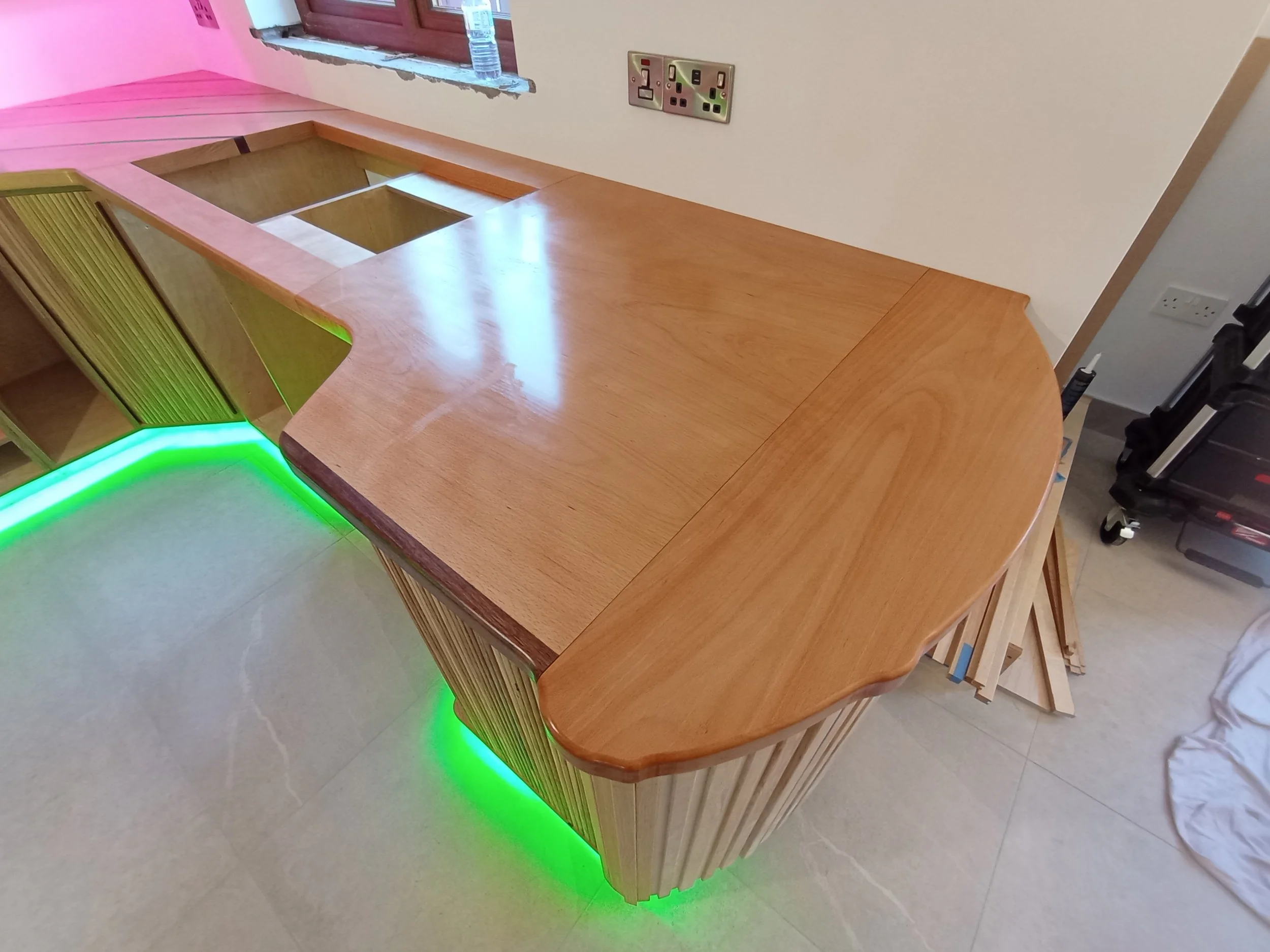
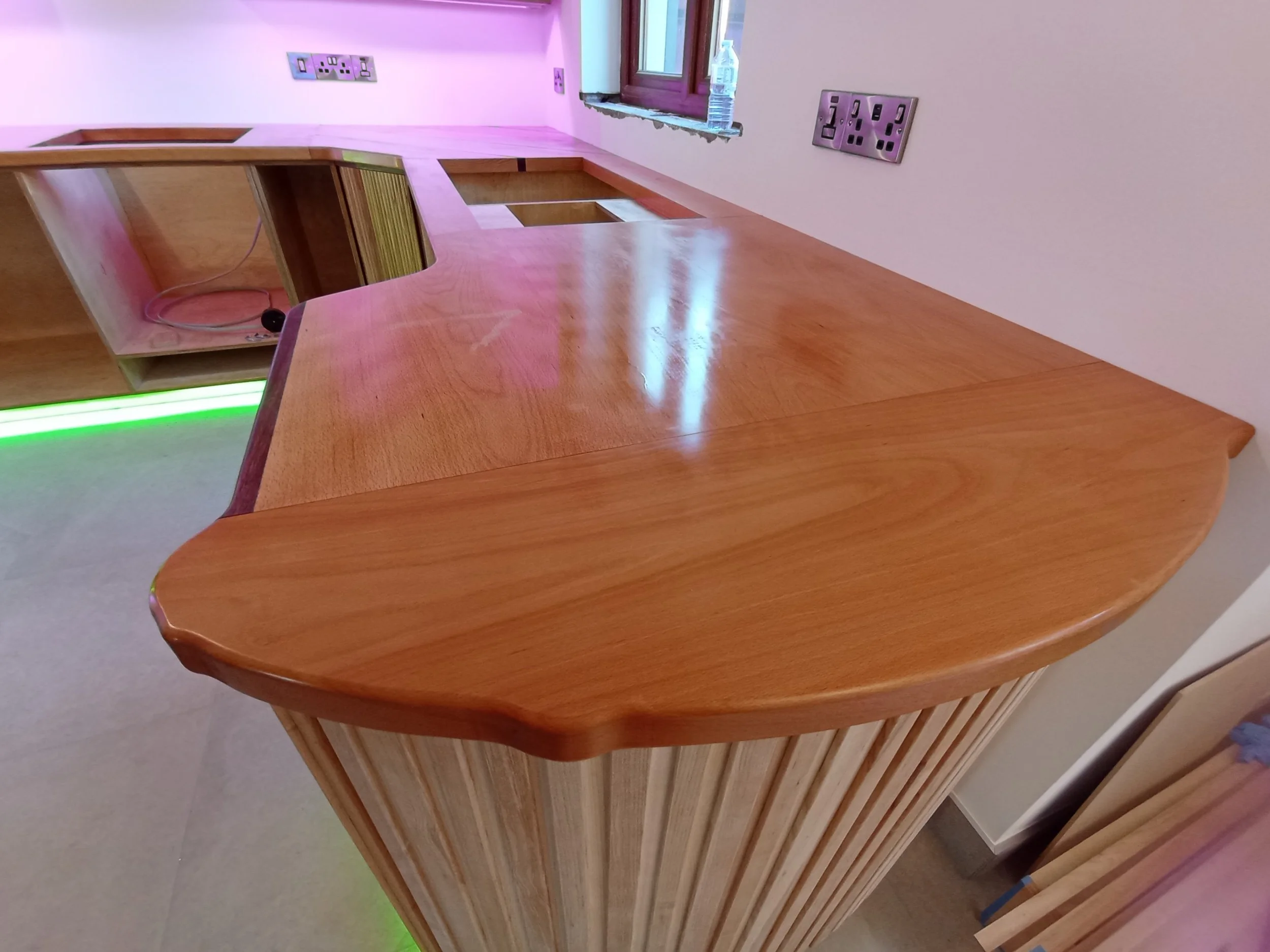
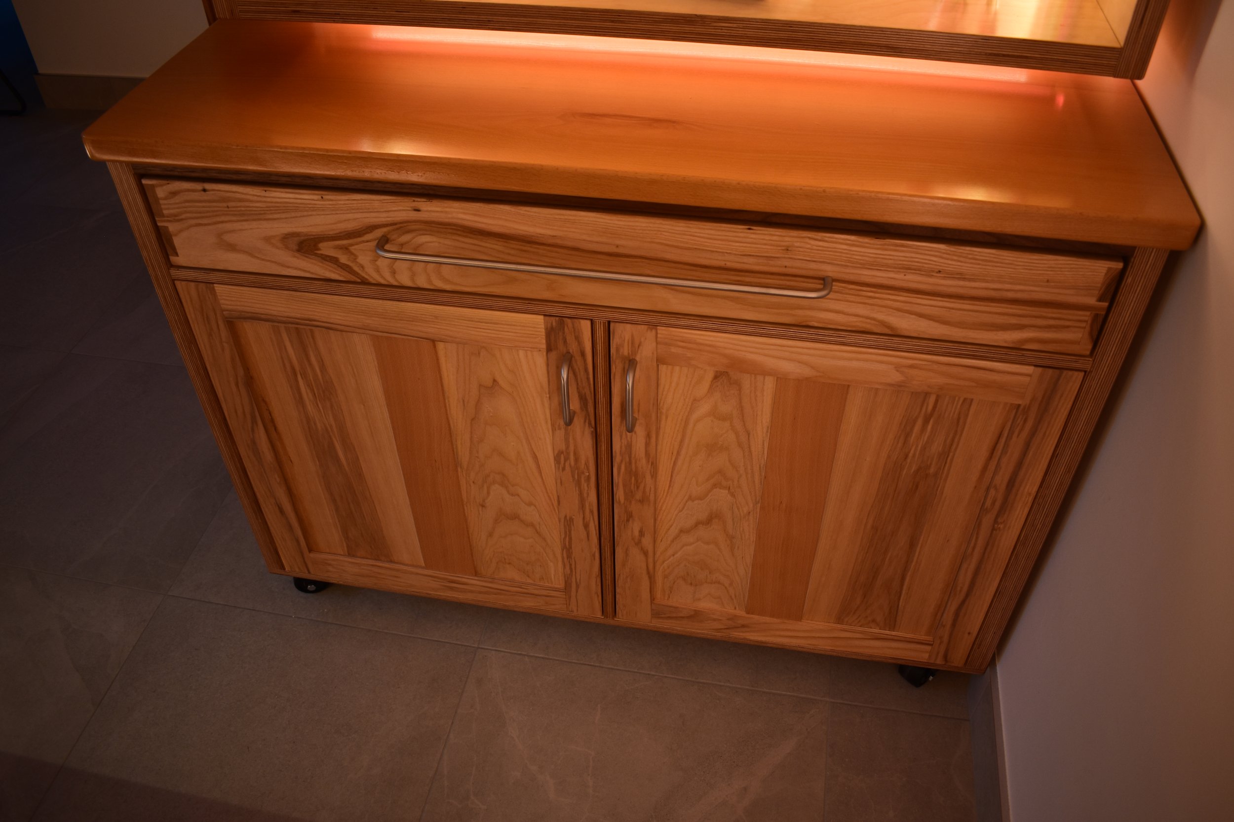
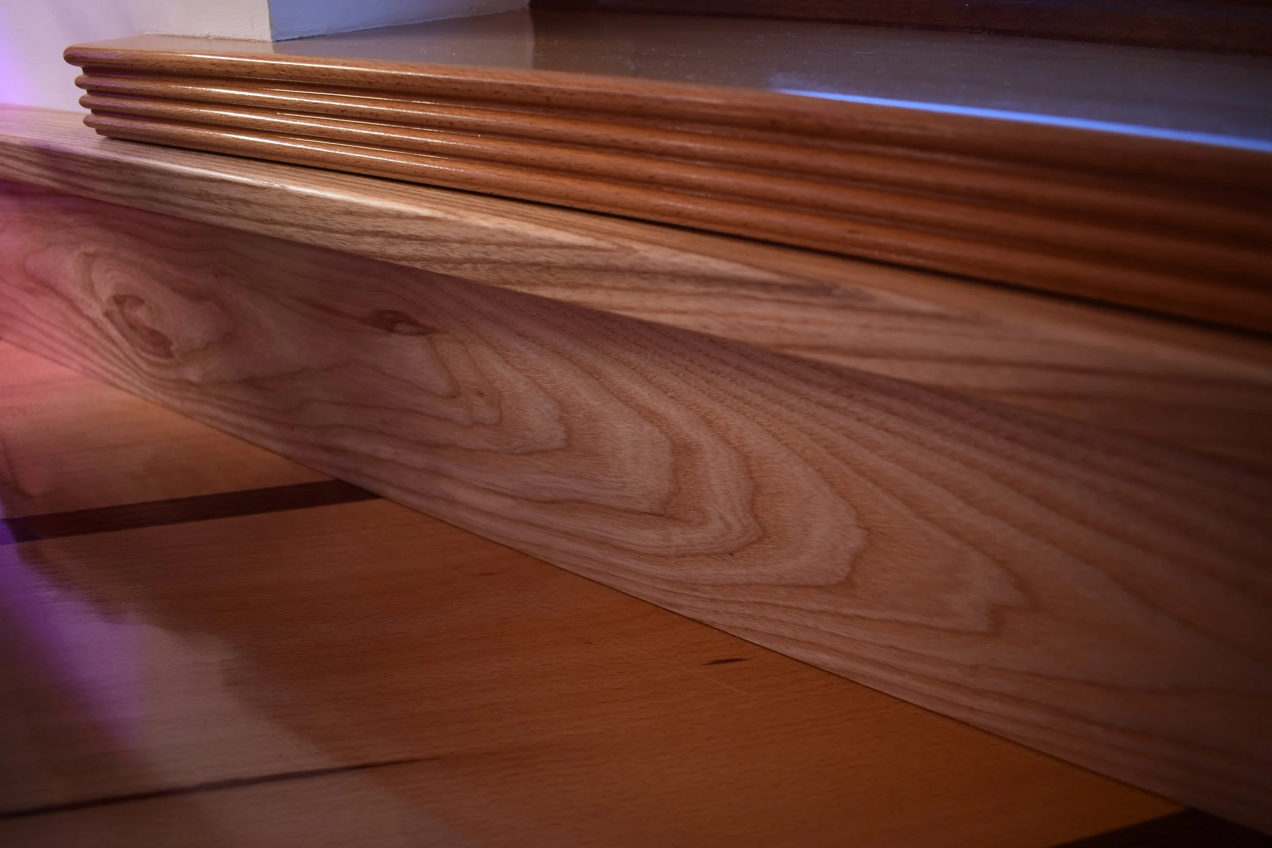
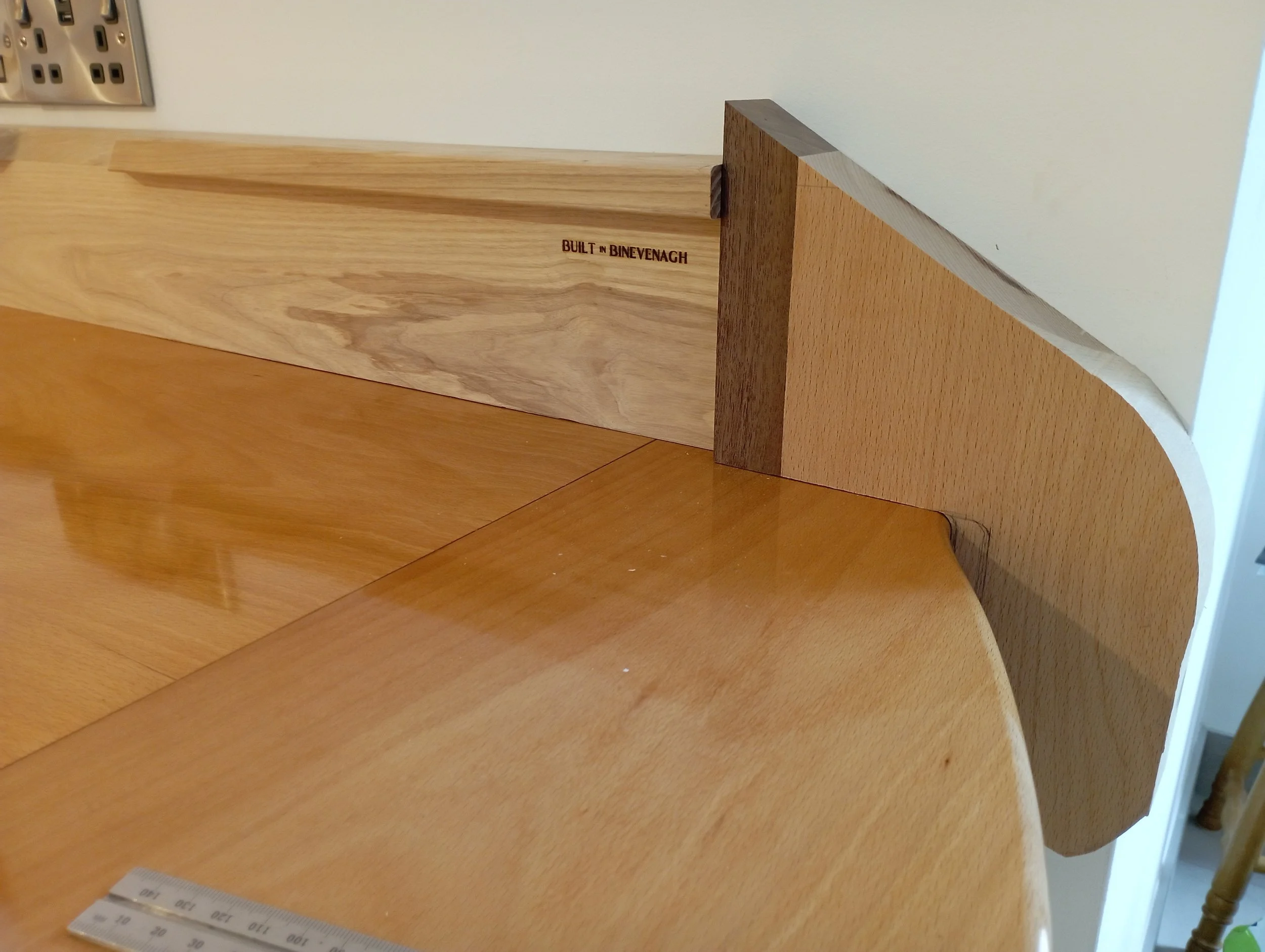
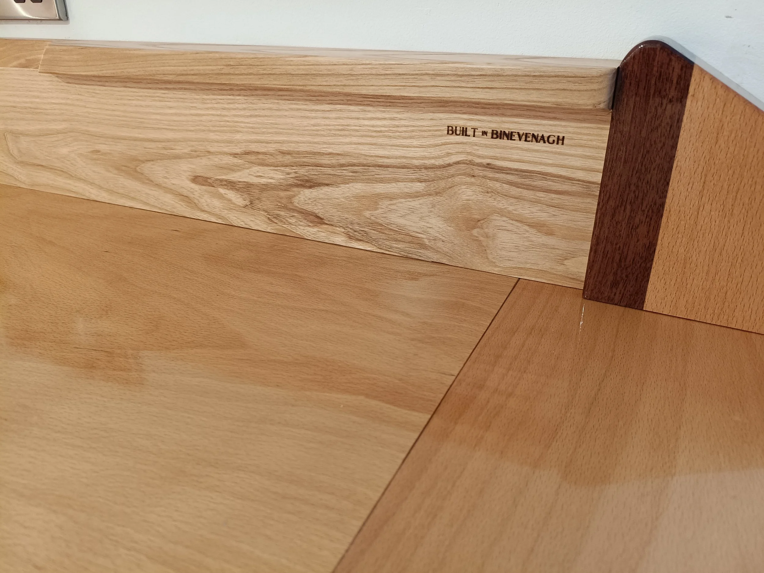
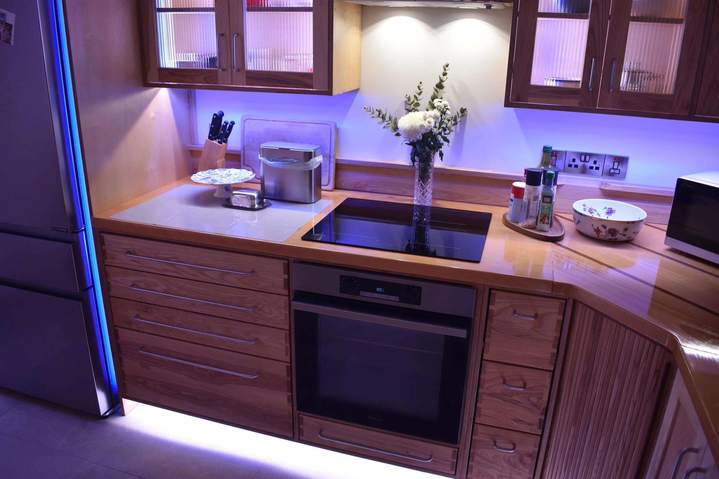
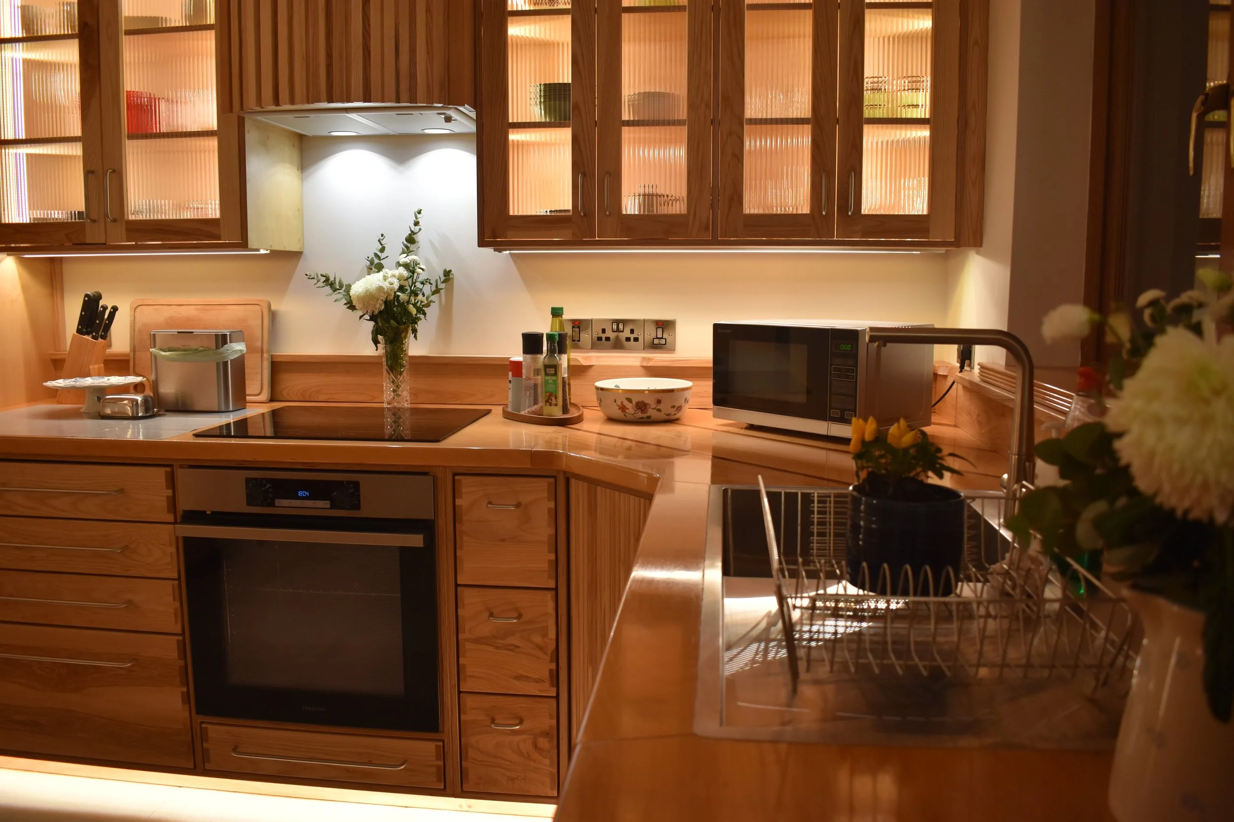
Countertops in Beech.
Perhaps the best choice of wood for a countertop, it deals very well with water, is incredibly tough and hard to mark, stays flat even across wider boards and has a mellow quiet look and feel with only a minor grain pattern. In this kitchen it is a good complimentary contrast to the Ash which can have a busy look in places.
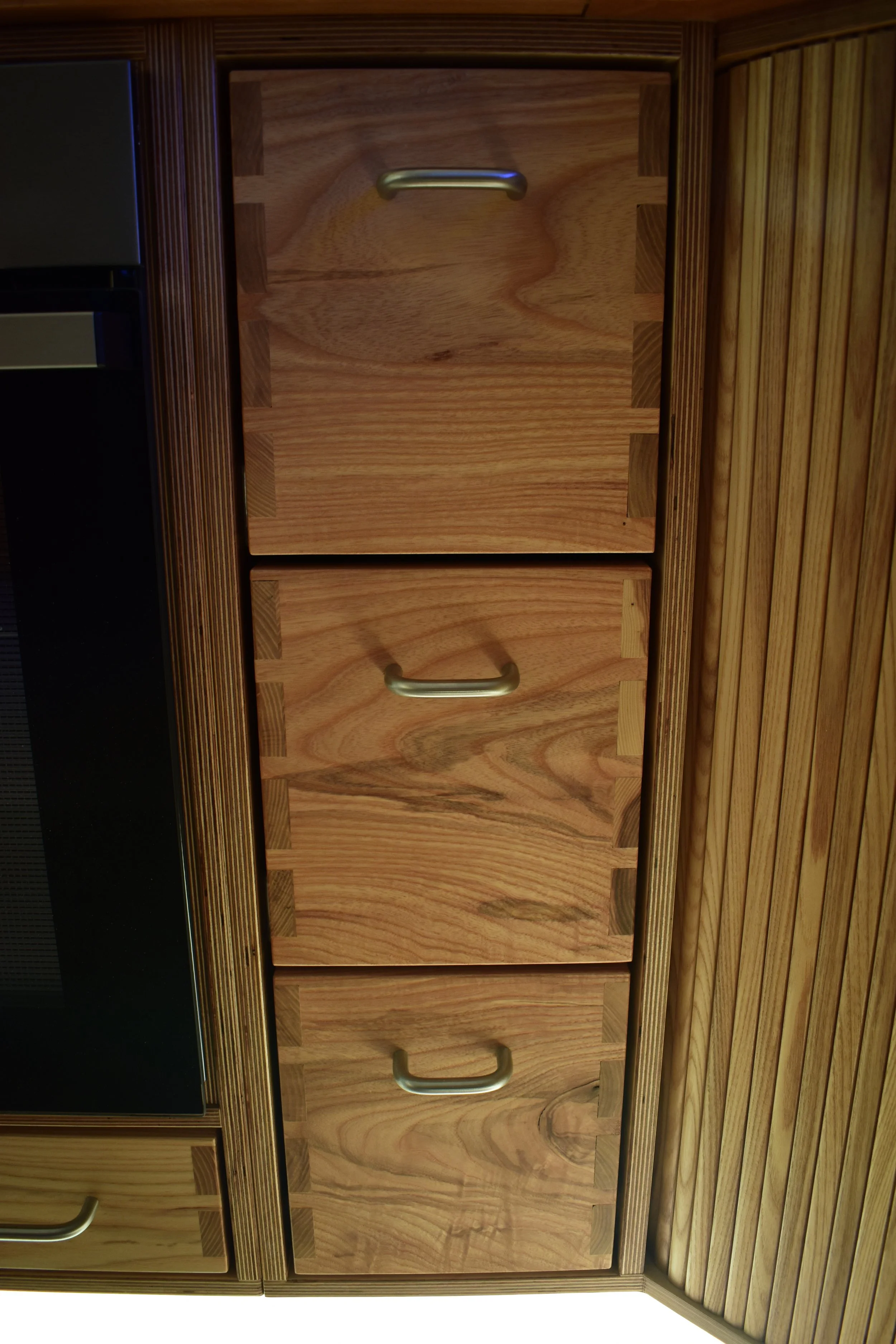
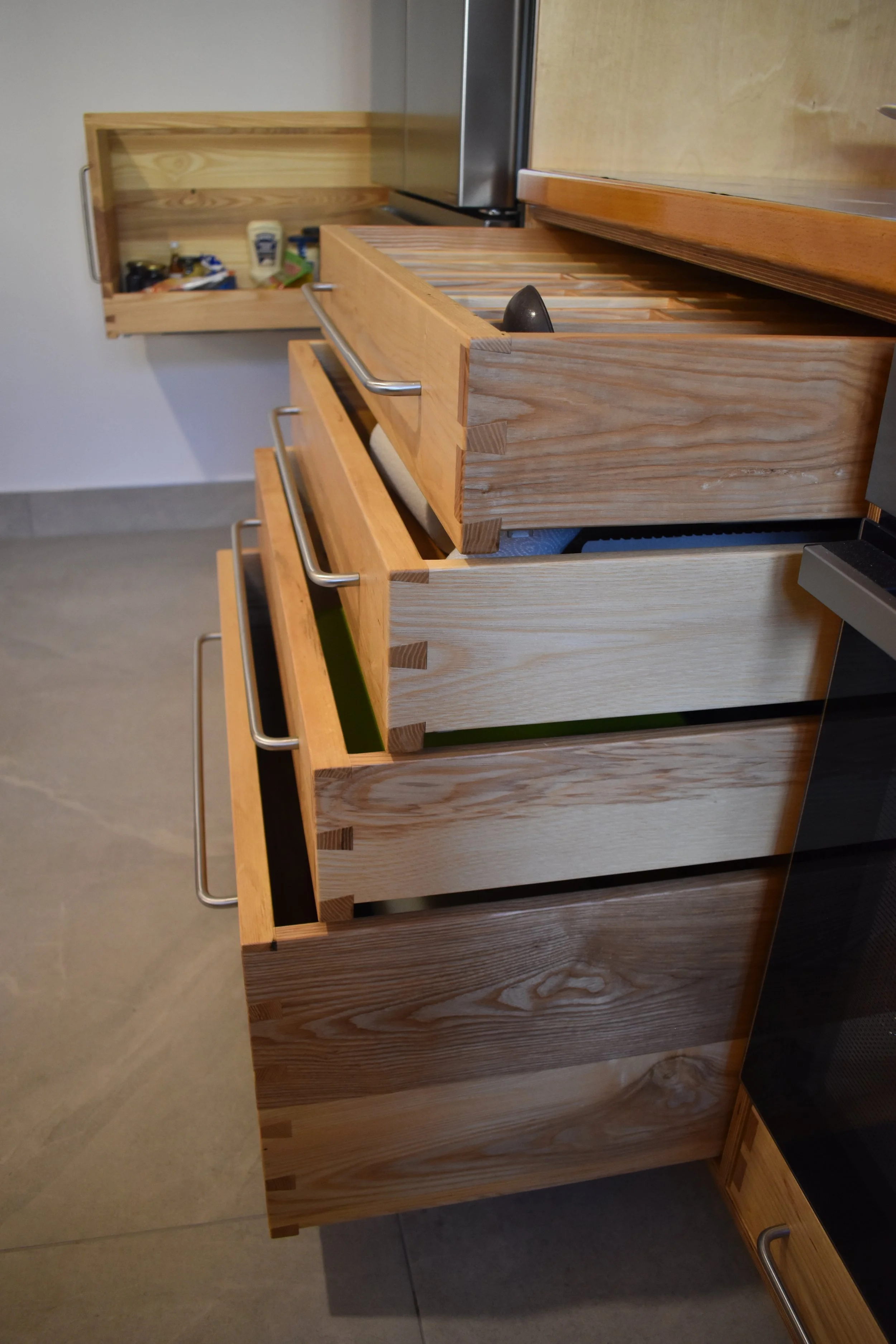
It is good to include some unique features and details in a project to give it some flair and perhaps, practicality.
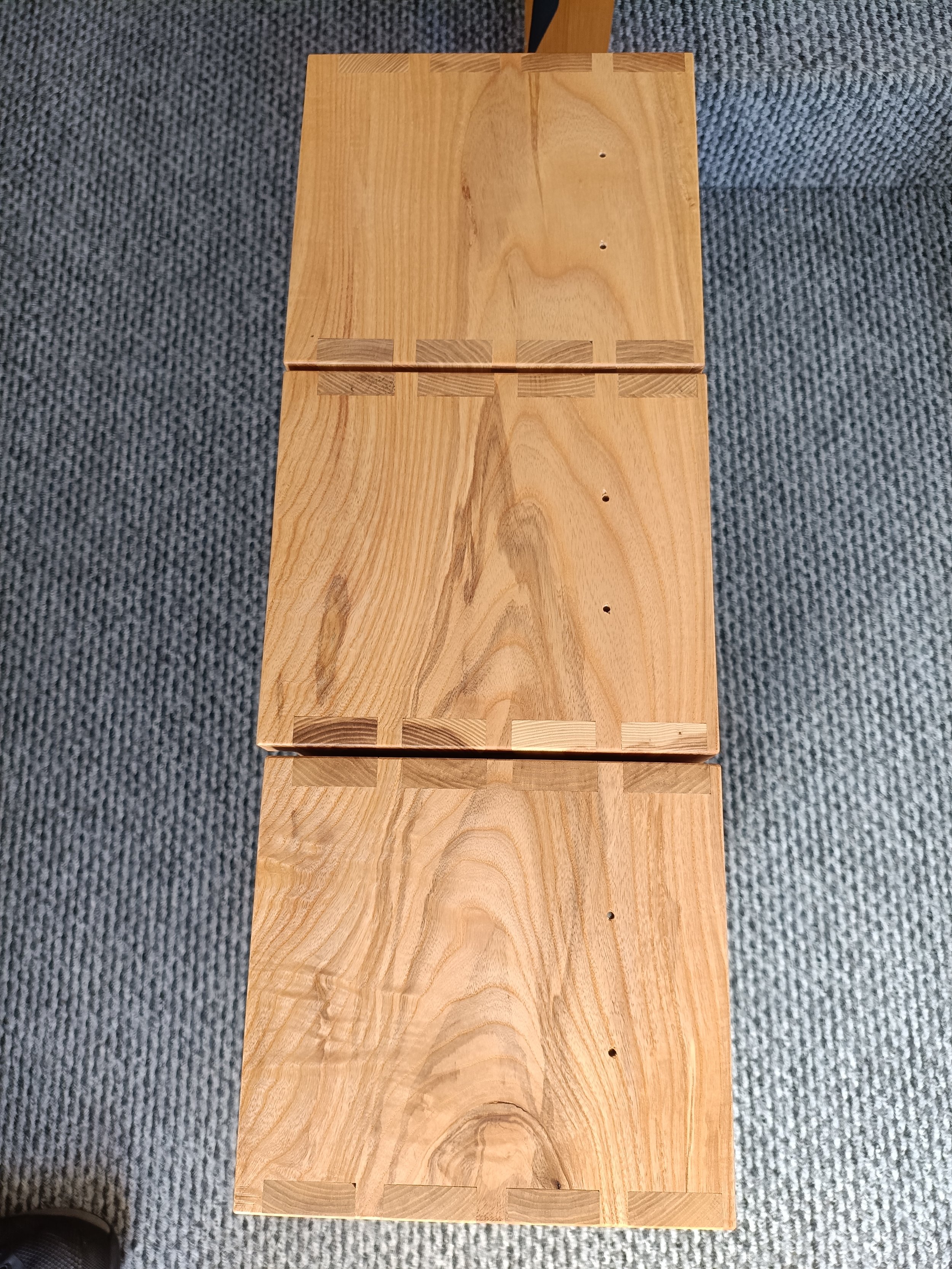
Hidden details in drawer faces…
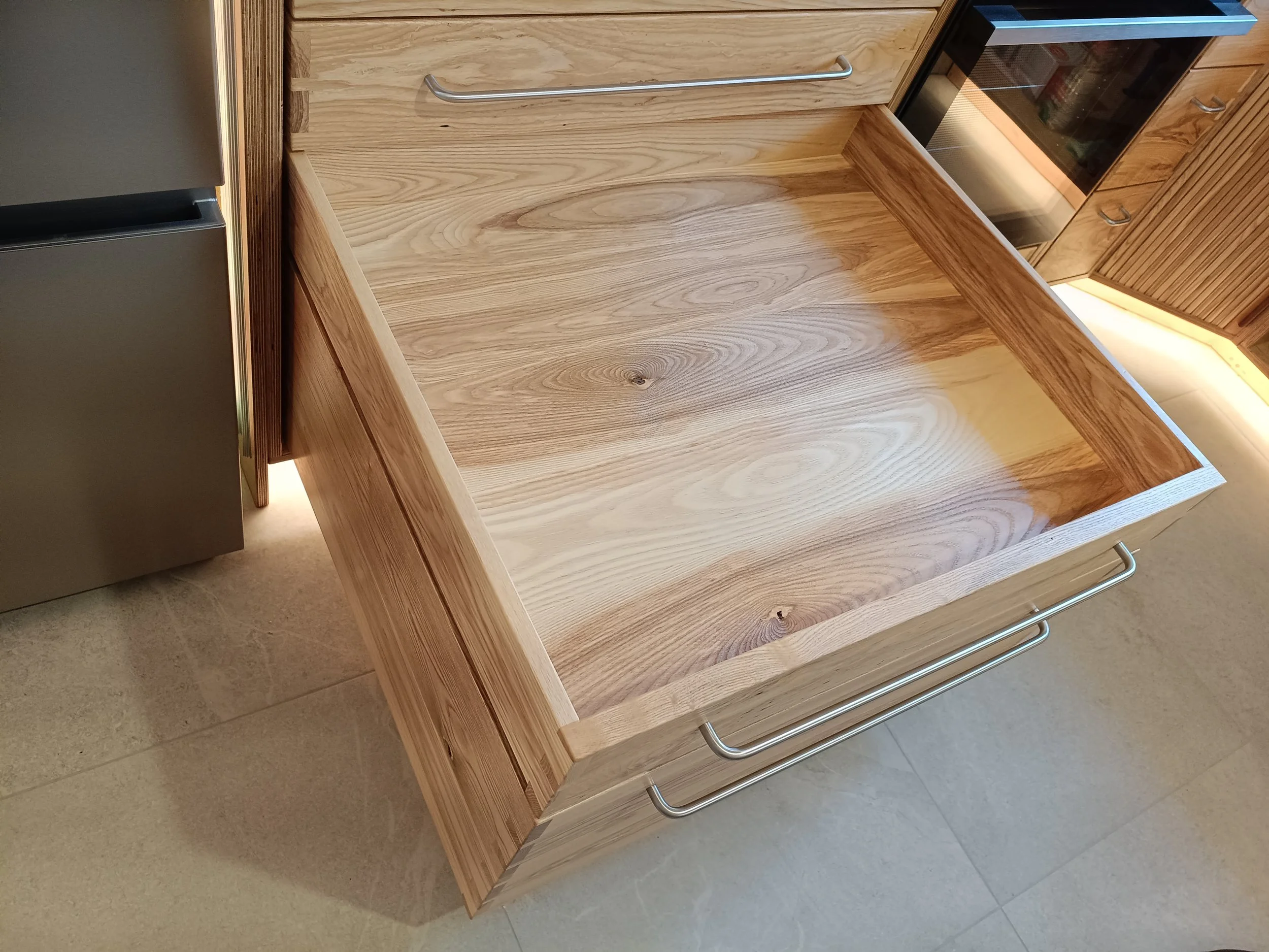
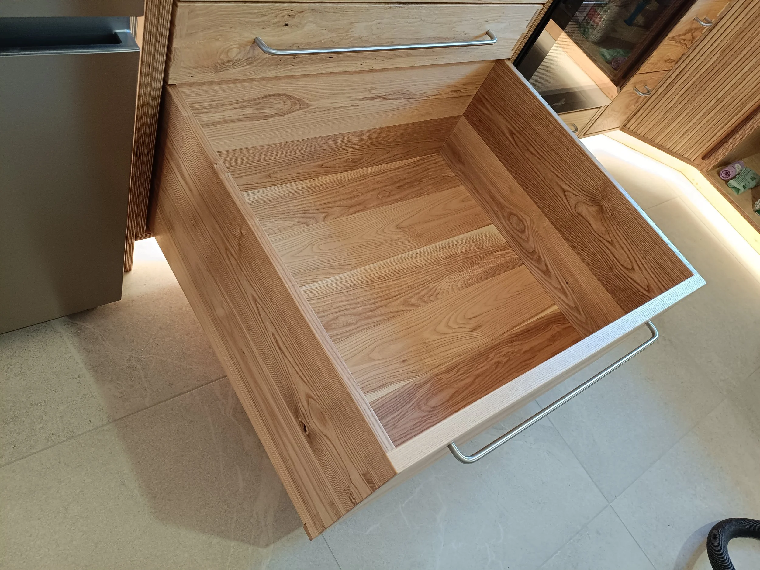
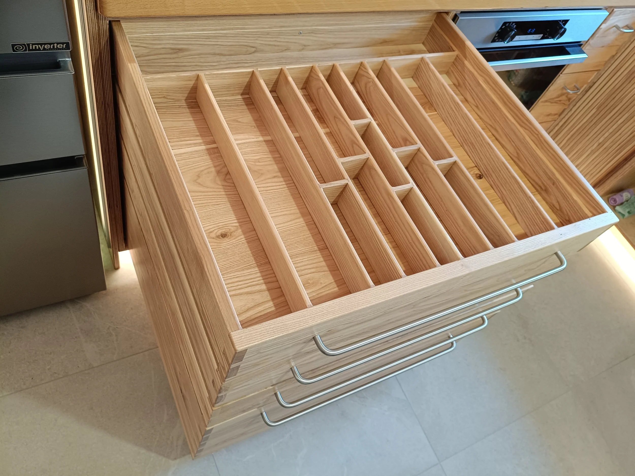
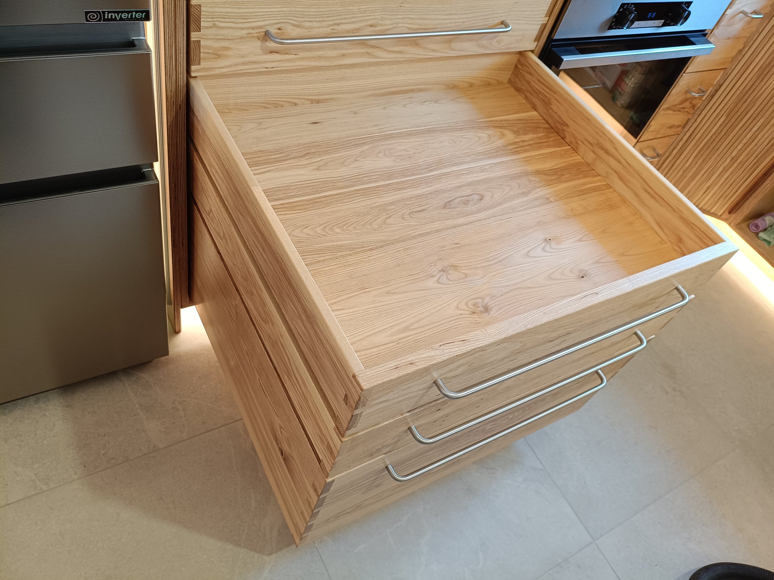
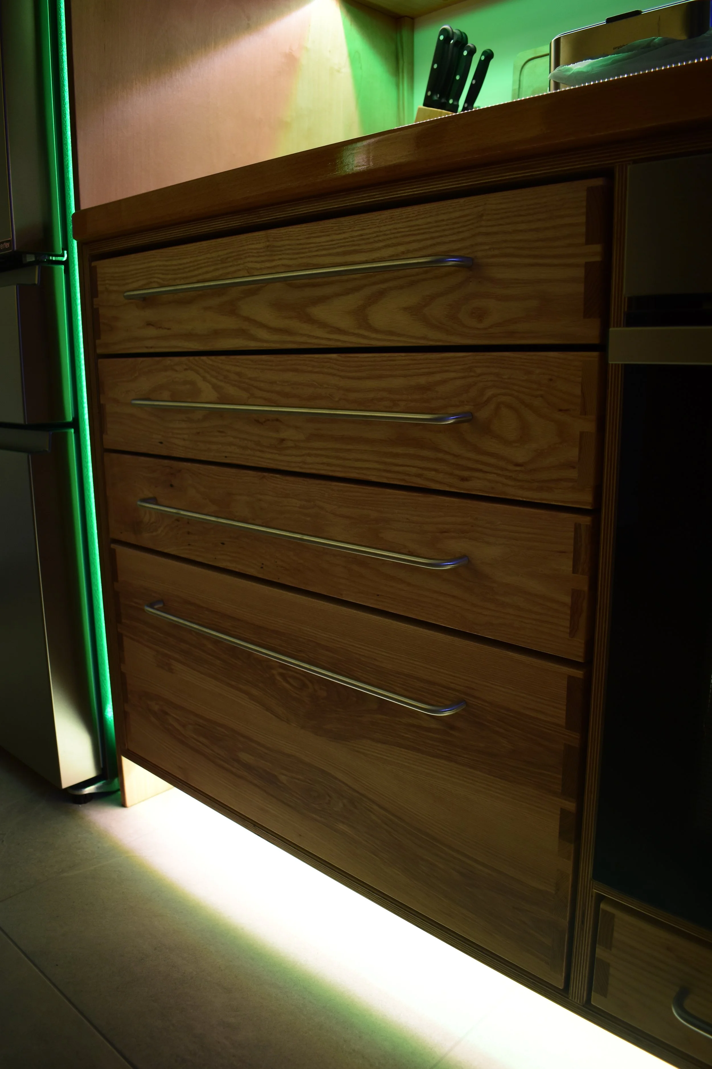
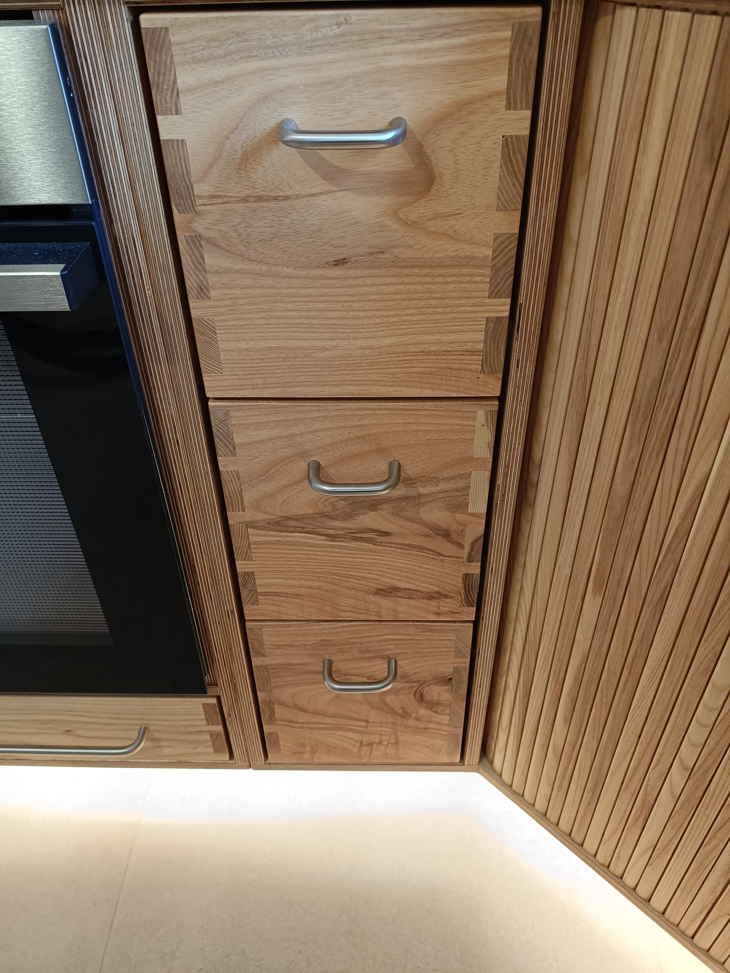
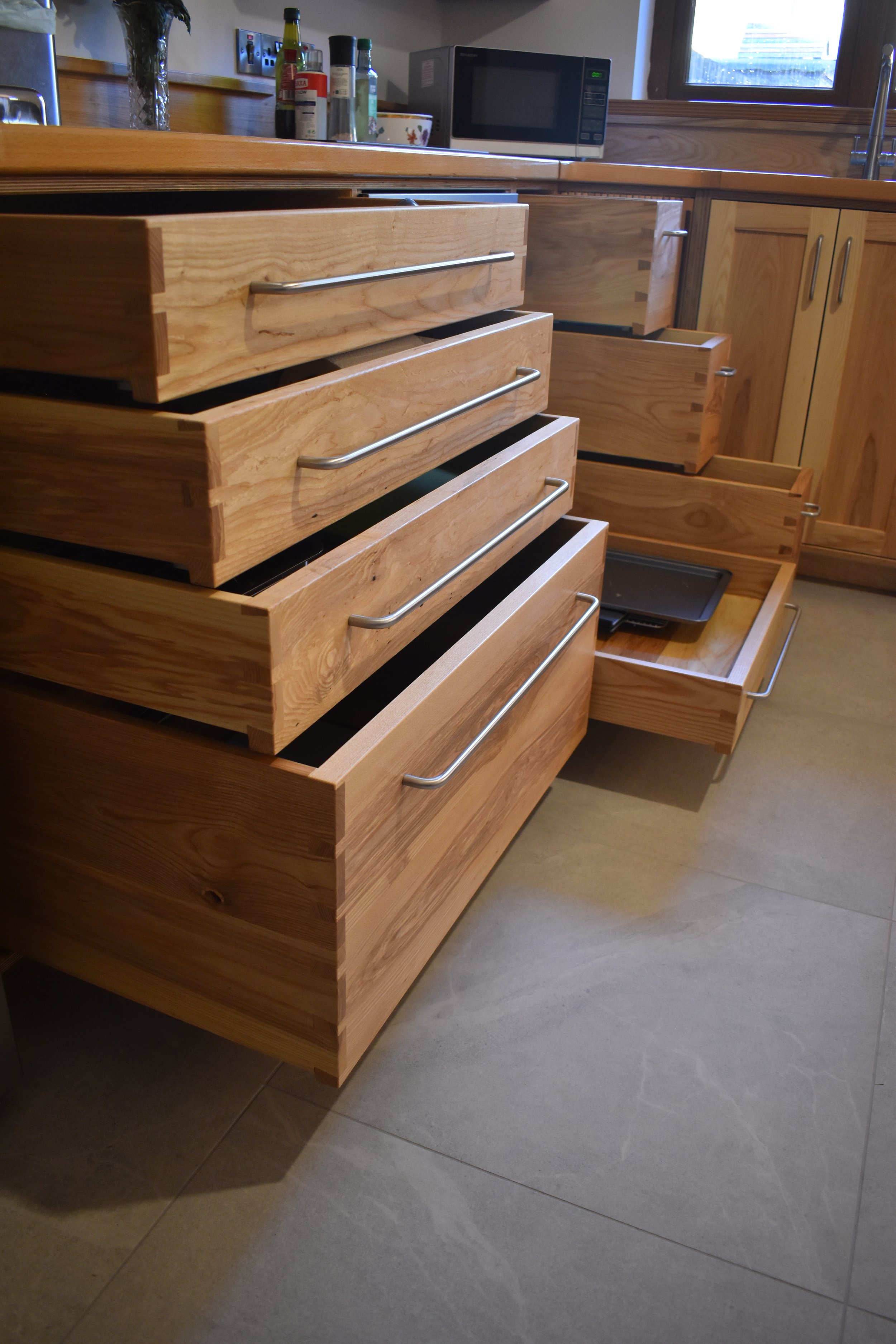
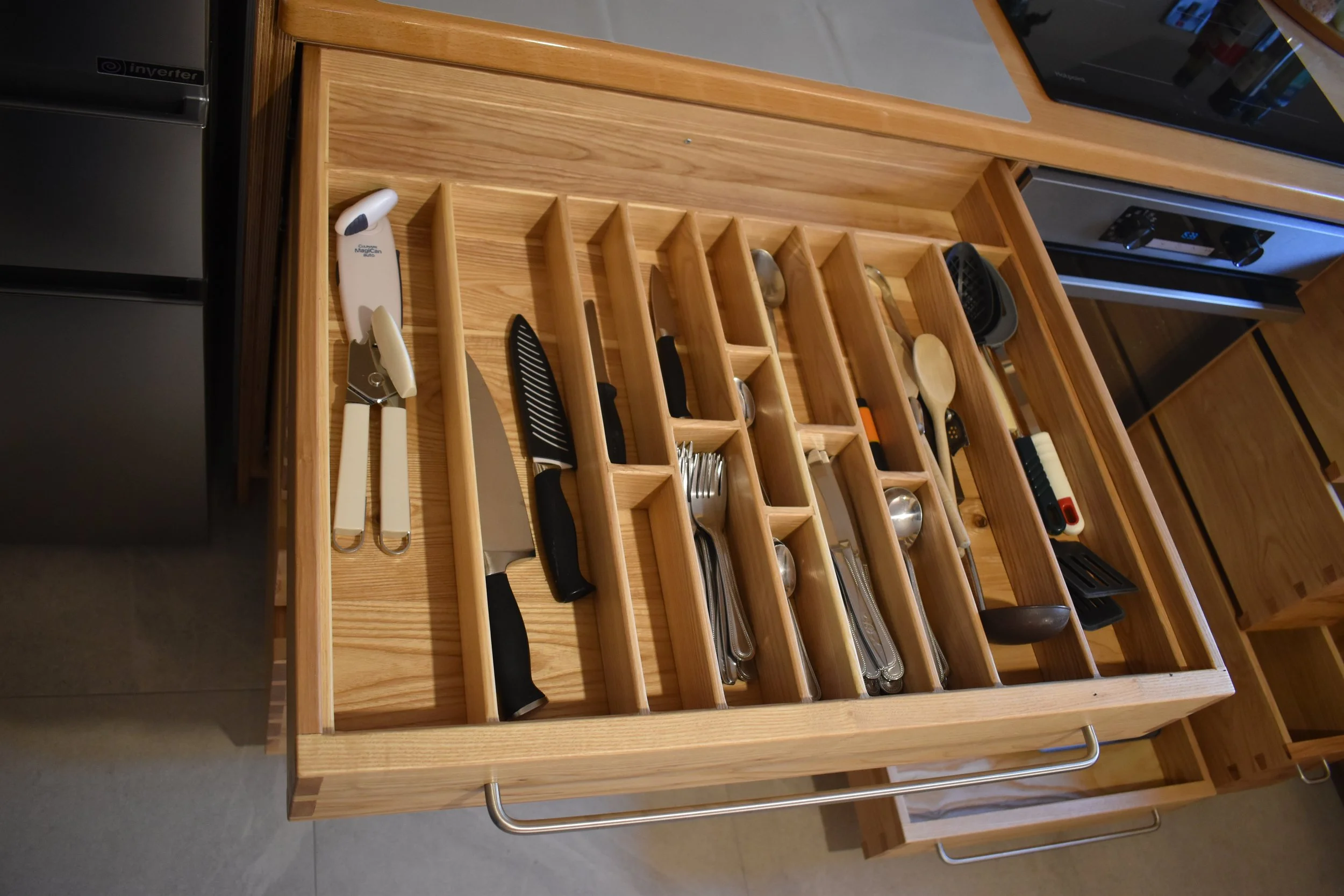
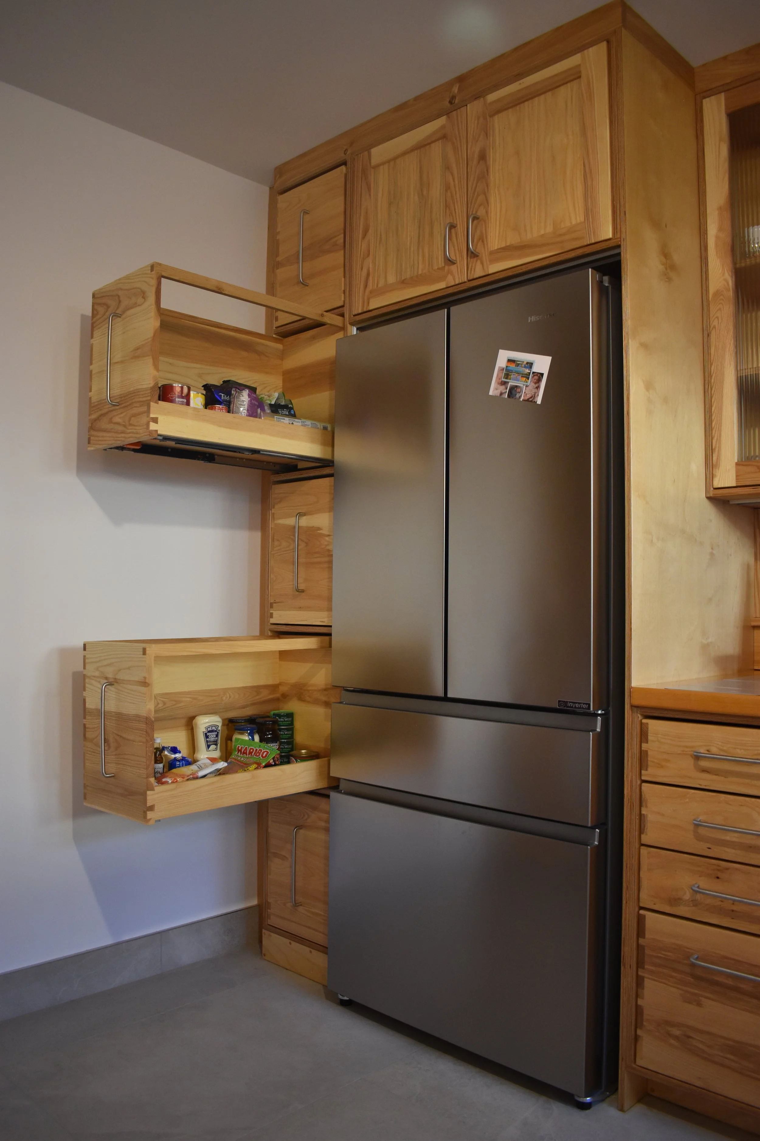
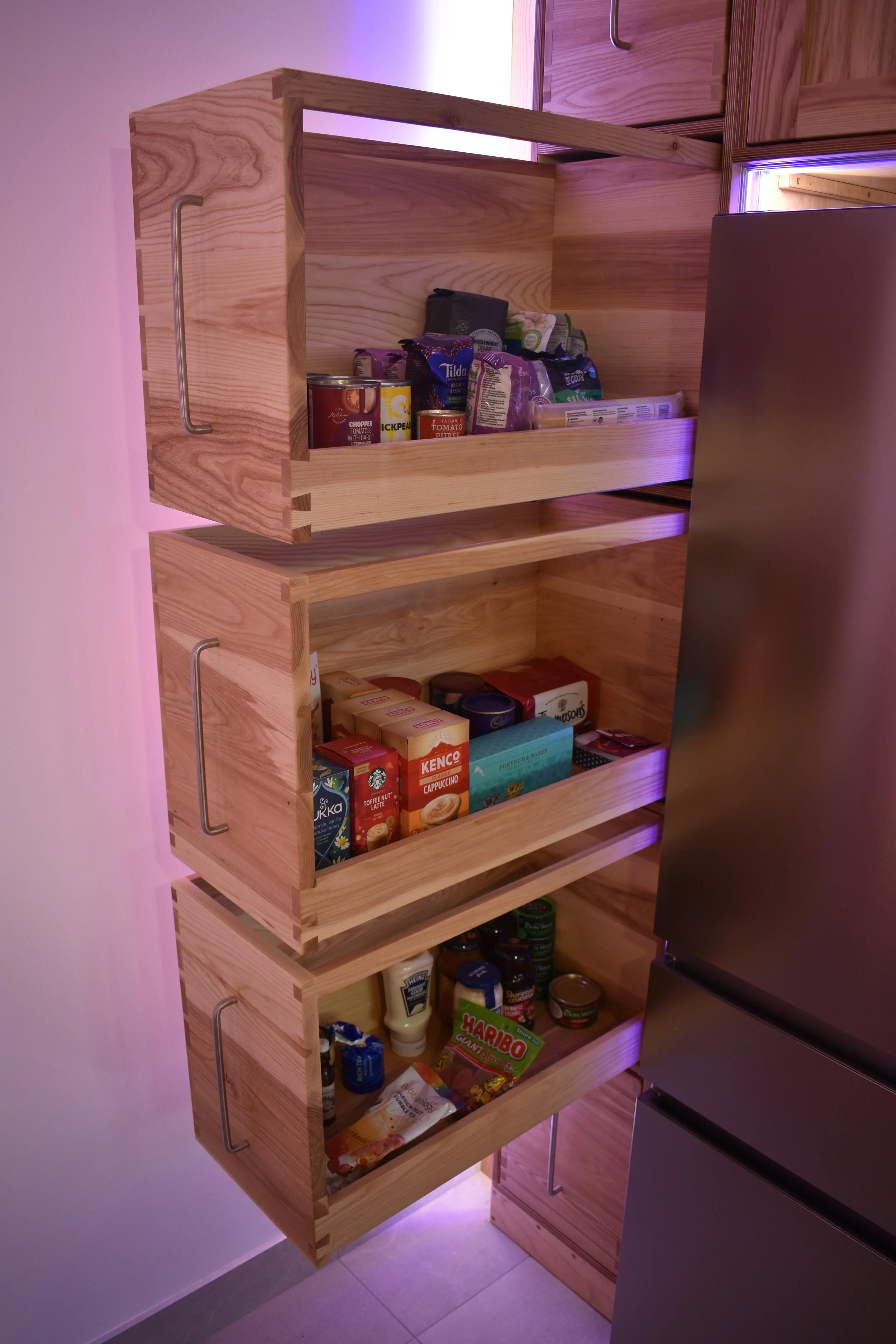
One of the benefits of the deeper cabinets we decided to go with is that we can have very deep drawers to match.
Modern drawer hardware is very capable when it comes to this sort of sizing, these drawers are each cabable of carrying 70KG of capacity.
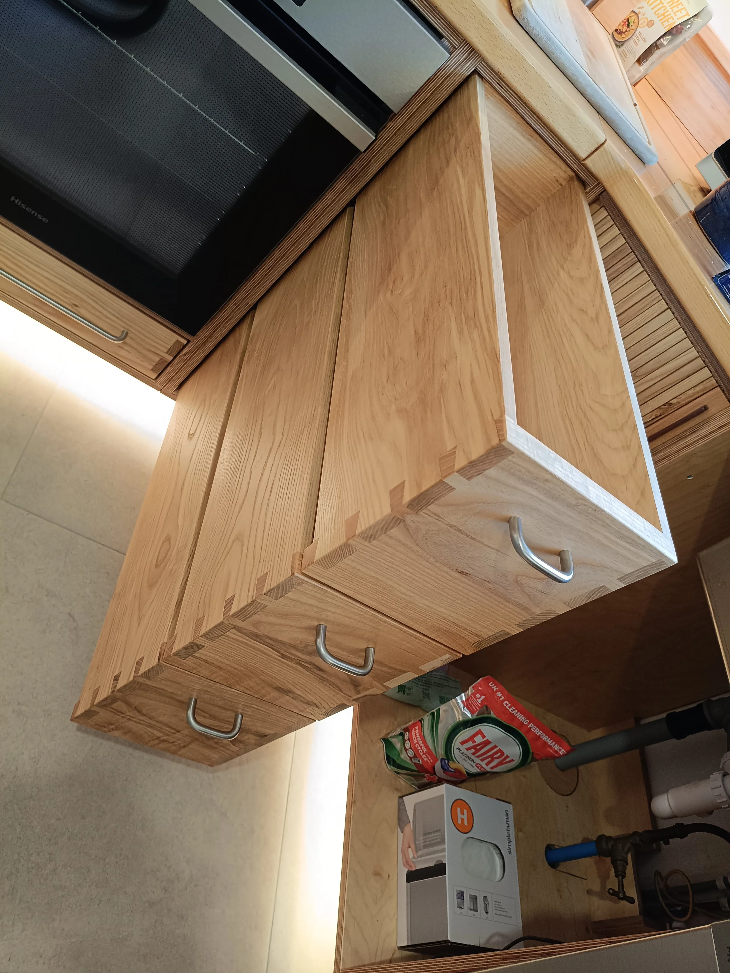
Sliding storage is the way to go for as much kitchen storage as possible. This limits the need for reaching deep into a traditional cupboard which would be a particularly inconvenient with cabinets of this size.
These can come in a wide range of sizes - literally. Here we went for extra wide which helps provide shallower stowage opportunities. The benefit here is everything inside can be laid out for easy viewing and less digging.
Pictured is a very useful cutlery organiser which can handle any kind of kitchen utensil, all in one place!
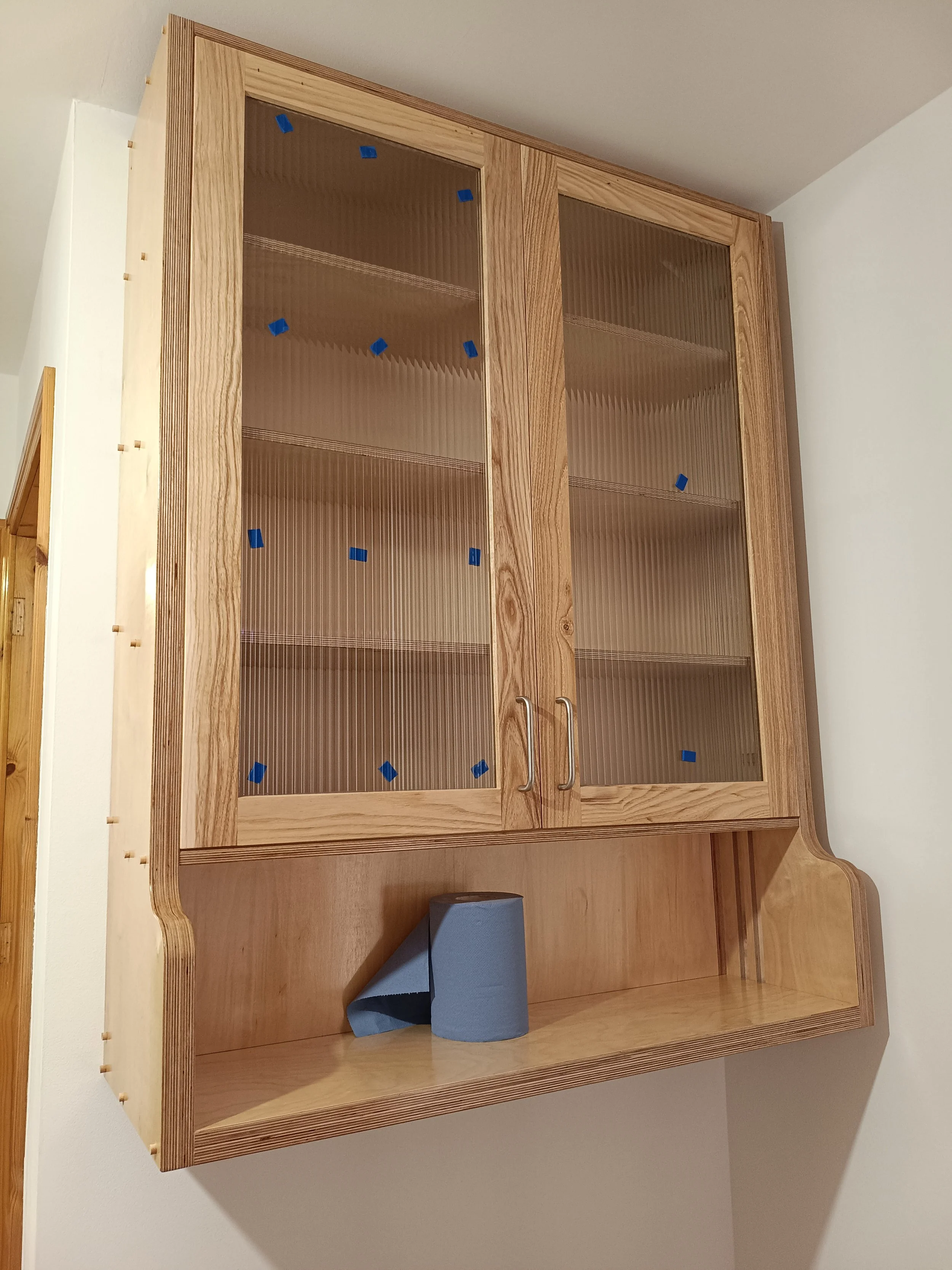
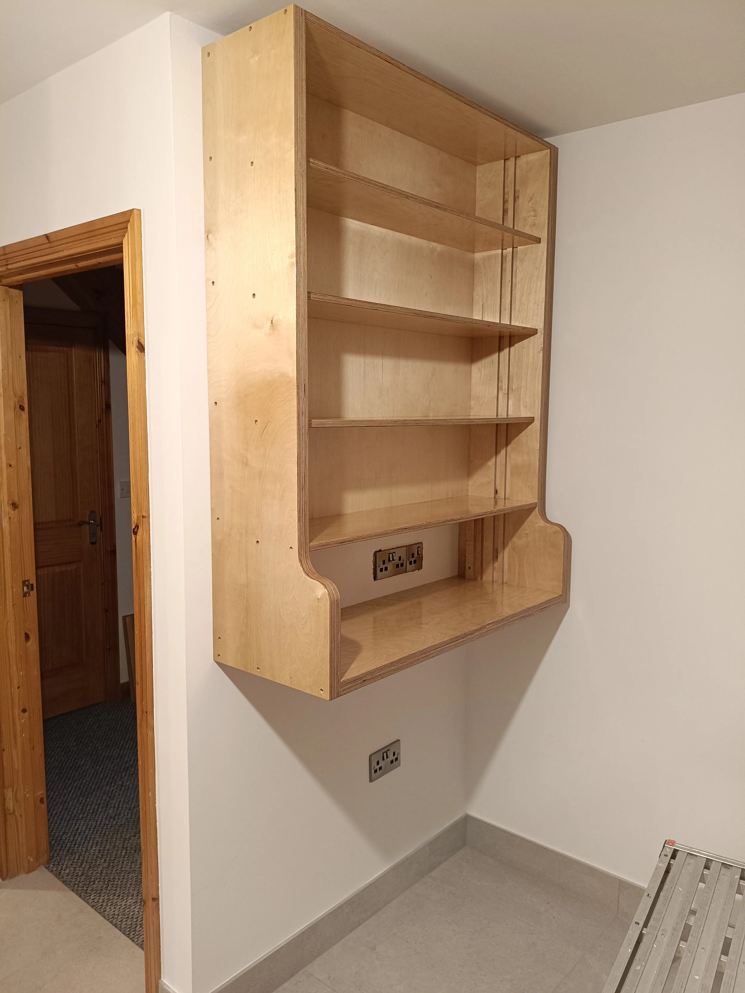
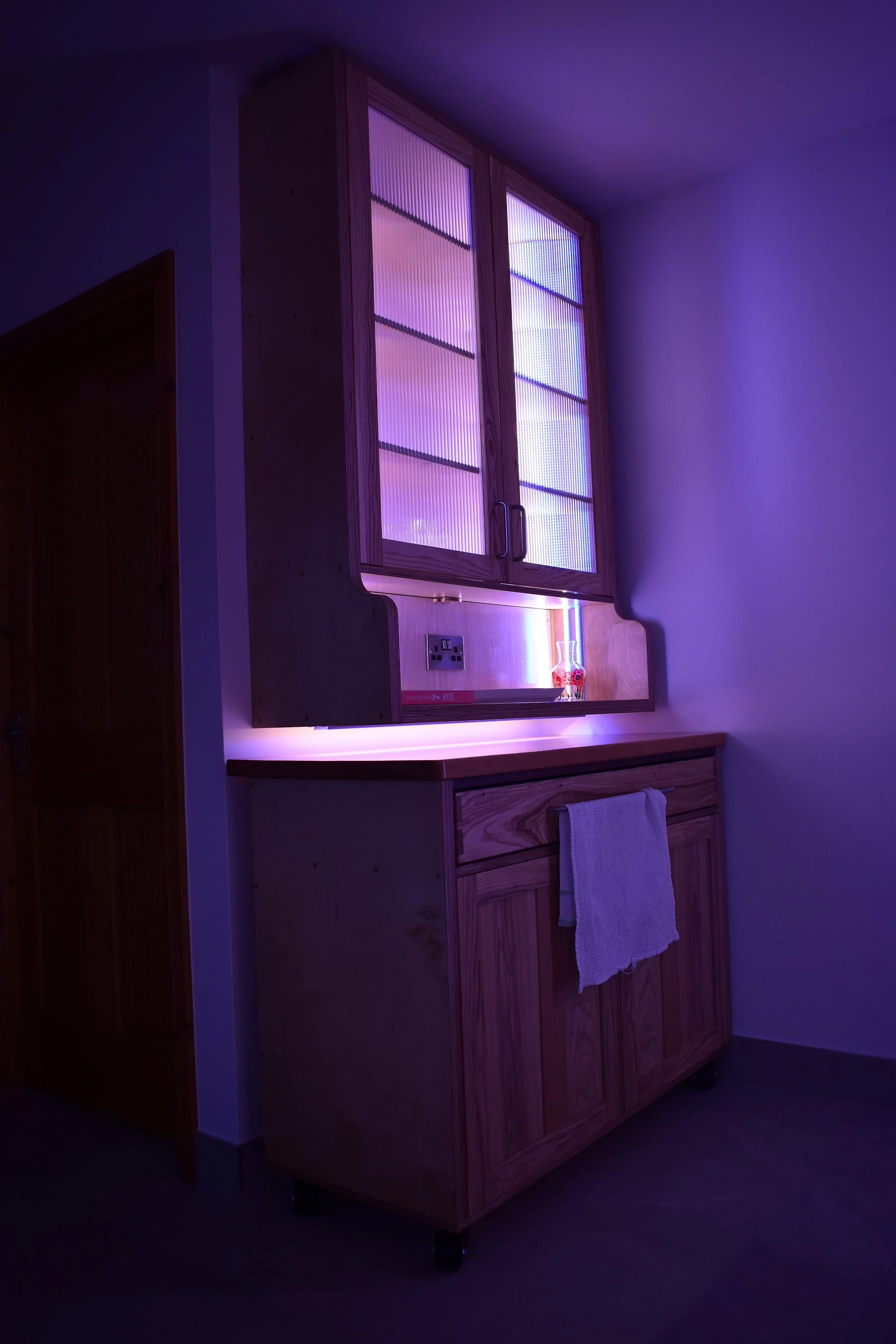
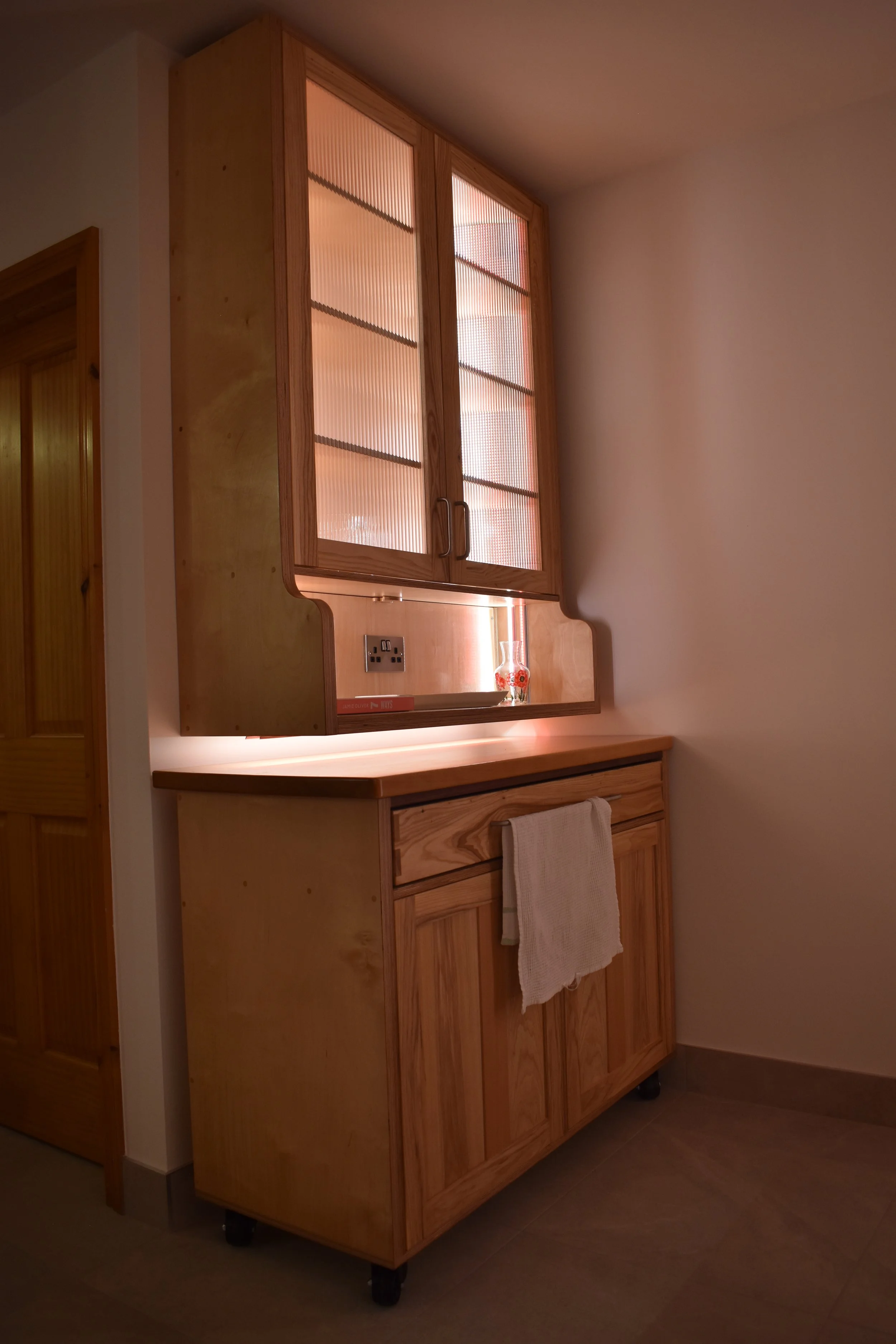
To make use of this wall, it was decided to make a wall hung dresser cabinet.
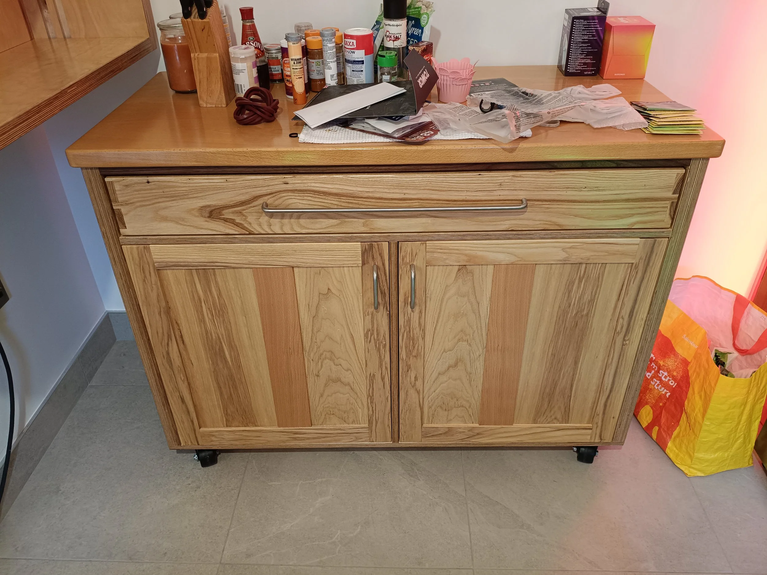
Underneath this for extra utility, a rolling island can be stored. It can be used as regular storage when not in use or rolled out and used as bonus countertop space when the kitchen is busy and needs the extra capacity.
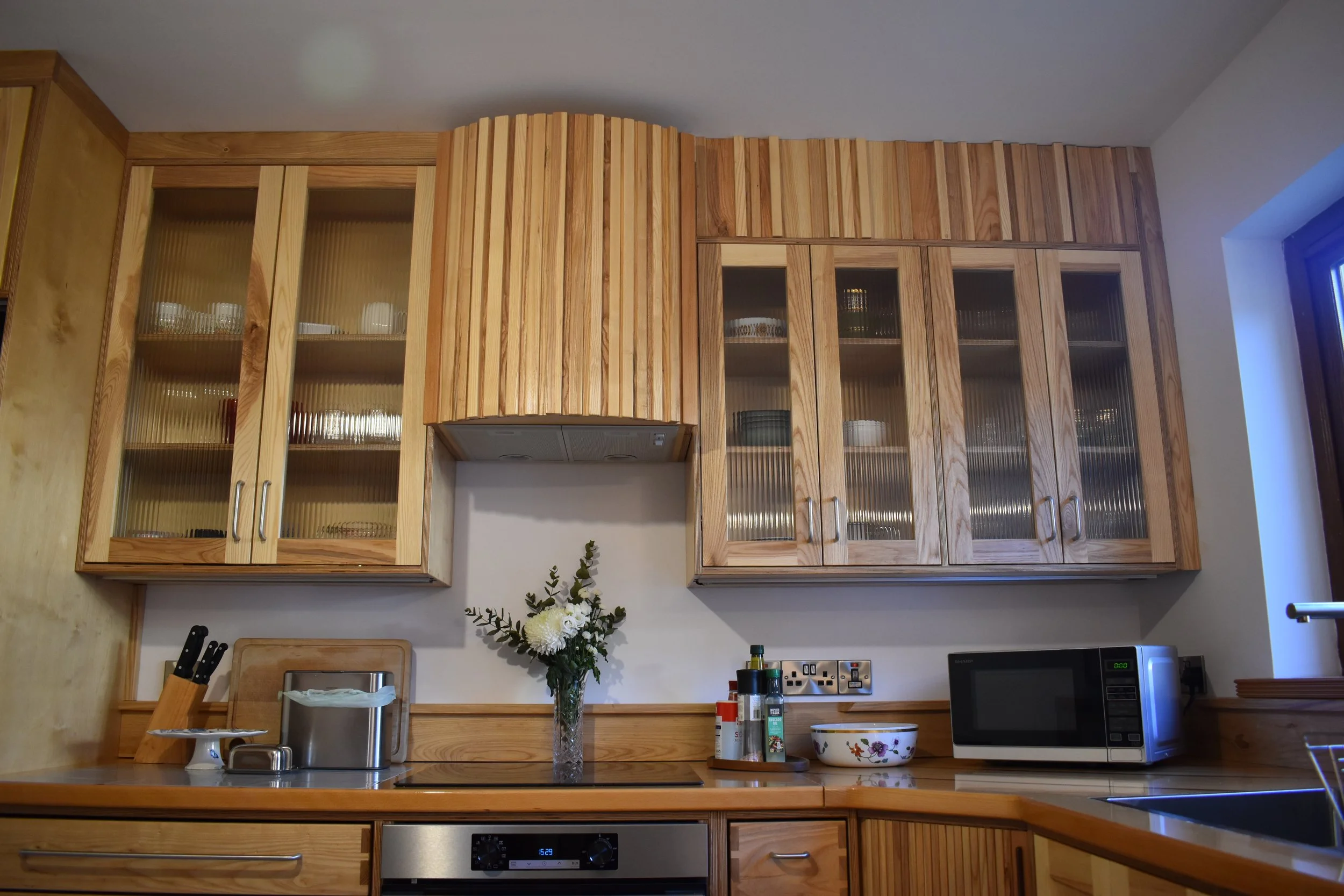
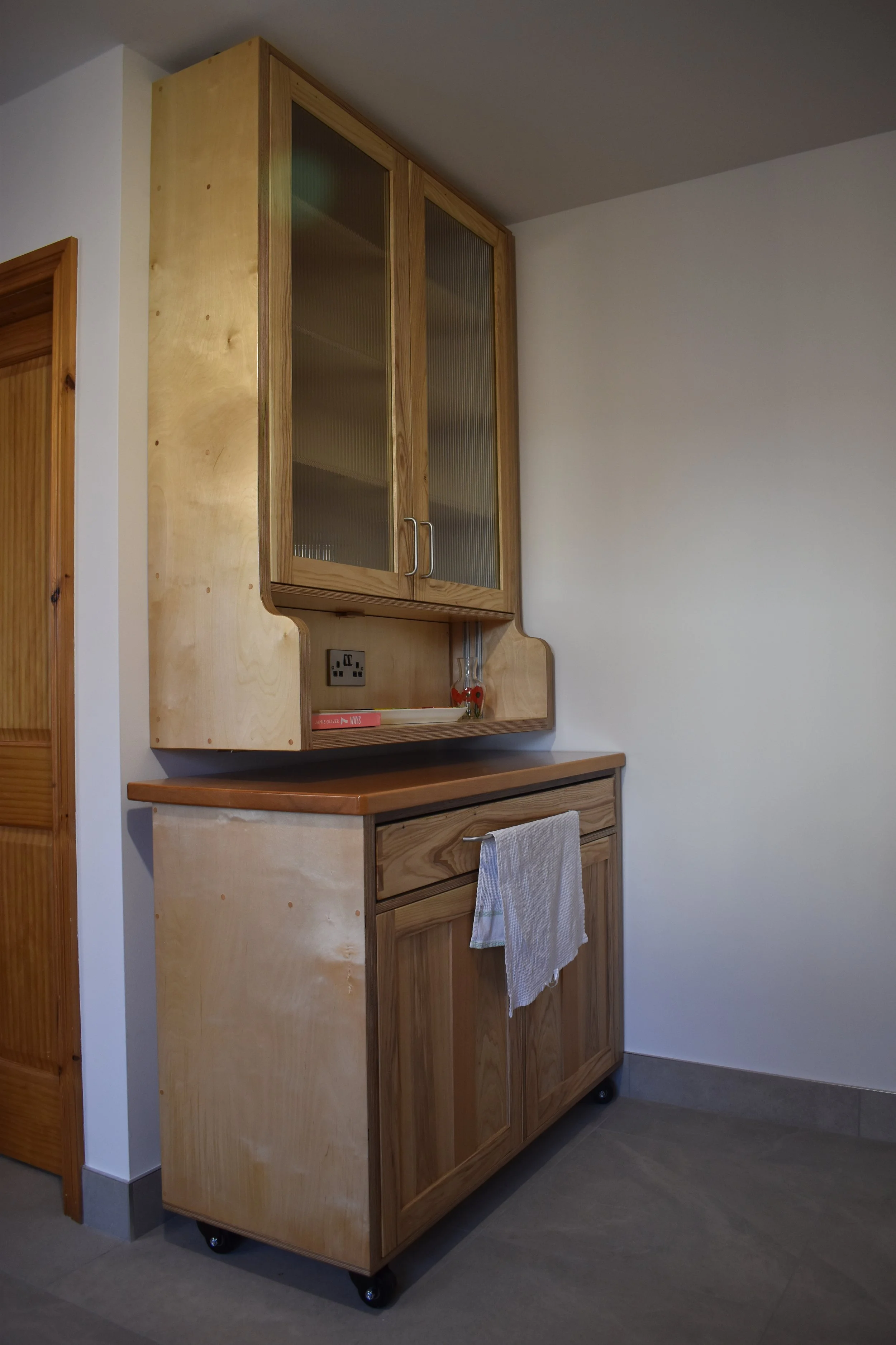
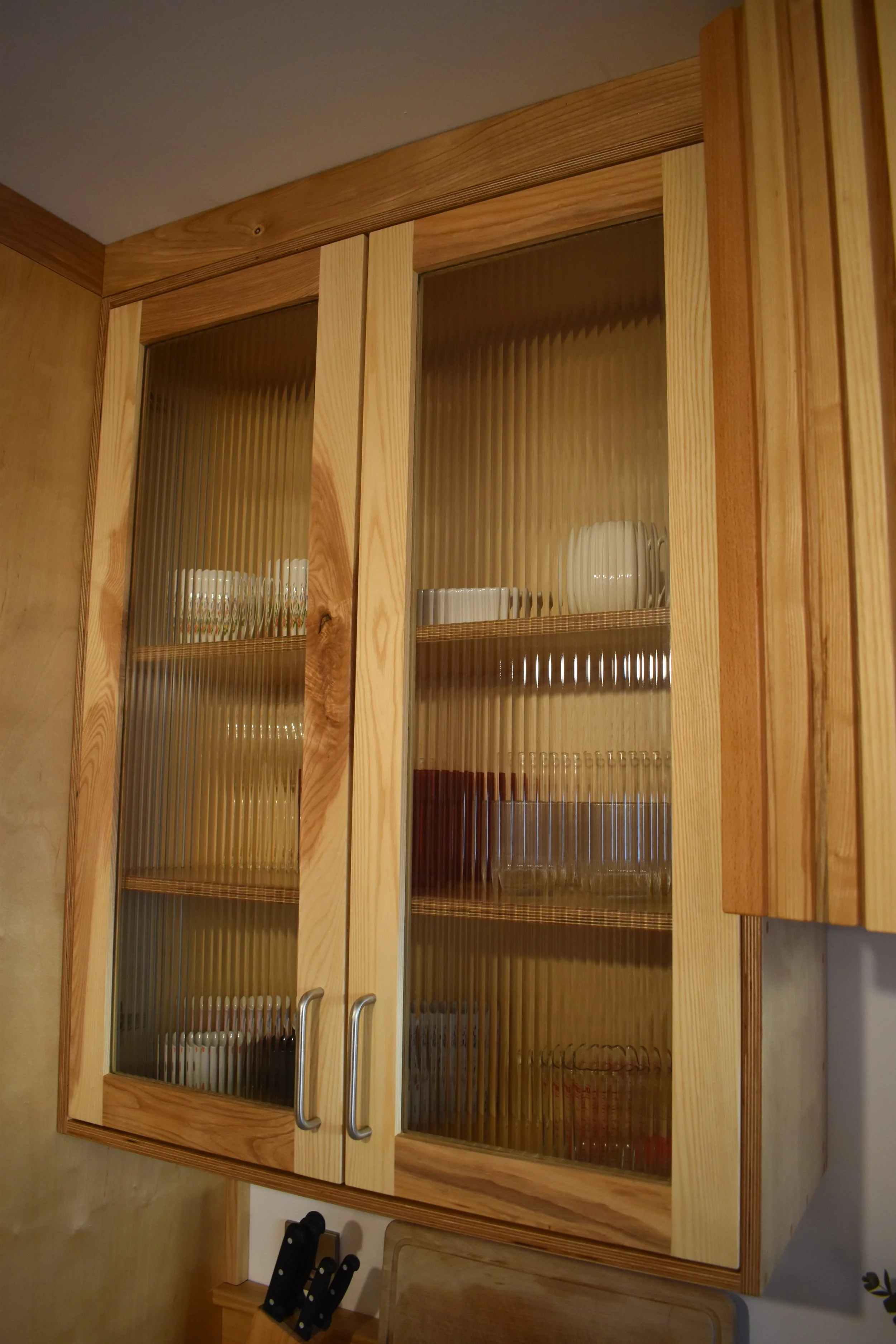
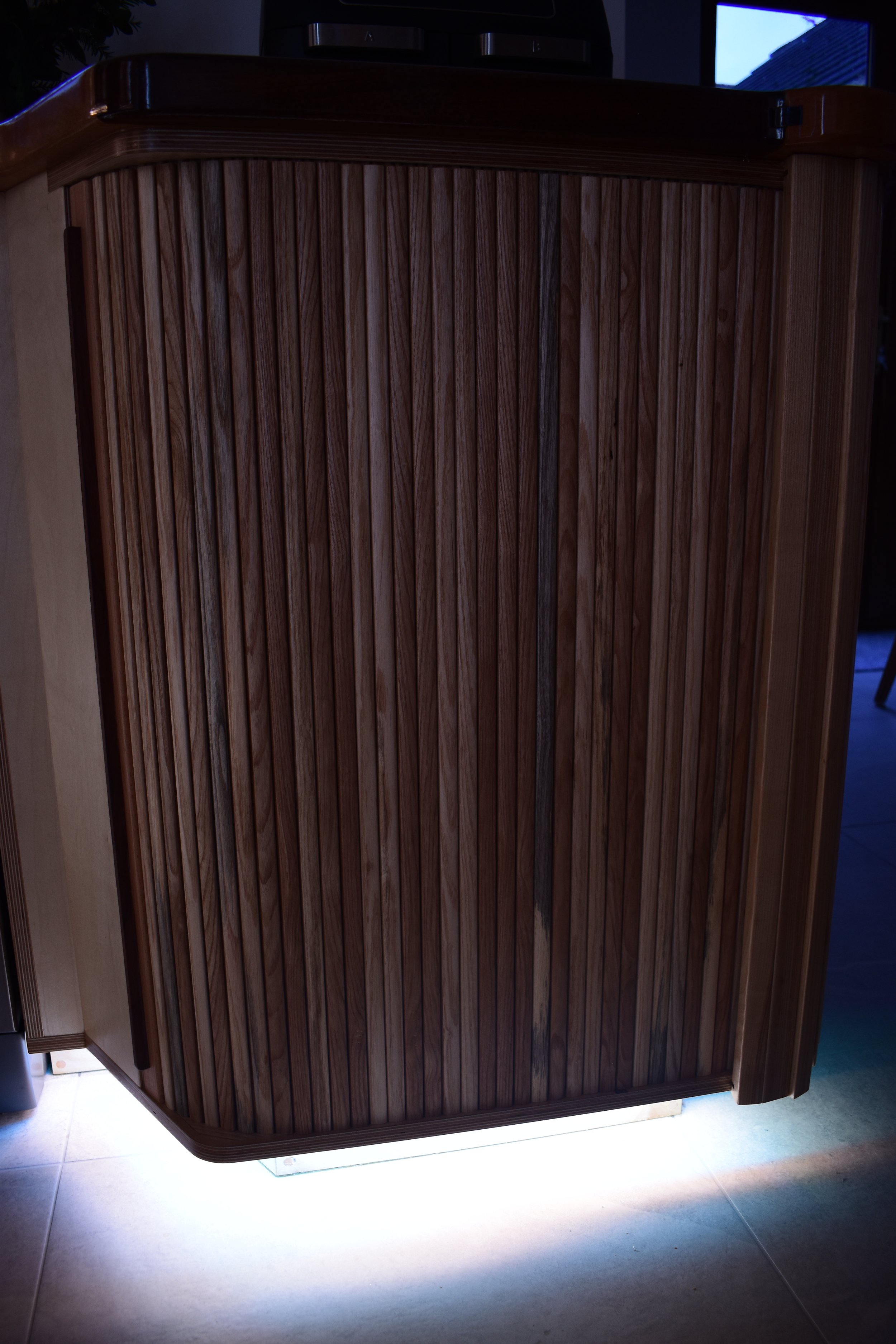
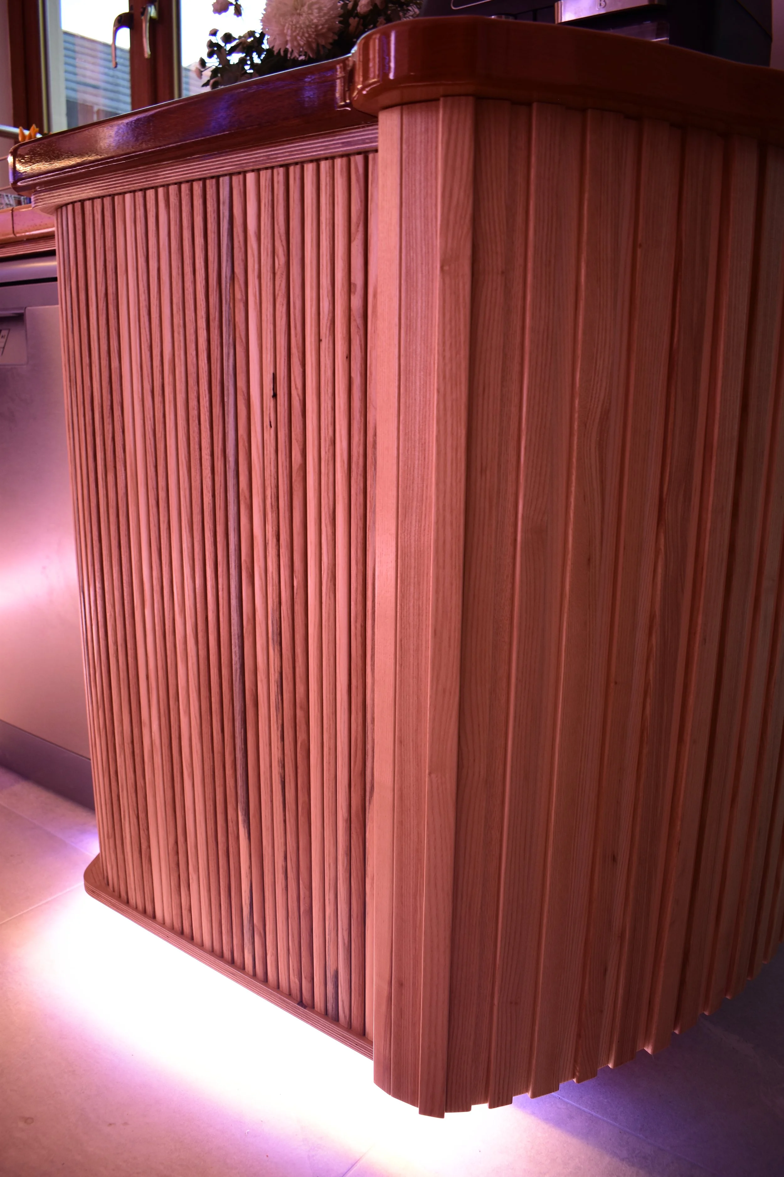
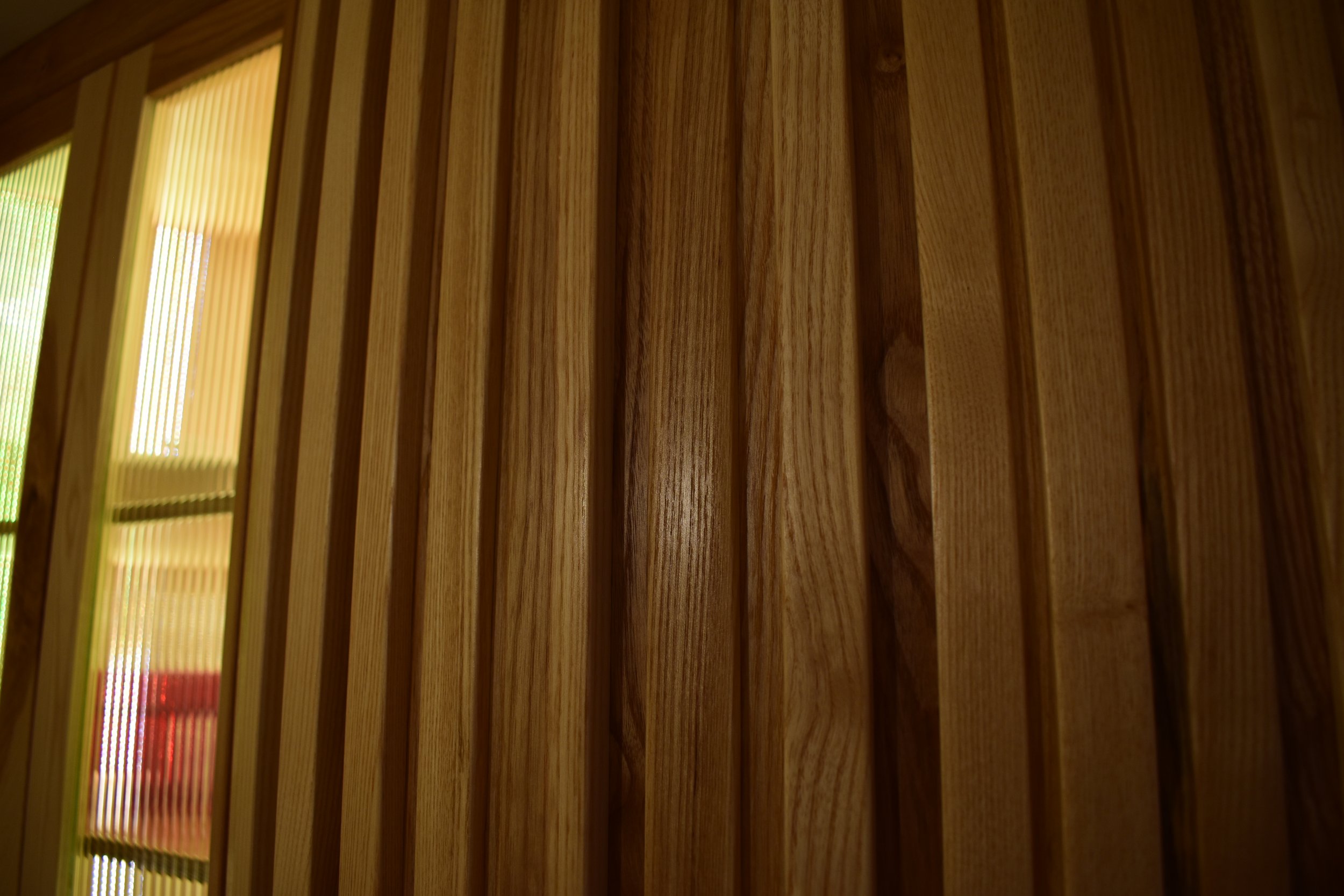
Even without the lighting this kitchen has a sophisticated feel. While it is still bright it isn’t overly vibrant or pale. The reeded glass cabinet doors add depth to the upper cabinets. Everywhere you look there are interesting features or attractive woodgrain to entertain the eye.
Now we get to the more glamourous section of photography. It is great to see a plan come off the page and into reality. The video above is a walkthrough of the kitchen design and features.
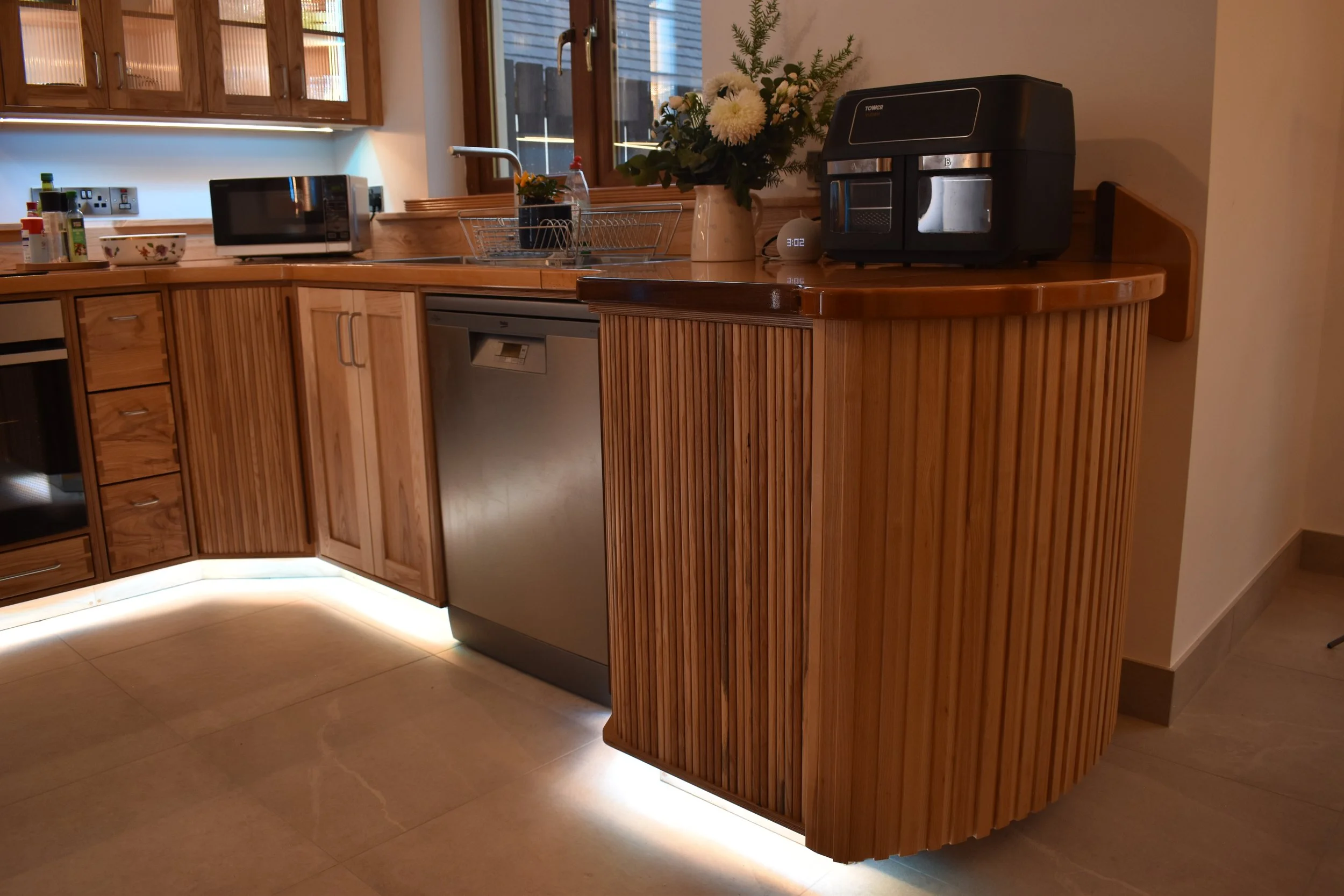
The lights really transform the kitchen and make it come alive. They make the space feel more spacious and uplifting as well as being very practical. With the way they light up the countertops, you won’t be chopping onions in your own shadow.
Ultimately, the aim of kitchen design is to create a practical space which makes cooking more attractive, and cleaning and tidying less of a chore. We could have made this kitchen much more utilitarian, focusing only on the pragmatic - however, one of the most important parts of the brief was to make a space that was brighter and more engaging than the original.
A kitchen is usually the largest item of furniture in a household and can impact the feel of a home which is why it is important to get the aesthetics right. It is important to recognise that we can also be a product of our environments.
Enjoy the following gallery of pictures as you see the kitchen from different angles and in various different colours and mood lighting.
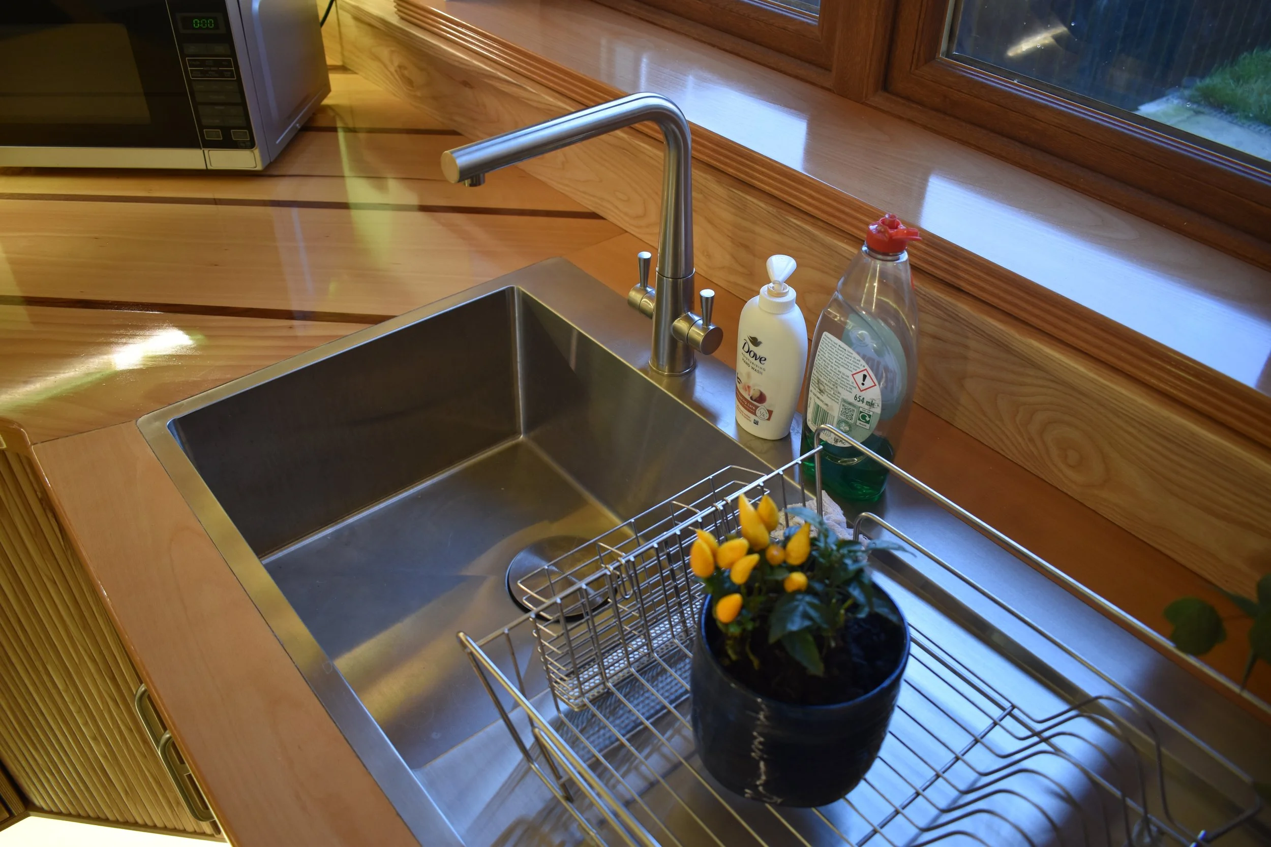
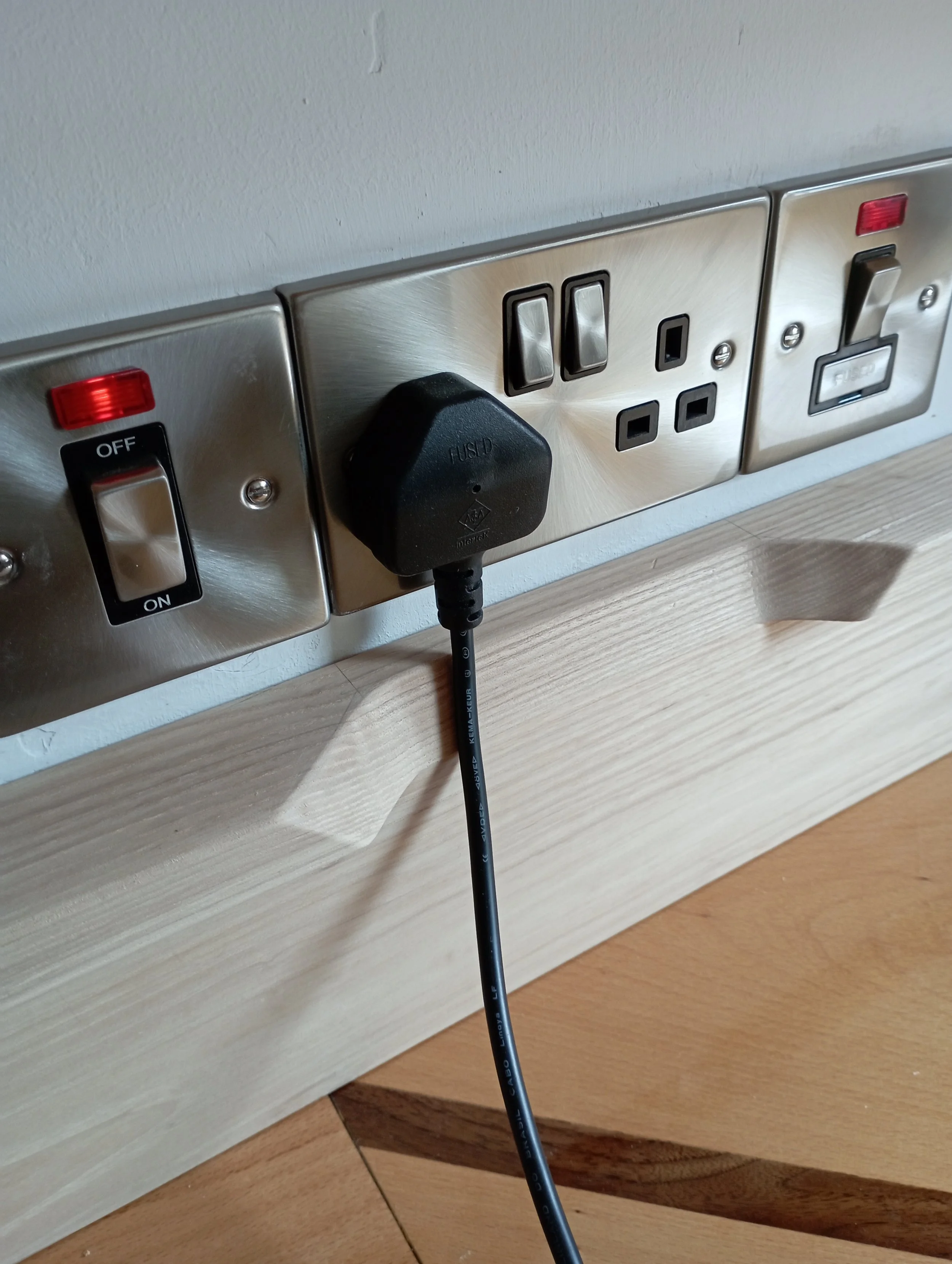
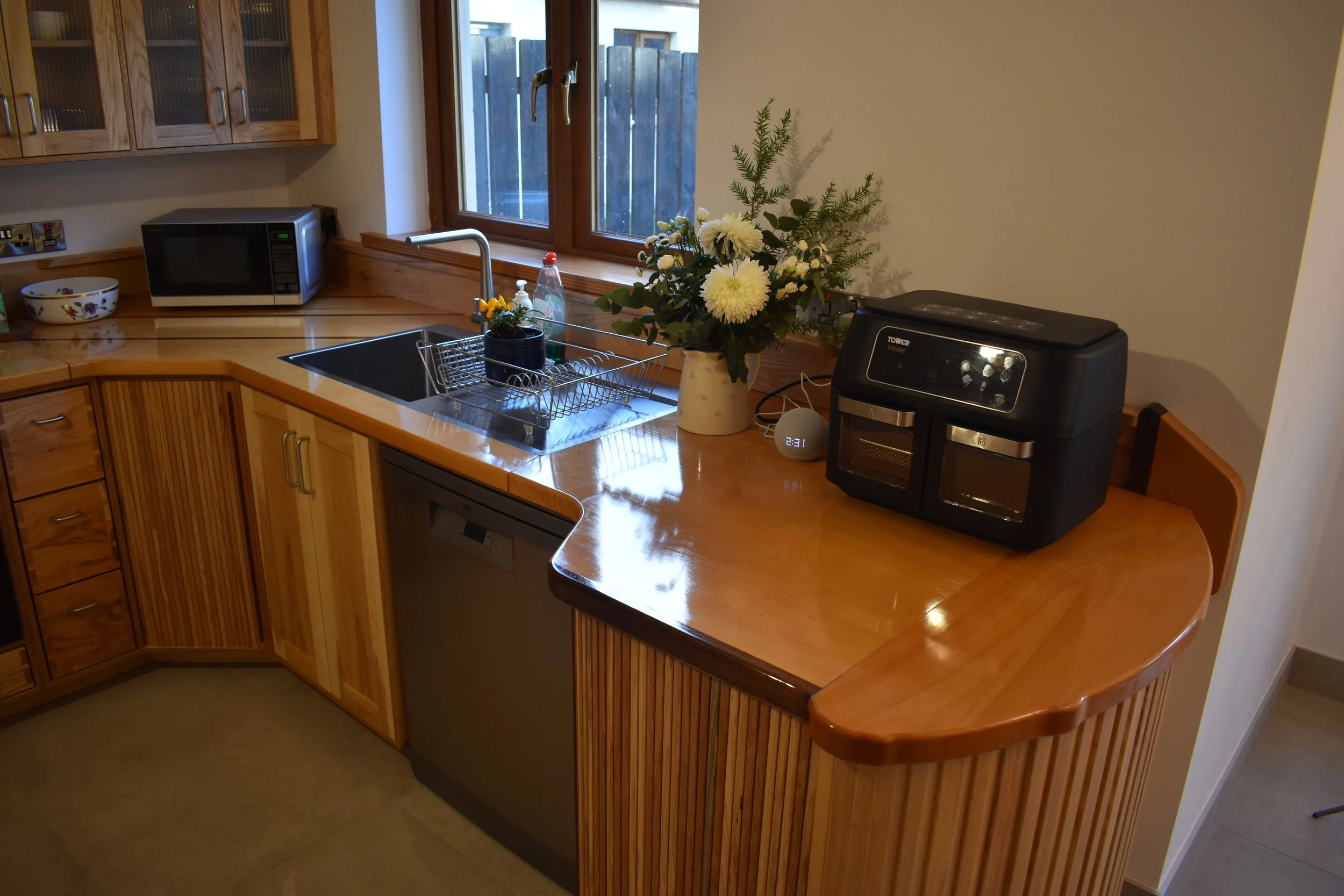
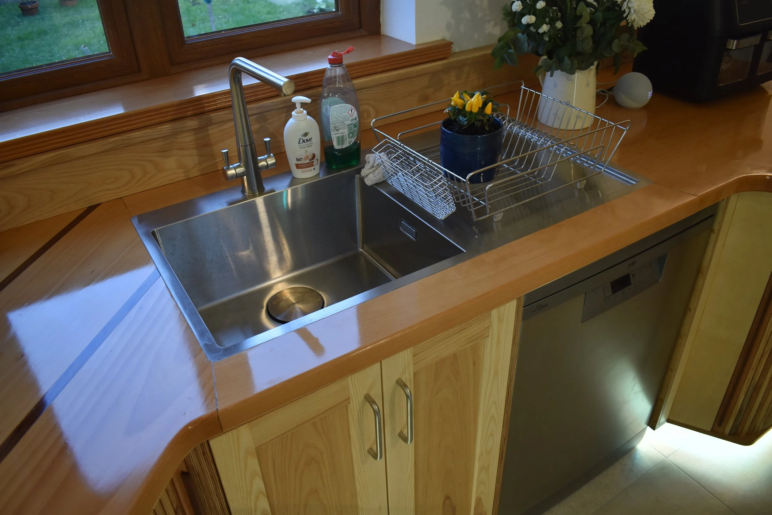
The sinks and taps are minimalist stainless steel and quite striking. They were not an easy fit but are actually very practical - a good size and easy to clean.

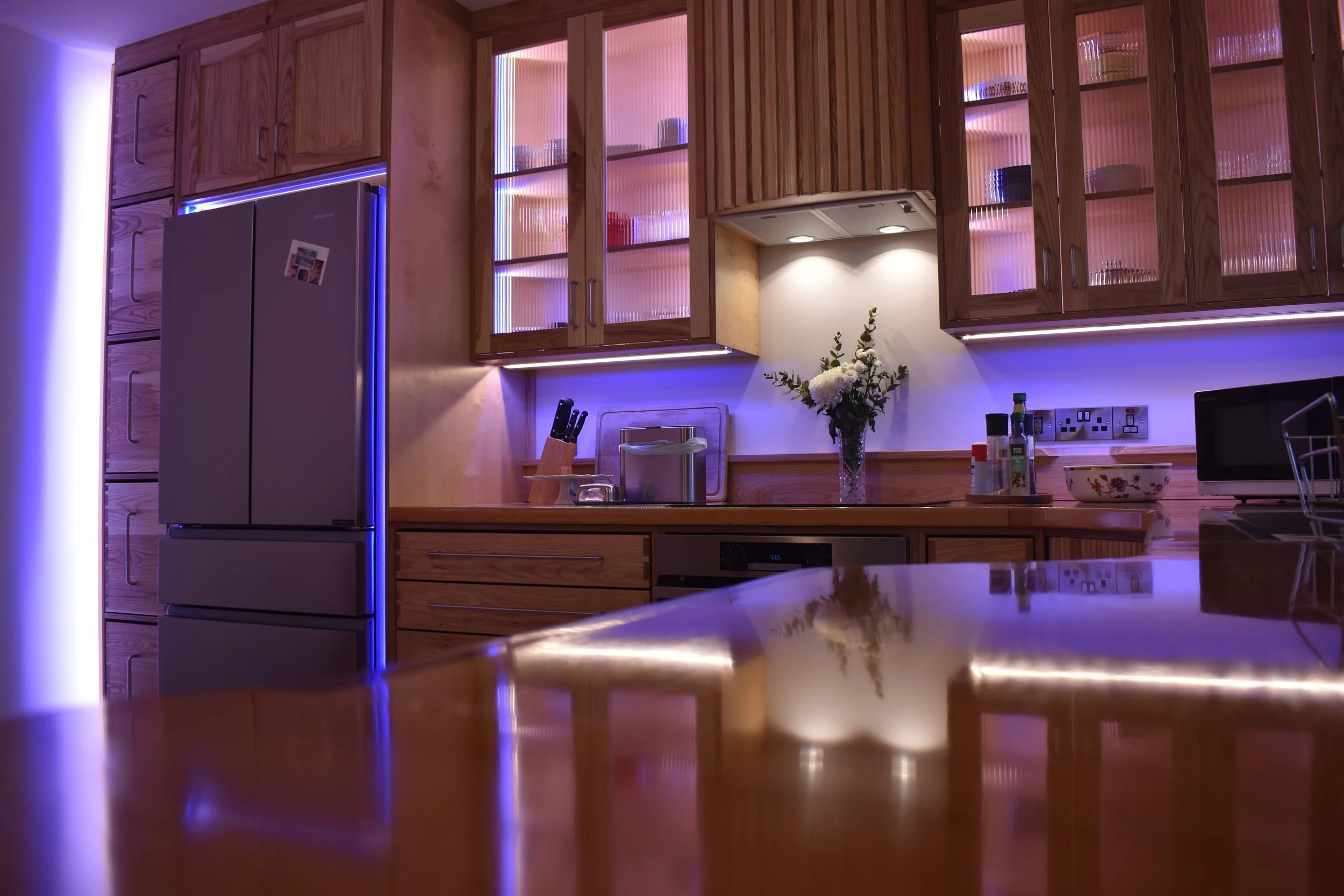
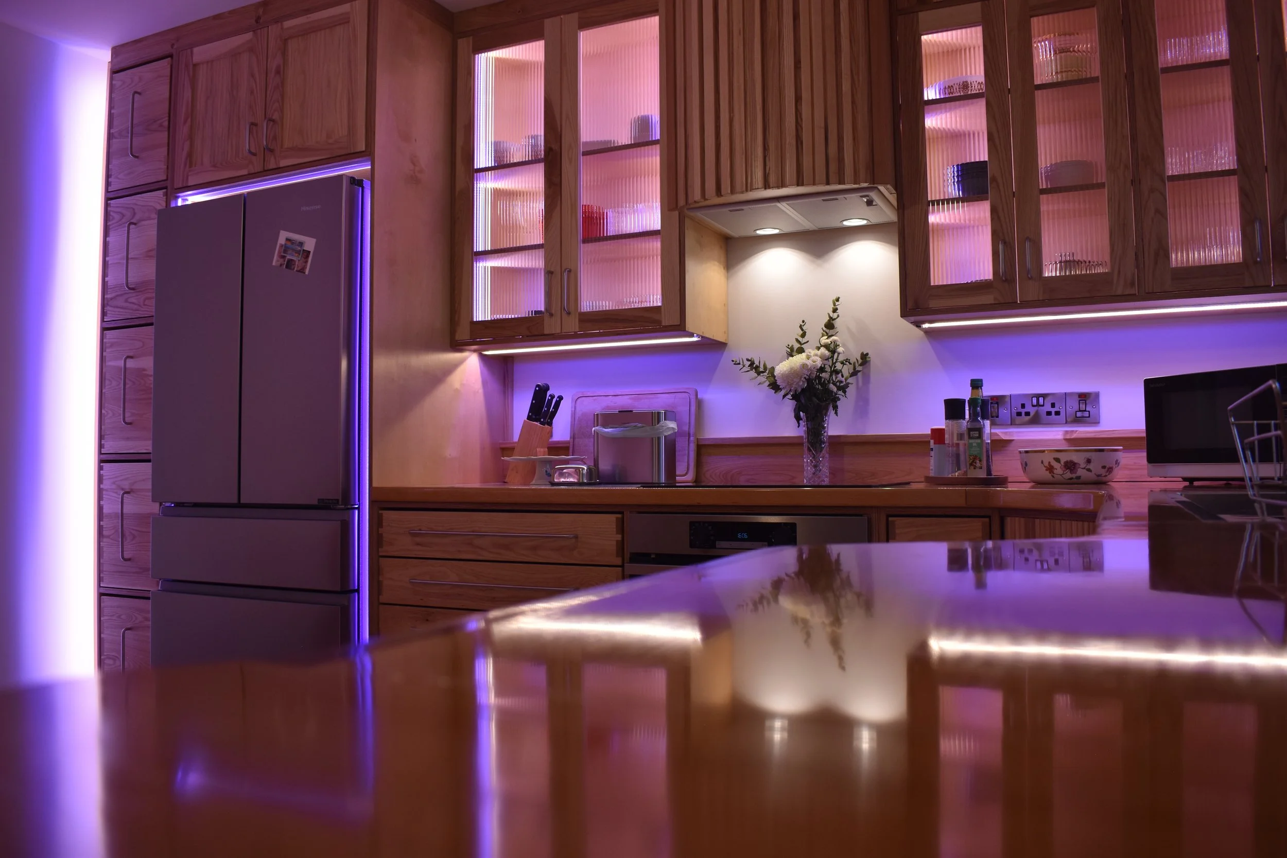
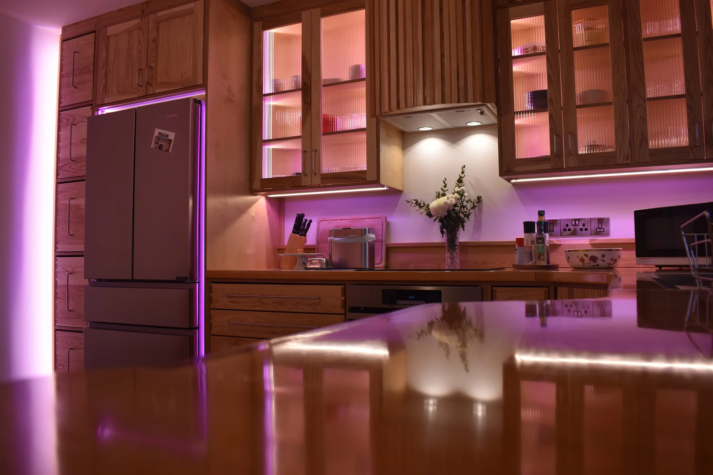
After Dark…